.net Awards 2011: the 10 sites of the year
In the last of our .net Awards 2011 profiles, we showcase the 10 websites of the year that you have nominated. They all are rich in visual flair and imagination but which one really pushed the boundaries of the web this year?
Over the last weeks we've profiled eight categories in the .net Awards 2011. Today it's the turn of the big one: site of the year.
We've asked you to nominate sites that offer a compelling user experience and are rich in visual flair and imagination. You've responded with an interesting mix that includes huge advertising and ecommerce campaigns for big brands, created by some of the world's biggest agencies, but also smaller client work built by just one lone designer. Plus, there are some experiments put together without the pressure of a client. But only one site can win...
To make things a bit easier for you we invited the brains behind our nominated sites to tell us a little bit more about their projects.
So, which site do you feel best pushed the boundaries of the web this year?
You have seven days left to cast your vote. Then, during October, our judging panel will choose a winner from the public's top three in each category. The Awards will be presented at a VIP ceremony on 24 November.
And without further ado, here are your favourite sites of the last 12 months, in alphabetical order:
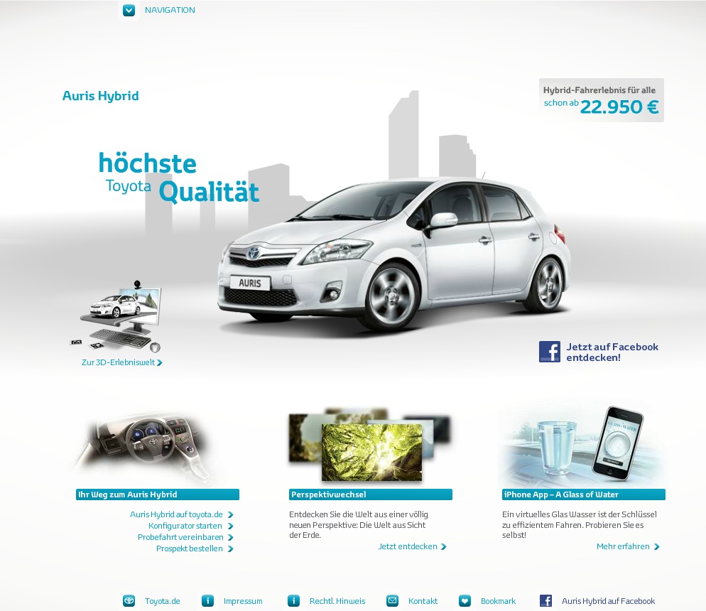
1. Auris Hybrid
URL: www.auris-hybrid.de
Created by: North Kingdom and Saatchi & Saatchi Dsseldorf
Get the Creative Bloq Newsletter
Daily design news, reviews, how-tos and more, as picked by the editors.
.net: What was the brief?
Henrik Karlsson, art director at North Kingdom: How do we let people experience and test drive the new Toyota Auris Hybrid car, when we don't have the car launched yet?
.net: How many people worked on the site? And how long did the project take?
HK: Since it was a collaboration with Saatchi & Saatchi Dsseldorf I'm not sure how many people were involved in total. But our team from North Kingdom consisted of eight people including tech, creative direction, art direction/design, 3D, user experience, project management and sound. The development time of the project from start to launch was roughly four months.
.net: How did you build it?
HK: The primary technologies used were Augmented Reality, Flash and XML.
.net: What's the feedback been like?
HK: The feedback's been great! People have really enjoyed building their own tracks, and hundreds of people have recorded and uploaded really creative test-drive videos on the site. We also reached more preregistrations for test-drives than with any other Toyota model at such an early date.
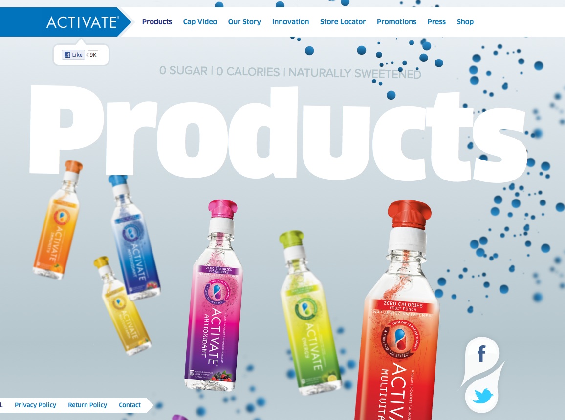
2. Activate

URL: activatedrinks.com
Created by: Big Spaceship
.net: What was the brief?
Dan Mall, art director at Big Spaceship : ACTIVATE engaged Big Spaceship as Digital Agency of Record to oversee digital strategy and production, including the brand's social and mobile marketing. The redesign of Activatedrinks.com and establishing their Facebook presence emerged as the primary initiatives in re-setting their online presence for this growing brand.
.net: How many people worked on the site? And how long did the project take?
DM: Big Spaceship operates in a team system: initial deliverables for site redesign, social strategy and implementation involved a total of seven amazing folks, representing strategy, design, technology and production. Engagement to completion for the new site and Facebook presence implementation was around six weeks.
.net: How did you build it?
DM: The site is a mix of HTML5, CSS, JavaScript, and Flash. We also leveraged existing libraries; we used jQuery, Justin Windle's Springboard template, Google Closure, Modernizr, SWFObject and Underscore, among others. For more info about the specific techniques we used, check out our tutorial on how we built the ACTIVATE site.
.net: What's the feedback been like?
DM: Very positive. This opportunity has been especially exciting for us, largely because of ACTIVATE's open approach, flexible engagement and commitment to allowing our team to evolve elegant and engaging solutions to enhance the brand's dynamic messaging. We are grateful to both the brand and growing audience for their continued recognition.
3. Beer Camp 2011
URL: 2011.beercamp.com
Created by: David DeSandro
.net: What was the brief?
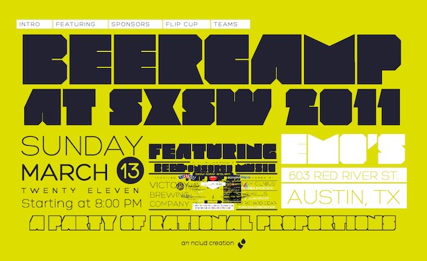
David DeSandro, frontend developer: My team at nclud was planning an event at SXSW 2011. BeerCamp was a fun party that we throw for our fellow web designers and developers. We wanted the site to be a celebration of our community and be something that our peers would enjoy. We knew that we could tailor it to the early-adopter, tech-savvy demographic and leverage latest browser capabilities. Apart from making something fun and captivating, I was free to make whatever I wanted. This was a great opportunity to try something new and play around a bit.
.net: How many people worked on the site? And how long did the project take?
DD: I alone am responsible for mess which ended up being the 2011 BeerCamp site. It took me about two or three weeks to make it happen.
.net: How did you build it?
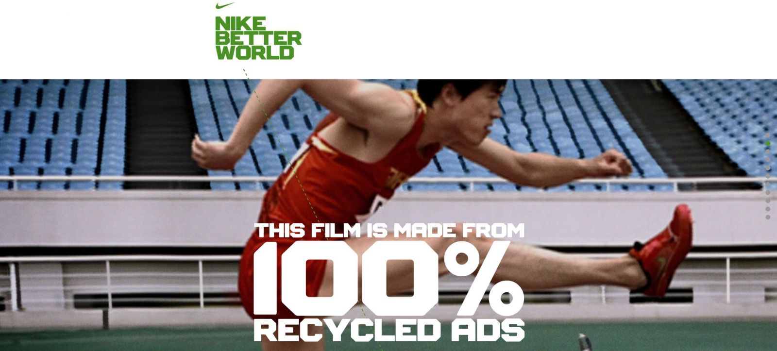
DD: I had an idea about a zoomable layout using CSS transforms. Like most of my projects, my development process began with iterating over several prototypes to see how feasible or compelling a concept might be. Midway through the project Nike Better World was released. This was the inspiration to use the scroll event to control the zoom.
You can learn more about the frontend development behind the site from the colophon I put together. I've also written a step-by-step tutorial to make your own zoomable user Interface for .net magazine, available in issue 216 and online (also check out my extended version, in which I cover more about the navigation and how to add CSS transitions to make an impressive interaction).
.net: What's the feedback been like?
DD: During the initial release, it was a delight to see how many people were wowed by the zoom-scrolling effect. It's a treat to think that someone said may have uttered a Keanu-esque "Whoa" while looking at your work.
The zoom-to-scroll interaction may get pigeon-holed as another fancy-scrolling gimmick of 2011. But I strongly believe that incorporating CSS transforms heavily into a layout has the capacity to say something substantial for a brand. I'd like to think that the BeerCamp site could be a proof-of-concept in that regard.
4. Harvey Nichols
URL: www.harveynichols.com
Created by: Pod1
.net: What was the brief?
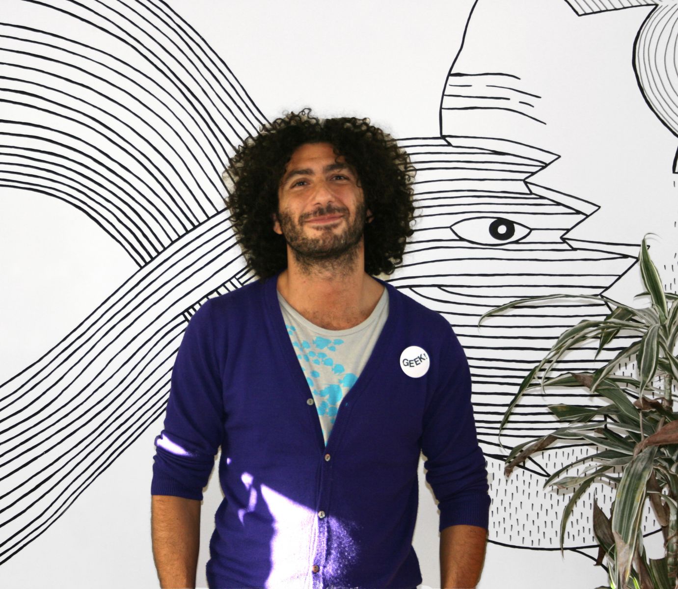
Fadi Shuman, co-founder of Pod1: An exciting ecommerce proposition to deliver the luxury shopping proposition, to be flexible in its design for campaign imagery and themes. We were tasked with revamping the retailer’s online presence and upgrading its website using the Magento Enterprise open source platform.
.net: How many people worked on the site? And how long did the project take?
FS: Pod1 worked closely with Harvey Nichols, with a team of 10 people on each side in constant communication to make the project a success.
.net: How did you build it?
FS: Magento Enterprise and WordPress.
.net: What's the feedback been like?
FS: The site has received strong feedback from the design and ecommerce community.

5. Nike Better World
URL: www.nikebetterworld.com
Created by: Wieden + Kennedy, Seith Weisfeld, Ian Coyle, Ryan Bolls and Duane King
.net: What was the brief?
Duane King, founder and managing partner of Thinking for a Living: Nike Better World is dedicated to serving the athlete and making a better world through sport. On New Year's day, the program was introduced to the world through a site that showcases Nike's initiatives for social good. The content was delivered through an interactive storytelling format that encouraged exploration and inspired sharing.
.net: How many people worked on the site? And how long did the project take?
DK: The site was a collaborative effort between ourselves and key teams at Wieden+Kennedy and Nike. We spent much of Fall 2010 designing and deploying the new initiative, which was launched on 1 January 2011.
.net: How did you build it?
DK: The primary technical objectives were for the site to be lightweight, optimised for both web and devices, as well as to be scalable for future content and platforms. HTML5, CSS3 and JavaScript offered a great balance of creativity and technology, allowing us to communicate the Nike Better World brand message in a fresh and compelling way.
.net: What's the feedback been like?
DK: The response to the site has been incredibly positive — both from the public as well as the client. User retention and time spent on the site is consistently high. There's no telling how many pixels have been scrolled in total.
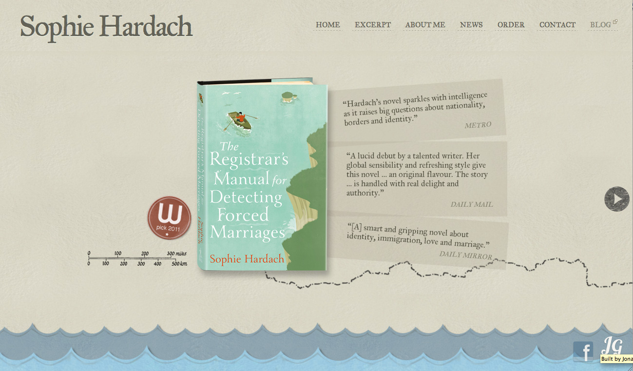
6. Sophie Hardach
URL: sophiehardach.com
Created by: Jonah Goldstein
.net: What was the brief?
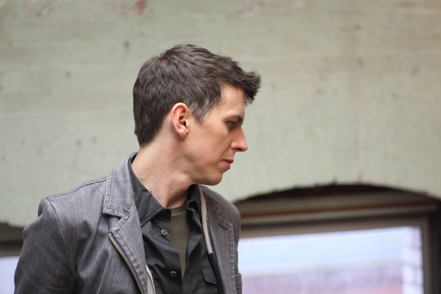
Jonah Goldstein, digital artisan: This was both Sophie's first website and first novel. It was clear that we needed to get her name out there, but beyond that there wasn't a true brief. Instead we embarked on an email chain of brainstorms since Sophie lives in Europe and my girlfriend and I were living in a small town in Nicaragua with limited net access. She began by sending along sites she liked, and what came through in her choices was a playfulness. That's what hooked me. I've tried to continue that feeling throughout the life of the project, even through a mini-campaign for the site in this competition.
.net: How many people worked on the site? And how long did the project take?
JG: I crafted the site myself, and as a solo designer/developer, I'm incredibly excited to be in the running with such super talented teams. My girlfriend was a great idea-sounding board (and I'm secretly training her to be a deadly frontend ninja at the moment).
The project faced a slight setback when my computer broke: getting a Mac fixed in Nicaragua is slightly difficult, so things didn't resume until we returned. The book's publishing timeline had analogous bumps in the road, and things progressed slowly but surely. All in all, I'd say four months off and on.
.net: How did you build it?
JG: I wanted the site to offer chances for discovery. The process of building the site was one of discovery as well, filled with little tests and prototypes that evolved over time. It was an enjoyable, creative process.
Underneath the flare I tried to build a good semantic structure ready for crawlers, screen readers, and non-JavaScript scenarios.
As for tools, I am forever indebted to the communities who tirelessly drive jQuery and WordPress development. They are amazing, and this site sits firmly on their shoulders.
.net: What's the feedback been like?
JG: I was very excited when the site first started showing up in tweets and design zines. People loved the tactile contact form and appreciated the attention paid to an often neglected user experience. The postcard went with the theme of the book, and I felt it was a nice reward for people taking time to write the author. Sophie is now receiving tons of test emails daily from designers and developers who are giving the site a spin. I'm hoping it also helps generate extra book sales for her.
Apparently, authors now have to pay for their promotional sites out of pocket, and since Sophie was a first-time author with a small budget, it was wonderful to create something that garnered public appeal and drive more eyes and ears to her work. I'm tickled pink (#FF6688).
7. Spacelog
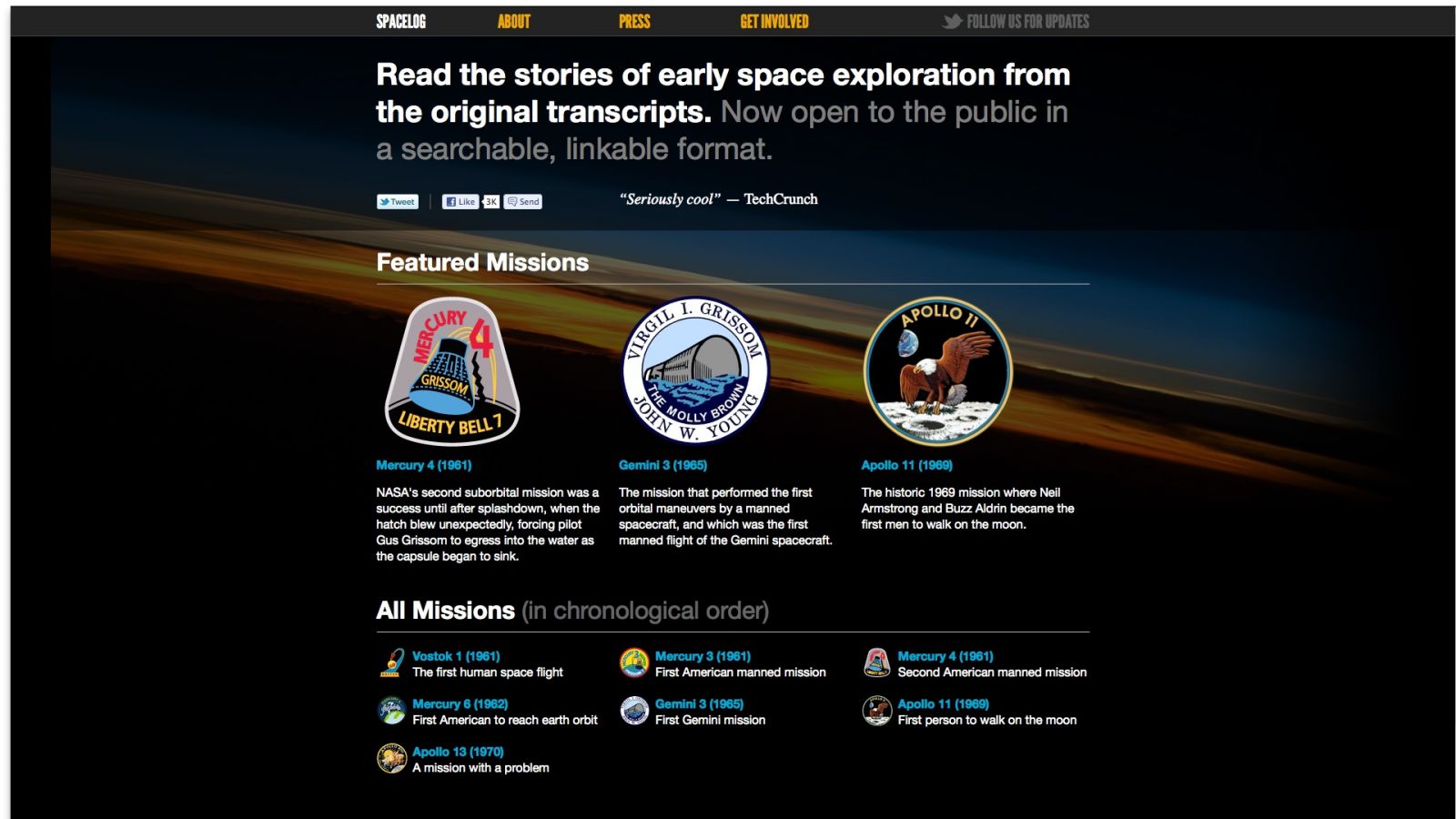
URL: spacelog.org
Created by: Russ Garrett, Matthew Ogle, Hannah Donovan, Chris Govias, Gavin O'Carroll, Ryan Alexander, James Aylett, George Brocklehurst, David Brownlee, Ben Firshman, Mark Norman Francis, Andrew Godwin, Steve Marshall
.net: What was the brief?
James Aylett, founder, /dev/fort and Artfinder.com: Spacelog was built at a /dev/fort, so there was no 'brief' as such, just a bunch of people who turned up with enthusiasm. The core idea, of making NASA transcripts more accessible, was from Russ Garrett (who brought a bunch of the transcripts for us to work on), and everyone else got sufficiently fired up to make it happen.
.net: How many people worked on the site? And how long did the project take?
JA: The first version of the site, containing two missions (Apollo 13 and Mercury 6) was 13 people in a week (actually six days). Since then we've had contributions from another 20 or so, with more people working on other missions for us right now.
.net: How did you build it?
JA: Spacelog runs Django with redis and Xapian behind it, and uses jQuery, backbone and underscore on the front end. Design elements not created by the team are the League Gothic typeface and the glyphish icons. There was also a bit of Perl that slipped past the censors.
The methodology used (a little tongue in cheek) is FORT; we have a way of running the week that’s designed to keep us on track while enabling us to get huge amounts done. Kind of agile but adapted for very short timespans, and fuelled by plenty of alcohol and bacon.
.net: What's the feedback been like?
JA: Feedback has been very strong (spacelog.org/press/); I don't really know how to put it! Lots of enthusiasm for space, lots of enthusiasm for the awesome product, design and build the team did, and some terrific and generous quotes.
8. The Do Lectures

URL: thedolectures.co.uk
Created by: Paravel
.net: What was the brief?
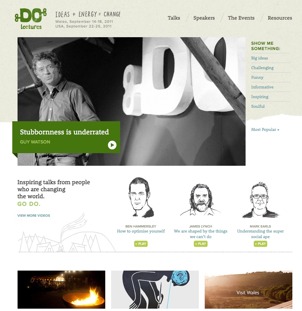
Trent Walton, founder of Paravel: The Do Lectures wanted a responsive video site so that they could provide better access to their content for any user on any device.
.net: How many people worked on the site? And how long did the project take?
TW: The project took three and a half months, and the team expanded from the typical Paravel trio to include Frank Chimero as well as the entire Do Lectures staff. In a highly collaborative fashion, Frank and our own Reagan Ray worked on the design while Alex Heslop provided the hand-drawn speaker illustrations. I worked with Dave Rupert on the responsive code-out and was thankful for his talent when the time came to make the videos fluid. Jon Heslop, who initially contacted us, worked with us daily to manage the project and migrate all the content.
Alongside David and Clare Hieatt, we credit Jon with fostering our newfound love for responsive web design. We all made the shift from thinking about the web in terms of desktops and pixels to content and proportions seamlessly, within project scope and budget.
.net: How did you build it?
TW: We’d worked with responsive web design techniques before, but not at this scale. At the time there weren’t too many responsive or adaptive sites to evaluate, but we quickly established some basic principles that we try to adhere to when building responsively. We are accustomed to spending a lot of time arranging the content on a page to establish hierarchy, and wanted to be sure that it was preserved as wider two- or three-column widths were combined into one for narrow views and mobile devices. The extra layer of planning went a long way not just in cramming content to fit a particular width but in choreographing it to provide the ideal experience at any width.
.net: What's the feedback been like?
TW: Positive and overwhelming, I’d say. You work on a site, staring at it all day for months leading up to the launch, with no gauge for what people will think. Launch days are always nerve-wracking, but we were happy to see the site so well received and thrilled that the amazing talks are being seen by more people.
9. Toronto Standard
URL: www.torontostandard.com
Created by: Playground
.net: What was the brief?
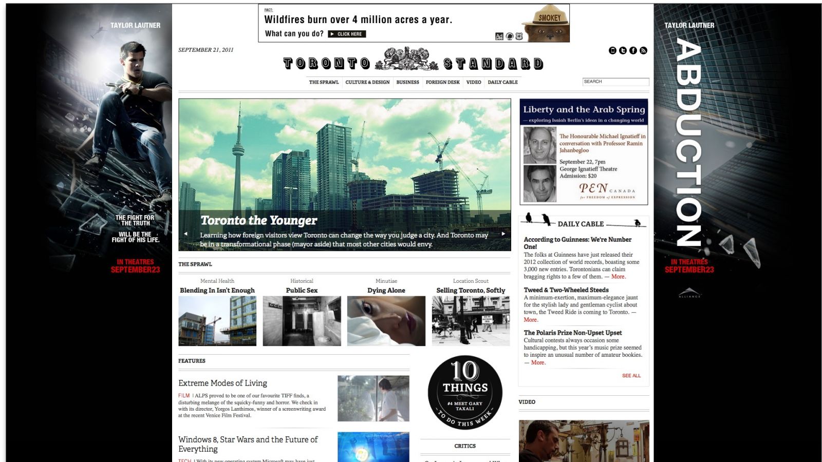
Ryan Bannon, creative director at Playground: The client came to us with an interesting idea. The client was an investor who had purchased the rights to an old Toronto news brand and wanted to reinvent it as a purely digital, fresh voice in the Toronto editorial scene. That was about it; purely digital, fresh voiced editorial.
.net: How many people worked on the site? And how long did the project take?
RB: Any time we work on a project it’s a whole team effort. Ideas come from anywhere and the best ideas come when you least expect them. While there isn’t a person in our office that didn’t contribute to the project’s success, the primary team on the final project was myself and Jeff Jewiss, a frontend developer along with a melange of other freelancers who filled in the gaps. The project went through many phases, like we said, the brief was quite vague in spec and scope. When we started the project, the popular conventions to achieve our goals were: a website as well as native applications for a vast number of mobile and tablet devices.
We had been hearing all the racket about ‘Responsive Web Design’ and felt like this was the perfect opportunity to ask our clients to be brave and try something new. To give some perspective on how forward thinking we were asking the client to be on this project, ‘the book’ on Responsive Web Design was published 7 June, about 60 days after the launch of The Standard. In all, we spent about seven months working on the project with about four of it dedicated to the design and development of the responsive site you see today.
.net: How did you build it?
RB: The site uses mostly HTML5 and CSS3. One of the most important tools we used are CSS3 media queries, which allowed us to reorganise our dynamic grid to make an experience that always fit the browser size. On the backend, the entire site runs on WordPress so there’s not a complex proprietary system for contributors to learn.
.net: What's the feedback been like?
RB: The feedback has been largely positive. It’s one of our greatest achievements as a company. The Standard continues to be a great talking point for us and a crown jewel in our portfolio. We’re certain that if we did it again we’d change an innumerable list of both design and functionality elements but we’re still very grateful for the opportunity to create the product we ended up with.
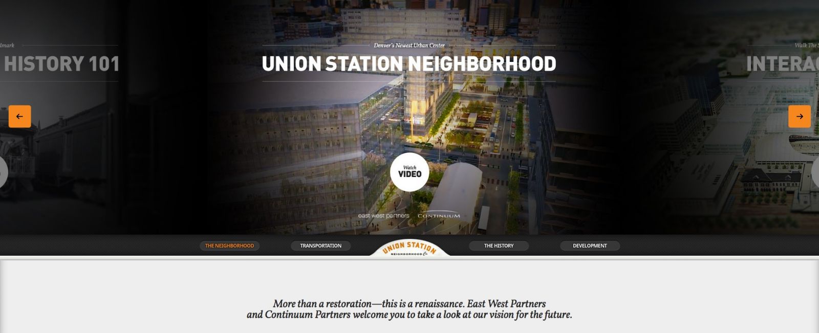
10. Union Station Neighborhood
URL: unionstationdenver.com
Created by: Legwork Studio
.net: What was the brief?
Sean Klassen, founding partner and creative director at Legwork Studio: Denver's historic Union Station is the centrepiece of a new neighbourhood and transportation hub that is one of the largest urban infill projects in the US. The Union Station Neighborhood Co. tasked us with making a site that mirrored the approach of the project: respect the history of the station while creating a forward-thinking experience centred on technology. By combining classic, editorial design principles with progressive web development we've done just that. The site uses modern JavaScript, HTML5 (video, canvas) and CSS3. It works across all modern browsers in addition to a targeted experience for the iPad. It even works in IE7. Hey, we wanted to respect history in all regards.
.net: How many people worked on the site? And how long did the project take?
SK: Five: strategist, creative director/designer, three developers.
The project had some stops and starts due to things outside of our control, but in the end I'd say it was about eight weeks of work.
.net: How did you build it?
SK: Tools: Coda, Photoshop, Github, Google Web Fonts and our trusty whiteboard. Technologies: JavaScript, HTML5, CSS3. Methodologies: beyond the desktop experience, the site also needed to look and work great on an iPad as the client's staff use it as a resource when on site. So, we approached this site with an immersive magazine flare, giving the layout and structure of each primary section careful consideration based on the type of content being presented but following a strict grid and typographical rules throughout.
We saw a users interaction being analogous to a person first flipping through a magazine, looking at the pictures and short features; followed by choosing and reading an in-depth article. Considering this, we proposed to promote several of the more visual and immersive aspects of the site to a large marquee area that is featured on the home page, but available on every page by simply scrolling up.
Once we had the strategy from above in place, the rest of the site was built in a very Agile process. We were continually designing and building small pieces of the site and iterating on them until we had one cohesive unit. We learned a lot along the way and were able to make constant improvements during the process rather than being locked in to an approved information architecture, static design, etc.
.net: What's the feedback been like?
SK: The feedback has been overwhelmingly positive. Beyond a lot of awards and kudos within our own industry it has received equally positive feedback from its target audience (the real estate world) commonly being referenced as an example of how to make an impactful site in that space.
So, what's your favourite site of the year? Make up your mind and head to www.thenetawards.com to cast your vote now!
And if the site that blew your mind this year has not made the shortlist, please let us know in the comments!

Thank you for reading 5 articles this month* Join now for unlimited access
Enjoy your first month for just £1 / $1 / €1
*Read 5 free articles per month without a subscription

Join now for unlimited access
Try first month for just £1 / $1 / €1
The Creative Bloq team is made up of a group of design fans, and has changed and evolved since Creative Bloq began back in 2012. The current website team consists of eight full-time members of staff: Editor Georgia Coggan, Deputy Editor Rosie Hilder, Ecommerce Editor Beren Neale, Senior News Editor Daniel Piper, Editor, Digital Art and 3D Ian Dean, Tech Reviews Editor Erlingur Einarsson, Ecommerce Writer Beth Nicholls and Staff Writer Natalie Fear, as well as a roster of freelancers from around the world. The ImagineFX magazine team also pitch in, ensuring that content from leading digital art publication ImagineFX is represented on Creative Bloq.
