Master the new CSS layout properties
New CSS properties offer easy ways to lay out web pages. Thomas Lewis of Microsoft walks you through Grid Alignment, Flexible Box and Multi-column Layout.
- Knowledge needed: Basic HTML and CSS
- Requires: Text editor, modern browser
- Project Time: 30 minutes
- Support file
This article first appeared in issue 226 of .net magazine.
Laying out pages in CSS has always seemed a more complicated process than it needs to be. So here’s some great news: there are fresh specs that will make creating layouts a much simpler task for web designers.
The major browsers, with the help of bodies such as the W3C, are starting to provide standards and implementations for a variety of new layout options that we can begin using today. For example, the W3C currently considers CSS3 Multicolumn Layout Module a Candidate Recommendation. Basically this means it’s at the point where the W3C is comfortable with browsers implementing it as a feature.
01. Vendor prefixes
Other specs haven’t yet attained Candidate Recommendation status – but that doesn’t mean you can’t use them. Today, the major browsers use vendor prefixes to indicate that a particular spec is an implementation that may possibly change and the expectation is that the vendor prefix will be removed once the spec and implementation are stable. Jonathan Snook describes vendor prefixes as doing two things:
- They enable browser developers to test new functionality without fear of a changing spec.
- They warn web developers that things are in flux.
While there is some controversy over the existence of vendor prefixes they represent a good opportunity to use features early in the standards process – although they need to be used wisely. Here we’ll be looking at a spectrum of layout properties, ranging from established to cutting edge. True, you may not be implementing all of these in production – but it’s certainly useful to know what’s coming over the horizon.

02. Multi-column
For our first layout feature, we’ll start with something simple, the CSS Multi-column Layout Module. (For our sanity, let’s just call it Multi-column.) As you can guess, this enables us to lay out columns on a web page without having to think about positioning and floats.
Also, it’s nice to have a feature that will create an appropriate number of columns based on the size of the display. For example, if you want to have a selector with a column-width of 13 ems (you could use pixels as well) and have the browser display as many columns as space allows, you can do that:
#mcexample {
column-width: 13ems;
}
Yes, it’s that simple! You can also define a fixed number of columns, although the column widths will be evenly distributed based on the width.
Get the Creative Bloq Newsletter
Daily design news, reviews, how-tos and more, as picked by the editors.
#mcexample {
column-count: 3;
}
If you want to exert finer control over your columns, that’s possible too. For example, you could define the number of columns, their width, the rules between columns and their styles.
#mcexample {
columns: auto 13em; /* column-count,
column-width */
column-gap: 1em;
column-rule: 1em solid black; /* width, style, color */
}
Other properties and attributes enable you to:
- define how columns should break
- define how you can have an element span across multiple columns
- balance content equally amongst all the columns.
One of the great things about Multi-column is how it auto-magically flows the content for you so you don’t have to do the maths or finalise word counts just to make everything line up!
Be careful when using Multi-column, though, because you don’t want to create a situation where someone visiting your site needs to continually scroll up and down the page because of long-height columns.
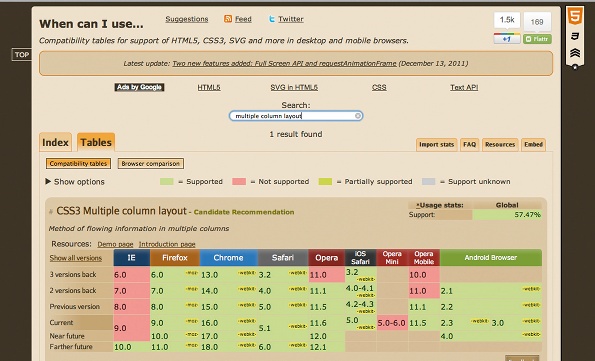
Almost all current desktop browsers and mobile browsers support Multicolumn (for Internet Explorer, you need to use the IE10 Platform Preview at this time). One of the quickest ways to find browser support for a feature is to go to caniuse.com and use the search to find what main desktop and mobile browsers support the feature you are looking for. Remember, although a feature may be supported, it may require a vendor prefix or the browser may not include every item in the spec – so test, test, test!
03. Flexbox
The CSS Flexible Box Layout Module is located at w3.org/TR/css3-flexbox. For our purposes, we will refer to it by its commonly used nickname, Flexbox.
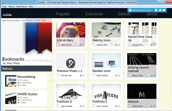
Flexbox enables you to lay out the children of a box vertically or horizontally and provide spacing requirements for those children (hence, flexible).
For example, to create a Flexbox in Internet Explorer 10 Platform Preview, we can use the display property and set it to use Flexbox:
#fbexample {
display: -ms-box;
background: black;
}
We can also set an orientation for the layout of the child elements by using the vendor prefix for Internet Explorer (typically starting with –ms-box):
#fbexample {
display: -ms-box;
-ms-box-orient: horizontal;
}
Flexbox gives us the ability to orient the child elements in a variety of ways: left to right, right to left, top to bottom and bottom to top. We may wish to declare the direction of the children in a way that’s perpendicular to the layout axis based on the orientation.
This could mean each child element centred between the edges of a parent element, so space above and below is evenly distributed for each child element.
#fbexample {
display: -ms-box;
-ms-box-orient: horizontal;
-ms-box-align: middle;
}
Another property we can use is the box-pack, which defines how excess space is distributed between child elements. For example, we could have our first child element start at the edge of the parent element along the layout axis direction:
#fbexample {
display: -ms-box;
-ms-box-orient: horizontal;
-ms-box-align: middle;
-ms-box-pack: start;
}
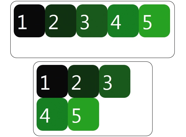
But what if we have more child elements than will fit and we don’t really want them squeezed to a size that’s not useful? Well, we can actually tell the browser to go ahead and wrap the child elements using box-lines:
#fbexample {
display: -ms-box;
-ms-box-orient: horizontal;
-ms-box-align: middle;
-ms-box-pack: start;
-ms-box-lines: multiple;
}
Now that we understand how to set up our container, how do we control child elements? First we need to set them as children of the Flexbox element:
<style>
#fbexample {
display: -ms-box;
}
#fbchild1 {
background: blue;
}
#fbchild2 {
background: green;
}
#fbchild3 {
background: red;
}
</style>
::
<div id="fbexample">
<div id="fbchild1">1</div>
<div id="fbchild2">2</div>
<div id="fbchild3">3</div>
</div>
To define the flexibility of a child element, we can set its box-flex property to 0, which means it is not flexible, or a number like 1 or 2, which defines how much of a fraction of space it gets.

For example, if we have three child elements where child1 has value of 0, child2 has a value of 1 and child3 has a value of 2, child1 would remain the same size because it isn’t flexible, child2 would get 1/3 of the available space shared with child3 – which would get 2/3 of the available space. The best part is, you don’t have to do the maths yourself because the browser does it for you!
#fbchild1 {
background: blue;
-ms-box-flex: 0;
}
#fbchild2 {
background: green;
-ms-box-flex: 1;
}
#fbchild3 {
background: red;
-ms-box-flex: 2;
}
Now if you have a keen eye, you may have looked at the latest spec and realised that some of the properties above don’t look exactly right. Right now Flexbox is considered a Working Draft by the W3C, which means it’s early in the standards cycle. So as a work in progress, it’s pretty safe to assume it will change. In fact, here are the dates of recent versions of the spec:
- November 29, 2011
- March 22, 2011
- July 23, 2009
If you look at caniuse.com and search for the Flexible Box Layout Module, you’ll see that with vendor prefixes you can use Flexbox as above. But it turns out that some of the browsers’ implementations follow the 2009 spec (like the examples above) instead of the latest one from November 2011. This is why it is always important to not just assume that ‘it works’ because a browser vendor said so, but to do some prototypes to understand what the support actually is.
The good news is that it’s not that difficult to make the switch to the updated spec. So for example, declaring an element to be a Flexbox is now:
#fbexample {
display: -ms-flexbox; /* Instead of –ms-box */
}
Again, the spec is in the midst of changing since it’s a working draft, but don’t let it keep you from trying it out with the appropriate vendor prefixes.
04. Grid Layout
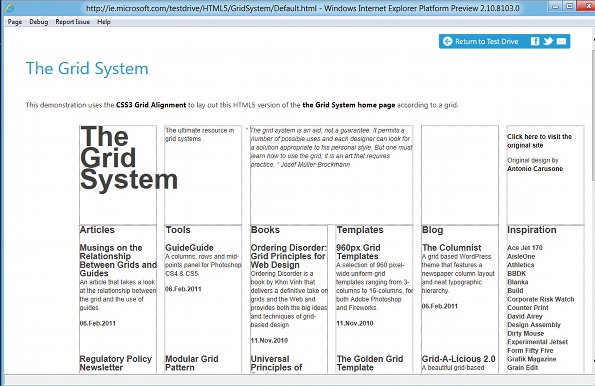
Historically, IE has been considered the laggard of desktop browsers in terms of standards innovation. But with newer versions in the pipeline, IE is starting to challenge this. For example, in the latest IE10 Platform Preview, support was introduced for CSS Grid Layout. The spec at w3.org/TR/css3-grid-layout was submitted by Microsoft to the W3C CSS Working Group last April, and at time of writing, Internet Explorer 10 is the only browser that implements it.

Grid layout is pretty fundamental even beyond web design, so it’s just a matter of time before all browsers begin supporting it. And this will hopefully end the tyranny of HTML table elements being used for layout! The spec enables us to lay out our page using rows and columns and define how the content will span across individual rows and cells while keeping our content separate from the layout. First, we need to define our grid by using a vendor prefix:
#gridexample {
display: -ms-grid;
}
We can define the size of our columns and rows:
#gridexample {
display: -ms-grid;
-ms-grid-rows: 30px 5em auto;
-ms-grid-columns: auto 70px 2fr 1fr;
}
What, what? Fr? Multiple attributes? Okay, let’s break it down. The code above declares that we will have four rows and three columns.
- The first row will be 30 pixels vertically.
- The second row will be 5 ems vertically.
- The third row will be sized according to the content in the row.
- The first column will be sized according to the content in the column.
- The second column will be 70 pixels horizontally.
- The third column will be two fractional units of the available space …
- … while the fourth column will take one fractional unit of the available space.
Now, we may have child elements that we want in specific locations in our grid. If we want an element to be in the first row, second column, we’d declare:
#griditem1 {
-ms-grid-row: 1;
-ms-grid-column: 2;
}
Remember, much like the Flexbox, our child elements will need to be children of the grid element. We may also want to have an element span across rows – we can do this using grid-row-span:
#griditem1 {
-ms-grid-row: 1;
-ms-grid-column: 2;
-ms-grid-row-span: 2;
}
Or maybe we want to align elements using grid-row-align or grid-column-align. These properties enable you to define whether the content is centred within the row/column, or you can even define its alignment horizontally or vertically. For example, to centre within a column, you’d do the following:
#griditem1 {
-ms-grid-row: 1;
-ms-grid-column: 2;
-ms-grid-column-align: center;
}
In the bad old days, HTML table-based layouts caused trouble because individual cells tended to be defined by their order in the markup, which made things brittle. But with Grid Layout we can use features such as Media Queries to apply different styling to our grid depending on device width, height and orientation.

05. Conclusion
If you’re more of a visual person, I’d recommend that you check out Markus Mielke’s presentation. This discusses both layout features covered in this article and others, and how they can be used together in an app.
In this article, we’ve covered features implemented in all browsers, and some that are just emerging. It may feel as if some of the latter are not ready for use in production sites, and in some cases you may be right. But as designers we should be aware of what they are and how they work because, let’s face it, all the CSS features we use every day started off with a spec and implementation.
Thomas Lewis is a technical evangelist at Microsoft focused on HTML5 and the web designer/developer community: asimplepixel.tumblr.com
Discover 101 CSS and Javascript tutorials.

Thank you for reading 5 articles this month* Join now for unlimited access
Enjoy your first month for just £1 / $1 / €1
*Read 5 free articles per month without a subscription

Join now for unlimited access
Try first month for just £1 / $1 / €1

The Creative Bloq team is made up of a group of art and design enthusiasts, and has changed and evolved since Creative Bloq began back in 2012. The current website team consists of eight full-time members of staff: Editor Georgia Coggan, Deputy Editor Rosie Hilder, Ecommerce Editor Beren Neale, Senior News Editor Daniel Piper, Editor, Digital Art and 3D Ian Dean, Tech Reviews Editor Erlingur Einarsson, Ecommerce Writer Beth Nicholls and Staff Writer Natalie Fear, as well as a roster of freelancers from around the world. The ImagineFX magazine team also pitch in, ensuring that content from leading digital art publication ImagineFX is represented on Creative Bloq.
