How to create a web design portfolio
If you don’t have a web design portfolio, you should – and if you do, perhaps you ought to take a fresh look at it, reckons Gary Marshall.
If, like us, you tend to read the newspapers from behind terrified fingers, you’ll know that it’s a tough world out there. The creative industries may have weathered the financial storms better than many older sectors, but they haven’t been unaffected: competition is fiercer than ever, and it’s harder and harder to stand out from the crowd.
- Read all our career-related articles here
If you don’t have a portfolio, it’s even more difficult. At its simplest, a web design portfolio is an online advert. Here I am, it says. Look at the stuff I can do! But there’s more to it than that.
Your web design portfolio is your calling card and your art gallery, the place where you showcase your skills and the stories behind your most impressive projects, where you show not just what you’ve done, but what you want to do next. In many cases, it’s also the only thing somebody will see before deciding whether to contact you with a job offer or a project proposal.
01. Story time
A web design portfolio may come in one of three main flavours. They can be an online resumé, designed to impress potential employers, a brochure, designed to bring in new clients, or a showcase, designed to impress and/or intimidate your peers. All three kinds have plenty of things in common.
Like any other kind of website, portfolios must fulfil multiple criteria. They need to be accessible and easy to navigate. They have to work properly across different browsers and devices. They need to be executed perfectly to meet the brief. With the exception of those portfolios that are designed solely to impress your peers, that brief will usually be ‘get me some work’.
Scott Belsky is CEO of the creative showcase Behance, which offers a range of portfolio building and promotion tools. “In aggregate, a collection of projects showcases your style and breadth of talent,” he says, arguing that there’s no reason why that collection shouldn’t include personal projects – “they show your passion and initiative for your craft.” No matter what projects you decide to feature, for each one “a visitor should see the brief or goal you started with, then a collection of media that represents the outcome. I suggest including both macro and close-up shots of the final work.” Belsky also recommends that you show your whole work rather than just a 400px snapshot: “Some designers try to reveal only tiny elements of their work, which arguably can be misleading,” he says. “The most confident designers are able to show their full project.” If the site is live, link to it.
Sacha Greif is a user interface designer and the founder of Folyo, a private job board for freelance designers, and in that latter capacity he sees a lot of portfolios. “Quality is more important than quantity,” he says, but “if you have fewer than five to six projects your portfolio will appear a little thin.” That doesn’t mean younger designers and developers, recent graduates and anybody else who’s only worked on a handful of projects should worry too much, though. “First of all, you can simply give more details about the projects you already have,” Greif advises. “You can also feature personal projects and pro bono pieces, as long as you make clear your Facebook redesign wasn’t commissioned by Mark Zuckerberg.”
For job interviews, people are often advised to dress for the job they want, rather than the job they’re doing. Something similar applies to a web design portfolio: if there’s a discipline you want to work in, then it’s a good idea to make your portfolio as relevant to that particular field as possible – and to demote or discard anything that won’t help.
02. Copy cats
Design is a visual medium, but that doesn’t mean words don’t matter. Some very effective portfolios only use a few words to describe their projects, but used wisely, copy can emphasise things that aren’t obvious from a screenshot or live website – such as your problem-solving talents, astonishing creative insights or amazing interpersonal skills.
Many portfolios begin with a tagline: a short, snappy line that gives a sense of who the portfolio belongs to and what they do. Taglines can be very effective, but try to avoid cliché: a tagline claiming that you make really great websites, even if it’s true, is the tech equivalent of writing “I am trustworthy and a very hard worker” in a CV.
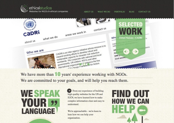
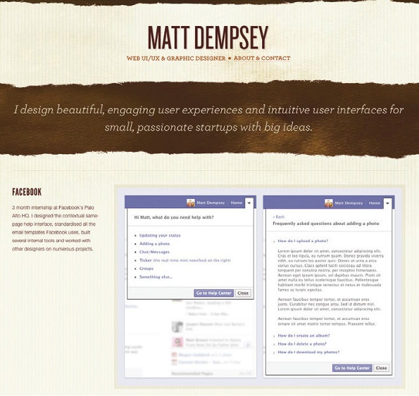
It’s a much better idea to be specific – so, for example, Ethical Studios has the simple and effective “websites for NGOs and ethical companies” while Matt Dempsey nails it with “I design beautiful, engaging user experiences and intuitive user interfaces for small, passionate startups with big ideas.” You immediately know not only what he does, but what his priorities are and what kinds of businesses he likes to work for, in 17 short words.
Some of the best taglines come from others: a client’s breathless testimonial, a great review for one of your projects or a really nice thing someone said about you on Twitter can all work well.
Testimonials can really help illustrate specific projects, too, and if your clients have raved about you and your work then it’s an excellent idea to include their comments in your project detail pages. If your clients haven’t said nice things on the record and you’re still on good terms, there’s no harm in giving them a quick call or dropping them an email to ask for a quick quote.
Many portfolios also include an About Me section or equivalent, detailing the specific kinds of work the designer or developer does, where they are, what kinds of projects they like doing and anything else that might be relevant. It’s a good place to mention any awards or praise, and to give an idea of your personality, although as with any online copy there is such a thing as too much personality. If in doubt, leave the jokes out – and beware of other copywriting sins, such as spelling mistakes, grammatical errors, long-windedness and irrelevance. Always think about your reader, not yourself: when you create a section marked ‘What I do’, it should mean ‘What I can do for you’. Remember, too, to tailor your copy to the kind of work you’re trying to get.
Scott Belsky reckons that it’s worth showing your working methods too. “When hiring creative talent, it’s helpful to understand how someone works,” he continues. “In my opinion, the best projects in a portfolio reveal some process as well – perhaps stages of production or an ‘unused’ section at the end.”
Belsky also recommends giving credit where it’s due. “It’s not common, but I really respect people who properly credit their collaborators in their portfolios. Listing the people who worked with you on each project expresses an extra dose of confidence and teamwork,” he explains. “So many portfolios I see don’t credit anyone, which means that many of them are dishonest in some way.”
Should you include a blog? The answer is a qualified yes: if it’s good and regularly updated then it can be an asset. “Your blog reveals your personality as well as your taste and design perspective,” Belsky says. “Hiring people and building a team, you’d want to get to know a person a bit; viewing their blog can be helpful.”
Can blogs backfire? “If your blog ‘backfires’ by alienating a potential employer, perhaps such a deterrent is helpful in the long run,” he says. “Personally, I would not like to work with folks that don’t like hearing what I think.”
Get the Creative Bloq Newsletter
Daily design news, reviews, how-tos and more, as picked by the editors.
03. Put it there
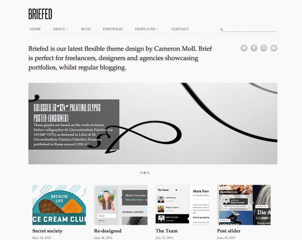
You know what you’re going to put in your portfolio, but where are you going to put it? There are several options here. You can hand-code your own site on your own domain; you could use a Tumblr with a theme such as SimpleFolio, build a WordPress site with a theme such as Sideshow, Garnish or Cameron Moll’s Briefed – or you could use somebody else’s site.
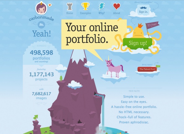
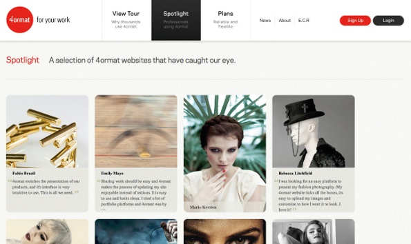
There’s no shortage of contenders in that latter category. The best known portfolio option is probably Behance’s ProSite, but other well-liked options include Cargo, 4ormat and Carbonmade. There are also skill-specific sites such as DeviantArt for digital artists and 500px for photographers.
Doing it yourself gives you complete control over every aspect of your portfolio, but using a ready-made site or template shouldn’t be considered as copping out. “There’s absolutely nothing wrong with using a ready-made portfolio site,” asserts Sacha Greif. “Clients will always evaluate your work on its own merit; they couldn’t care less about your portfolio site itself. In fact, the only people who care about designer’s portfolios are other designers. So if your goal is to impress your peers, sure, go nuts on a fancy CSS3-animated portfolio. But if you want to get work, Cargo or a WordPress theme will do the job just fine.”
Belsky concurs. “The most common mistake we see people make is getting too ‘original’ with their portfolio structure and, as a result, visitors or recruiting companies will struggle to navigate through their work,” he says.
There’s also the issue of discoverability: portfolio sites encourage their visitors to browse, and can help people discover your work. As a result some creatives have multiple portfolios: photos on Flickr, drawings on DeviantArt, web stuff on Dribbble and so on. However, Greif doesn’t recommend that strategy. “I believe you’ll get a better return by focusing on a single site and actively being part of that community rather than spreading your work around. And if you have portfolios on five different sites, that’s five times as much effort spent maintaining them instead of doing actual design work.”
But Belsky doesn’t share this viewpoint. “Be your own agency. Seriously,” he says. “Don’t expect people to just stumble upon your online portfolio and hire you. You need to post your work up on platforms that support the discovery of creative talent. While my bias is obviously towards Behance, I encourage you to put up work on many different sites and then pay attention to where you get the most views/follows and traction.”
04. Portfolio no-nos
No matter where you put your portfolio, it must be near-perfect: while nobody’s going to reject your work out of hand because of the odd typo, some errors can be show-stoppers. We’ve seen portfolios containing elementary mistakes: baffling splash screens; too-small text; inconsistent and/or overly complex navigation; missing contact information; clichéd stock photography; cringeworthy copy; lack of site validation, spell-checking or testing in different browsers ... if such portfolios could talk, they’d be screaming “help!”.
Sacha Greif is more forgiving than we are. “I’d say the first rule of evaluating portfolios is to never discount somebody outright for an apparent design mistake, no matter how outrageous,” he says. “Even if a designer uses Comic Sans for their portfolio, I believe their work still deserves a fair evaluation.” But even he admits that some mistakes will have employers and potential clients reaching for the close-tab button. He identifies three common cock-ups: “only providing small thumbnails, or images with bad compression artefacts”; “putting up roadblocks such as Flash intros or heavy animations that make it harder to access your actual work”; “not providing any context or details about your work.” Overly arty cropping can make thumbnails meaningless – creating a brand new image can often be a better idea – and overzealous image optimisation can make them appear indistinct. Linking to tiny screenshots can be a pain, too: wherever possible link to the real thing if it’s live or a decent-sized image if it isn’t.
The no-roadblocks advice applies even if you’re showcasing Flash or animation work. It’s better to link to the work from within your portfolio than hide your best stuff behind an enormous loading screen: the person doing the browsing might be on a Flash-free iPad. And pay attention to how your portfolio works on mobile sites and in different resolutions if you’re promoting responsive design skills: we’re sure we’re not the only people who, the second we see the word ‘responsive’ on a website, fire up the smartphone or start resizing the browser window to see what happens.
But the biggest mistake of all is to be average: your portfolio should show your very best work, presented in the best possible way. As Scott Belsky says, “Successful portfolios tell a story. They are not just a smattering of images; on the contrary, they reveal process and personality.” You’re awesome, and your portfolio should prove it.
This article first appeared in issue 231 of .net magazine – the world's best-selling magazine for web designers and developers.
Liked this? Read these!
- Create a perfect mood board with these pro tips
- The ultimate guide to logo design
- Our favourite web fonts - and they don't cost a penny

Thank you for reading 5 articles this month* Join now for unlimited access
Enjoy your first month for just £1 / $1 / €1
*Read 5 free articles per month without a subscription

Join now for unlimited access
Try first month for just £1 / $1 / €1

The Creative Bloq team is made up of a group of art and design enthusiasts, and has changed and evolved since Creative Bloq began back in 2012. The current website team consists of eight full-time members of staff: Editor Georgia Coggan, Deputy Editor Rosie Hilder, Ecommerce Editor Beren Neale, Senior News Editor Daniel Piper, Editor, Digital Art and 3D Ian Dean, Tech Reviews Editor Erlingur Einarsson, Ecommerce Writer Beth Nicholls and Staff Writer Natalie Fear, as well as a roster of freelancers from around the world. The ImagineFX magazine team also pitch in, ensuring that content from leading digital art publication ImagineFX is represented on Creative Bloq.
