In the last few years, Luke Wroblewski’s ‘mobile first’ philosophy of web design has radically changed the way we go about building online experiences. He tells Tom May why you should join the revolution and how your users will benefit
In web design, as in life, it’s the simplest ideas that are often the most revolutionary. And a prime example of this is ‘mobile first’. Conceived and popularised by product designer, entrepreneur, author and speaker Luke Wroblewski, in the last few years this approach has radically changed the way that professionals approach website design.
The core idea is elegantly simple. Rather than the traditional approach of starting with the ‘desktop version’ of a website and then simplifying it for mobile, Wroblewski proposes we begin by building sites that work well on small-screen, portable devices, then build up from there.
Mobile growth
Wroblewski, who’s worked at Yahoo and eBay and launched a string of startups including Bagcheck, outlines three main reasons why a mobile first approach is essential to web design in 2012. “The first is just the growth in mobile and the quantity of devices that are making their way into people’s hands,” he explains. “About 1.3million Android and iOS devices alone are being sold every day. When you compare that to, say, how many babies are born per day (about 371,000) you appreciate that this is a real game changer.
Latest Videos From Creative Bloq
“It’s not just that there’s a lot of these devices,” he continues. “It’s that people are starting to use them to access the network more than their computers. And if you’re not thinking about that, you’ll wake up one day and be left behind.
“Until recently if we did anything for mobile it was an afterthought, a port, sort of a separate thing. But the sheer number of smartphone users means that’s increasingly becoming a backwards way of doing stuff.”
Secondly, Wroblewski argues, designing for mobile first actually leads to better ‘full site’ designs. “Mobile, because of it having to be portable, has a lot of constraints,” he explains. “The screen size is very small. The network activity can go out at any time. Users tend to be in places where they don’t have a lot of ability to focus. As a result, we really have to simplify, prioritise, pick out the things that really matter – and that’s good for web design and good for business in general.”
You don’t think: ‘Oh, let’s add another thing’ – because you simply can’t.
Mobile first forces you to get down to the bare essence of what makes your content work. “You don’t think: ‘Oh, let’s add another thing’ – because you simply can’t. Which keeps everything clean and focused from the outset.”
A final reason for focusing on mobile first is that mobile devices have a whole slew of new capabilities that don’t exist on personal computers. “Smartphones can pinpoint you down to 10m with GPS, down to 50m with Wi-Fi,” says Wroblewski. “They know the direction you’re facing, the direction you’re moving, how fast your device is moving, the position it’s in – the list goes on. And if you start thinking about mobile first you can take full advantage of these capabilities.”
But if these are the advantages of mobile first, are there any disadvantages? “The thing I hear most is that it’s a really big change to people’s processes and mindset,” Wroblewski responds. “It requires a lot of rethinking about the way you do things. And it requires work. So that’s been a challenge to a lot of people, to put themselves into that mindset. But I also hear that when people do, a lightbulb goes off in their heads and they realise: ‘Aha, this is a fantastic way of working’.”
Different devices
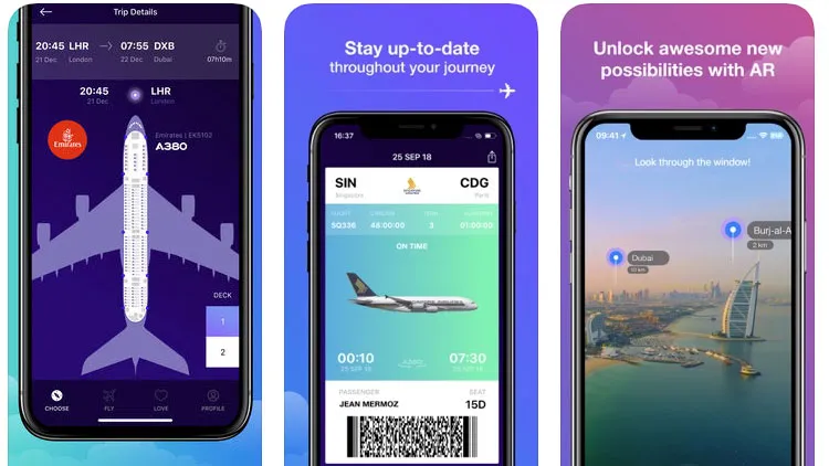
Of course the term ‘mobile’ covers a huge variety of internet-capable devices. So it’s important to note that by ‘mobile first’ Wroblewski is referring mainly to smartphones – although designers are increasingly thinking about feature phones too. “A lot of feature phones are now getting pretty decent browsers,” he explains. “So a lot of people start with a simple CSS, HTML baseline design and assume very few capabilities in a device, then gradually enhance it for devices that can do more. If you build that way you can actually reach a lot of devices including older feature phones.”
And what about the iPad – where does that fit in? “Tablets and smartphones tend to get clumped under this label of ‘mobile’,” Wroblewski replies. “But if you actually look at the research, most people are using tablets in the mornings and the evenings, and they’ll commonly be using it on a couch, while watching TV, or in the bedroom. So these aren’t really very portable devices in the sense of mobility. They’re mobile around the house. That’s why only six per cent of tablet connectivity is off a mobile network. The rest is all running off Wi-Fi.
“So, as far as ‘mobile first’ goes, the phone is the first order device, just because it’s always with you, it’s always available. Anywhere I am I can do something on my phone. That’s not necessarily true for my laptop or my tablet.”
Responsive web design
The biggest design trend of the last few years has been responsive web design, and ‘mobile first’ has become an integral part of this methodology. But it wasn’t so from the start, recalls Wroblewski. “The way responsive web design was done initially was that you started with the desktop version, coded everything to make it look great and then adapted it down to mobile,” he says. “But then people pointed out that this wasn’t doing anything for optimisation from a mobile perspective. In fact it was making things worse because you were sending over these giant images and so on.
“So one of the initial responses to that was this idea of a mobile first-approach to responsive web design – which tends to be the methodology that people are using now. You start with a baseline of styles and then you build up. That way, you give people a nice experience on both mobile devices and bigger devices.”
Entering the mainstream
Just in case you weren’t sure, we’re not just talking about developers on the experimental, cutting edge here: the mobile first philosophy has definitely entered the mainstream.
“AOL is doing it,” Wroblewski points out. “Yahoo has done it. Google has done it. Facebook has done it. Pretty much all the major internet companies at this point have all put mobile first somewhere on their strategic roadmap, usually within the 1, 2 or 3 slot of ‘What are we doing with our entire company?’.”
Startups are equally keen. “The startup combinator Y-Combinator had their demo day recently and the majority of the companies there were mobile first companies,” he adds. “So you’re really starting to see people embrace this.”
People are increasingly fed up with the sheer amount of crap that they have to deal with on web pages
Part of the reason for its popularity is that the results are so clear to see. “I know many CEOs that have seen the benefits of mobile and then said: we need to make the desktop site more like the mobile site,” says Wroblewski.
“Take for instance Kayak (www.kayak.com), which is one of the world’s largest travel sites; recently the CTO said publicly that he found the experience of booking flights on their iPhone app so much better, so they’re going to be making changes to the desktop site. And I hear that over and over again.
People are increasingly fed up with the sheer amount of crap that they have to deal with on web pages. People want the desktop site to be as simple as the mobile site. And so they seek out the mobile site because they find it easier to use and more focused.
“When desktop sites throw everything at you at once, that’s not taking account of how people gradually start to learn things,” continues Wroblewski. “We wouldn’t expect to walk into a maths class, see the entire math textbook up on the wall, and get told: ‘Go figure it out’. Very few things in the world work like that.”
Instead, a maths class is a very measured process – and using a website should be the same. “You start at the beginning, you learn to do simple things, and you expand, you grow. Ultimately you become very adept. That’s the holy grail of a simple interface: it should be powerful, but it should allow you to take on things at your own pace.”
This article first appeared in issue 229 of .net magazine – the world's best-selling magazine for web designers and developers.
Thank you for reading 5 articles this month* Join now for unlimited access