Why Severance’s Lumon logo is the perfect pastiche of corporate design
Read between the lines.

There are plenty of crafty details in Apple TV's hit series, Severance, but if you're a design fan that mysterious Lumon logo may have caught your eye. On the surface, it's the perfect unassuming corporate design, but as fans of the show know, not everything is always as it seems.
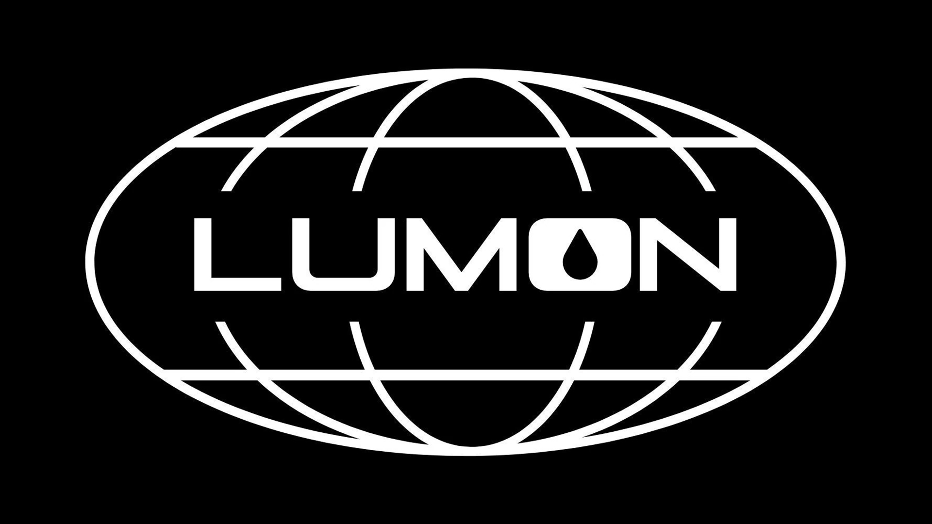
The refined design of the Lumon logo could easily blend into our list of the best logos of the 1970s thanks to its retro aesthetic, creating an eerie authenticity that makes the Severance world feel all the more real. It's a simple design packed with symbolism if you look a little deeper (but don't worry, I'll keep this a spoiler-free analysis).
Created by graphic designer Tansy Michaud, the Lumon logo takes inspiration from various pharmaceutical companies. The wordmark's droplet motif is supposedly an indirect reference to the implant placed inside Lumon's severed employees, while some fans theorise a darker symbolism – a drop of blood. The logo is made of separated sections in an illustrative gesture to a global map. Physically divided by the Lumon wordmark, the incomplete lines reference the concept of severance under the power of the Lumon corporation.
In many ways, the Lumon logo can be seen as a representation of the show's central theme – a scathing critique of the corporate lifestyle. The cyclical design is a reflection of the endless churn of office work while its impersonal flatness lacks any individuality, much like Lumon's severed workers. Despite the 70s-esque design's vague familiarity, its corporate coldness gives it a chilling uncanny quality.

For more design inspiration take a look at the 6 lessons in branding we can learn from reality TV. If you're after more retro design take a look at the best logos by decade for a whistle-stop tour of some of history's most iconic brand identities.
Get the Creative Bloq Newsletter
Daily design news, reviews, how-tos and more, as picked by the editors.

Thank you for reading 5 articles this month* Join now for unlimited access
Enjoy your first month for just £1 / $1 / €1
*Read 5 free articles per month without a subscription

Join now for unlimited access
Try first month for just £1 / $1 / €1

Natalie Fear is Creative Bloq's staff writer. With an eye for trending topics and a passion for internet culture, she brings you the latest in art and design news. Natalie also runs Creative Bloq’s Day in the Life series, spotlighting diverse talent across the creative industries. Outside of work, she loves all things literature and music (although she’s partial to a spot of TikTok brain rot).
You must confirm your public display name before commenting
Please logout and then login again, you will then be prompted to enter your display name.

