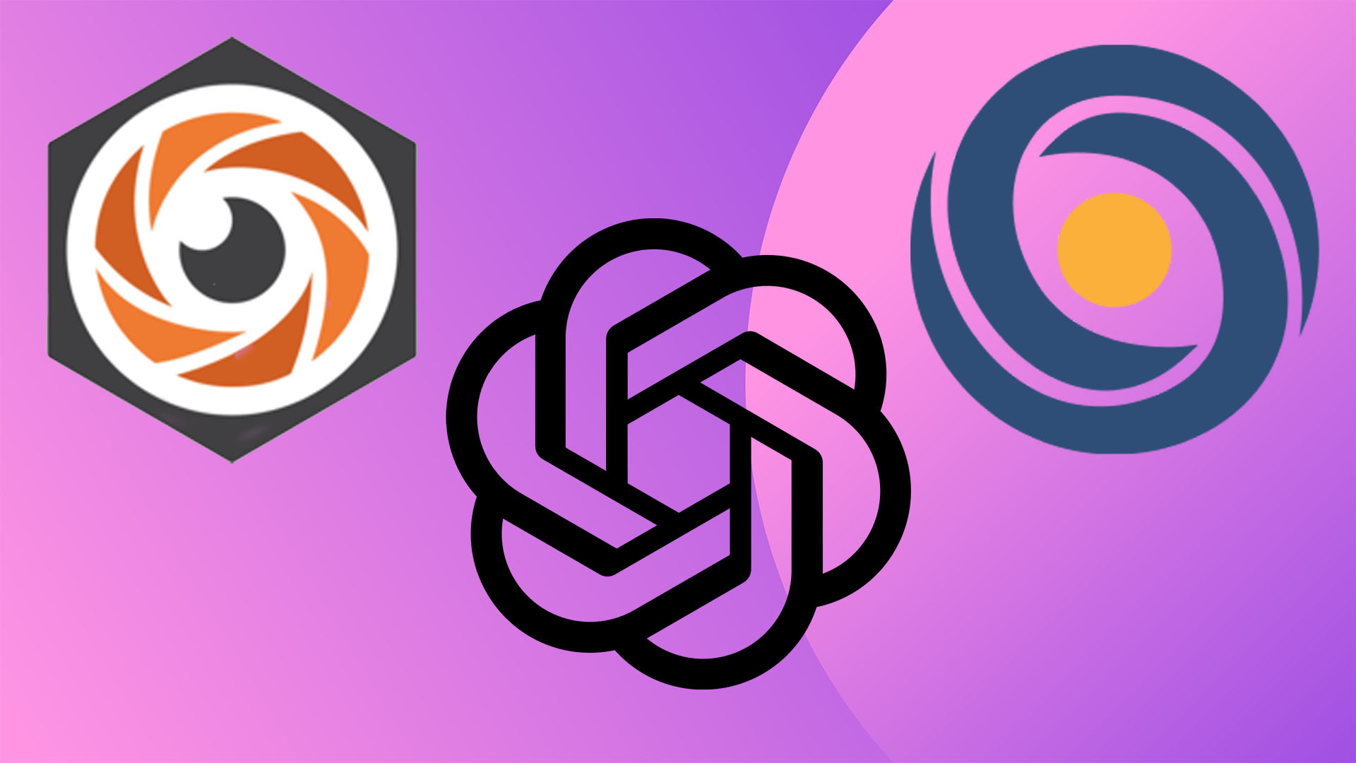
Why do all AI company logos look the same?
Corporate conformity has taken over.

It's no secret that AI has infiltrated the creative industries but despite this, most AI company logos look the same – boring, corporate and wholly lacklustre. The irony of this logo design trend is hard to overlook as the conventional designs have unintentionally become a symbol of creatives' mounting fears around the technology. AI logos are a manifestation of corporate uniformity – the death of creativity as we know it.
Dramatics aside, there's a mounting trend with AI company logos whether it's due to corporate conformity, 'contemporary design', or simply a lack of originality. Spherical in nature, boring by brand, there's a distinct lack of meaningful design when it comes to these logos and with the technology only continuing to advance, it seems the plague is just beginning.
Why do all the AI logos look like butt holes? pic.twitter.com/O5VC3bAgP5January 31, 2025
This design trend first caught my attention via a rather crudely worded (but arguably hilarious) tweet from Greg on X. "Why do all the AI logos look like buttholes?" the great philosopher questioned, sparking some interesting theories from followers. "Because they are made by a**holes," one responded, while another added, "I think it says more about you than it does about the logos."
While the sphincteral connotations are up for debate, Greg presents a valid point. The uniformity and corporate convention of the designs are arguably somewhat dystopian in nature. To me, this spherical AI logo trend is peak corporate design, using organic shapes to give the subtle illusion of human touch. The spiral motif gives each design a contemporary feel without being too bold or over-engineered, using a tepid design to blend into the crowd. With frontrunners like OpenAI and Stability spearheading the trend, it's only natural that other brands would want to follow suit – the very nature of AI is derivative, so why bother to buck the trends?
For more logo design inspiration take a look at the biggest logo design trends for 2025. If you're after more AI news take a look at how Superside built a human-led AI brand.
Get the Creative Bloq Newsletter
Daily design news, reviews, how-tos and more, as picked by the editors.

Thank you for reading 5 articles this month* Join now for unlimited access
Enjoy your first month for just £1 / $1 / €1
*Read 5 free articles per month without a subscription

Join now for unlimited access
Try first month for just £1 / $1 / €1

Natalie Fear is Creative Bloq's staff writer. With an eye for trending topics and a passion for internet culture, she brings you the latest in art and design news. Natalie also runs Creative Bloq’s Day in the Life series, spotlighting diverse talent across the creative industries. Outside of work, she loves all things literature and music (although she’s partial to a spot of TikTok brain rot).
You must confirm your public display name before commenting
Please logout and then login again, you will then be prompted to enter your display name.
