This Californian city’s new logo completely misses the point
Let the people have their say.

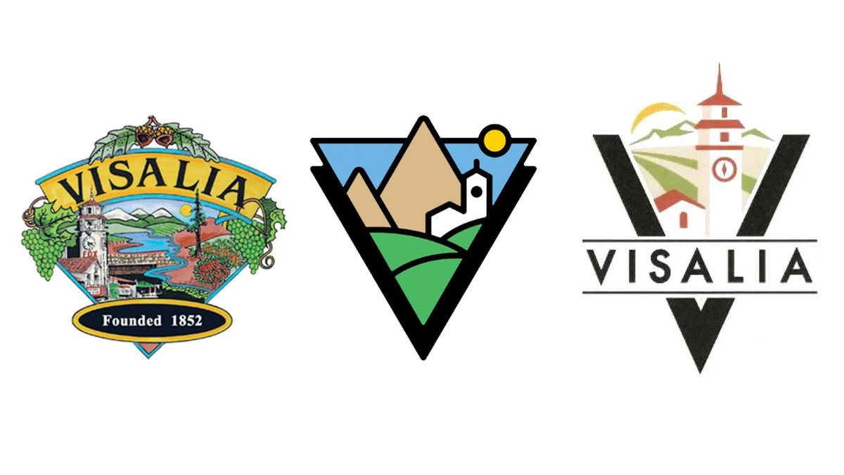
The City of Visalia has been the centre of a messy logo design dispute since early May, and the longer it continues, the more chaotic it seems to get. In case you're unfamiliar with this tumultuous tale, the Californian city replaced its popular 20-year-old legacy logo with a modern minimalist design (much to the dismay of residents). In a bid to please naysayers the old logo was reinstated, but not for long, as the city decided to open up a public competition to redesign the new logo.
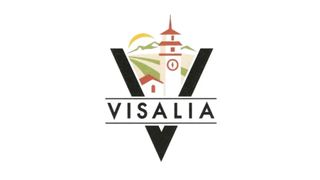
So that takes us to where we are today. A third logo has emerged which the city is currently seeking feedback on, despite councillors already selecting the new design. If past public opinion is anything to go off of, I predict we may be in for some more logo design controversy – if one thing's for certain, people hate change.

The new City of Visalia logo serves as a middle-ground hybrid of the legacy logo and the resoundingly unpopular updated design. With a contemporary, stripped-back illustration style, it solves criticisms of the overly minimalist design, integrating key elements like the classic clock tower and mountainous landscape of the legacy logo. The earth-toned colour palette is subdued yet tasteful, bringing a classy organic feel to the design. Contrasted with bold text that bears the city's name, the new logo is a confident reimagining of its past iterations.

Despite the new logo's improvements, the main issue still stands – Visalia's residents didn't get a choice in the decision. Opening up the public design competition was an opportunity to let the community create (and elect) their own identity – something that has once again been stripped away. With council member Emmanuel Hernandez Soto claiming they had "spent enough time" on the issue, it seems unlikely that residents will finally have their say, despite the city's official X account tweeting "Visalia, we still want to hear from you!".
Visalia, we still want to hear from you! 📣 At last night's City Council meeting, your Council voted to select Logo #59 as the newest City logo! Head to https://t.co/wqM2YuDpZh now where you can view the logo and provide your comments by emailing communityfeedback@visalia.city. pic.twitter.com/15MLA2sFafJuly 17, 2024
Whether or not you're a fan of the updated design, it's disappointing to see this messy logo saga come to such an unsatisfactory resolution so far. With resident feedback set to close on 26 June, there's a possibility that the shortlisted logos could make it to a public vote if enough people are unhappy with the selected design. In the name of democracy, let the people have their say.
To see where it all began, take a look at the original backlash to the Californian city's minimalist new logo and check out why it got even messier when the council backtracked on its decision. For some logo design inspiration check out the best logos of all time.
Get the Creative Bloq Newsletter
Daily design news, reviews, how-tos and more, as picked by the editors.

Thank you for reading 5 articles this month* Join now for unlimited access
Enjoy your first month for just £1 / $1 / €1
*Read 5 free articles per month without a subscription

Join now for unlimited access
Try first month for just £1 / $1 / €1

Natalie is Creative Bloq's staff writer. With an eye for trending topics and a passion for internet culture, she brings you the latest in art and design news. A recent English Literature graduate, Natalie enjoys covering the lighter side of the news and brings a fresh and fun take to her articles. Outside of work (if she’s not glued to her phone), she loves all things music and enjoys singing sweet folky tunes.


