Happy Oreo Day! No, I didn't really realise this was a thing either. But I'm delighted I've found out about it because it's led me to a beautiful graphic design moment, full of retro joy that beautifully charts design across the decades.
It turns out the Oreo logo has been around since 1912, and since then has taken on some stunning logos that encapsulate the design of the time. Though today the logo is quite minimal and, dare I say, bland (certainly not one of our best logo picks) that hasn't always been the case. Some of the old ones were fabulous. Stand by as I show you some logos (almost) as delicious as the cookies themselves.
01. 1912-1923

02. 1923-1931

03. 1931-1936

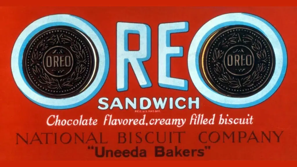
04. 1936-1940

05. 1940-1949

05. 1949-1952

06. 1952-1960

07. 1960-72

08. 1972-1990

09. 1990-1995

10. 1995-2001

11. 2001- present

12. 2024-present


Thank you for reading 5 articles this month* Join now for unlimited access
Enjoy your first month for just £1 / $1 / €1
*Read 5 free articles per month without a subscription
Join now for unlimited access
Try first month for just £1 / $1 / €1