Colour is hugely important in branding and logo design. In our guide to colour theory, we look at how colours can generate different emotions. We've also looked at examples of great uses of colour in branding and how to choose a colour for a logo.
But we've often focused on what colours brands use – not on what colours they don't use. A new report takes an interesting alternative approach by attempting to identify the least used colours in logo design. And while some of these colours may be little used for good reason, their rareness could also make them options to consider for brands that want to differentiate themselves in a crowded marketplace.

The digital asset management platform Bynder identified pale pink, mint green and violet as the least used colors in logos. That's according to a dataset of over 15,000 designs. It's created an interactive tool based on its findings, allowing marketers to determine how popular their brand’s colours are within their sector.
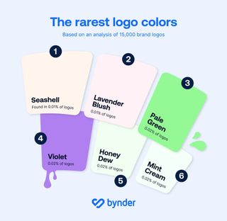
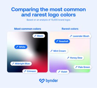
Bynder says it found pale pink to be the rarest color used in logo designs, making up just 0.01% of all logos, specifically 'Seashell' and 'Lavender Blush'. The second rarest logo colours were violet and the pale green hues 'Mint Cream', 'Honeydew' and 'Pale Green' itself, which made up 0.02% of logos.
Senior Director of Content Marketing Ljubica Jovanova said: "Colors like mint green and pale pink are often associated with softness, calm, and subtlety, which may not align with the bold, attention-grabbing nature that many brands aim for in their logos."
But there's another clear reason why these colours aren't used often in logo design. They're so pale that they can be hard to make out, especially against white backgrounds.
"Paler colors can sometimes pose legibility challenges, especially on digital platforms where contrast is key," Jovanova admits. "As a result, brands might avoid these shades in favor of stronger, more visible colors to stand out in various environments."
Get the Creative Bloq Newsletter
Daily design news, reviews, how-tos and more, as picked by the editors.
The most popular colours in logo design

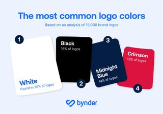
And the most popular colours in logo design? Unsurprisingly, white and black were found to dominate, with white being the most common, appearing in 70% of all logos. Black appeared in 16% of logos, followed by Midnight blue (14%) and Crimson (13%)
"White and black are timeless, versatile colors that offer a high level of flexibility across different mediums," Jovanova says. "White, in particular, is often associated with simplicity and clarity, which is why it remains a go-to choice for brands aiming for a clean, minimalist look. Black, on the other hand, conveys authority and sophistication, making it popular for brands that want to exude a sense of power or professionalism.
"Both colors ultimately provide a neutral background that allows for other brand elements without any risks of clashing—such as typography and other primary colors—to stand out more prominently. Combining the two offers the ultimate contrast to make your logo bold and clear - take the infamous Apple logo, for example."

In a market where first impressions form in just 0.05 seconds and signature colors increase brand recognition by 80%, getting your logo and colour choices right is crucial for brand recognition. Bynder suggests we shouldn't write off these pale colours so quickly.
"In today’s saturated digital marketplace, standing out is essential, and one of the most effective ways to do this is through the strategic use of color in a company’s logo. Opting for rare or unexpected colors can provide brands with a distinct edge, instantly setting them apart from competitors who rely on more traditional shades.
"Uncommon colors not only create instant recognition but also evoke unique emotional responses, allowing brands to be seen as fresh, innovative, and different. By choosing colors that aren’t widely used in their industry, companies can disrupt consumer expectations, signaling creativity and a willingness to break away from the norm.
"This approach can also appeal to niche audiences who are drawn to originality, helping brands foster deeper emotional connections and build a more memorable presence in the minds of consumers."
For this week's logo design news, see the new MSN logo and the new Guggenheim logo.

Thank you for reading 5 articles this month* Join now for unlimited access
Enjoy your first month for just £1 / $1 / €1
*Read 5 free articles per month without a subscription

Join now for unlimited access
Try first month for just £1 / $1 / €1
Joe is a regular freelance journalist and editor at Creative Bloq. He writes news, features and buying guides and keeps track of the best equipment and software for creatives, from video editing programs to monitors and accessories. A veteran news writer and photographer, he now works as a project manager at the London and Buenos Aires-based design, production and branding agency Hermana Creatives. There he manages a team of designers, photographers and video editors who specialise in producing visual content and design assets for the hospitality sector. He also dances Argentine tango.
Related articles
-

-

-

-

