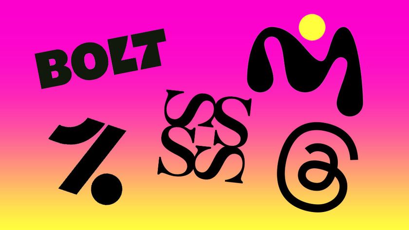
In 2024, logo design reached a fascinating inflection point. And as someone who's been writing on the topic for over a decade, it's been very refreshing.
For much of the 2010s and 2020s, logo design was characterised by one megatrend: the relentless march toward simplification. Rebrands across this era typically saw the logo getting simpler, flatter and more minimalist.
There were many good reasons for this, of course; not least the need to make logos work on small digital screens. But as a commentator it became deeply boring (certainly not up there with the best logos ever). And more recently, many designers have told me they've found it quite suffocating. (Echoing these concerns, in March 2023, we published an article titled Is the minimalist logo trend destroying brands?).
Over this last 12 months, though, things have begun to change. In 2024, we've seen three major themes dominated: a strong backlash against minimalism, a pull towards heritage and tradition, and a move toward systematic thinking over standalone symbols. Let's examine each of these in turn, and what they mean for logo design going forward.
01. The new complexity

After years of brands stripping down their logos to bare essentials, 2024 marked a clear turning point. This wasn't just a gentle evolution – it was often an explicit rejection of minimalist principles.
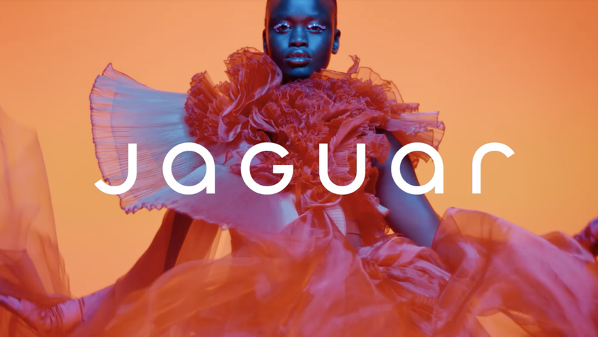
Jaguar provided the year's most talked-about example of this "new complexity", unveiling a controversial wordmark that mixed upper and lowercase letters in what the brand called "visual harmony." This prompted criticism from everyone from petrolhead journalists to Elon Musk. Yet Jaguar remained defiant, stating they were "not afraid to polarise."
Other designers went further. As we noted in September, Unreadable typography is the latest trend in logo design. At the extremes of this approach, fashion designer Katarzyna Konieczka launched a intentionally illegible logo based on a crown of thorns motif, incorporating barbed-wire elements and challenging every convention of clean, simple design you could possibly.
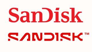
Other, more measured examples of experimentation included The Clearing's weird creation for Barnardo's, Koto's quirky design for Kit and SanDisk's brutally deconstructed wordmark. We didn't always love the results of this approach: IDW Publishing's logo for Comic Co, for example, hit a bum note for us. But it certainly seem that branding designers have broken out of the minimalist sans-serif box and are trying new things. And that feels… well, exciting.
Get the Creative Bloq Newsletter
Daily design news, reviews, how-tos and more, as picked by the editors.
That said, the shift wasn't universal. PayPal's rebrand, for instance, demonstrated that considered minimalism still had its place, with the company trading its dated italics for a bold, upright wordmark based on modified Futura typography. Yet rebrands like this were thin on the ground in 2024. Which suggests that while the design world hasn't turned against simplicity itself, it is turning against simplification for its own sake.
02. The heritage dilemma

Every designer embarking on a logo design has to grapple with how much of a brand's history to maintain or discard; that's a given. There's never any 'right' answer here, it's a balance you have to strike on a case-by-case basis. But I'd argue that in 2024, the design industry seems to be getting better and better at this tricky task.
Bose, for instance, offered a masterclass in subtle evolution, keeping its iconic 1960s wordmark largely intact while making refined adjustments to letter forms and introducing a sonic-inspired colour palette. It's a great example of how brands can embrace modernity without abandoning their core identity.

Pentagram also hit the right notes with their new logo for The Guggenheim Museum, which we called "a modern masterpiece". Honouring the institution's architectural heritage while serving its contemporary global presence, it's a great case study in respecting a brand's past while building for the future.
That said, not everyone gets it right. Nottingham Building Society sparked local outrage by abandoning its Robin Hood logo in favour of an abstract "loopy N". The backlash, which included criticism from the city's official Robin Hood actor, highlighted the dangers of severing historical connections too abruptly.
03. Systems over symbols

Perhaps the most significant shift in 2024, though, has been the move away from thinking about logos as standalone marks. Instead, brands are increasingly focused on creating comprehensive visual systems that can adapt across different contexts while maintaining overall coherence.
This was evident in the fast-food sector, where KFC launched Saucy, with a distinct visual identity that barely acknowledged its parent brand. The hot pink palette and curvaceous logotype may have looked incongruous with the home of fried chicken, but that was kind of the point. Seen part of a broader system designed to appeal to younger consumers, while maintaining a connection to the parent brand, many see it as a genius movie.

The sporting world provided another examples of this more systematic thinking. Speedo's rebrand focused on functionality, centred around a wordmark specifically engineered to stretch on swimwear fabrics, and incorporating a shade of green proven to be most visible underwater. The Six Nations tournament similarly approached its controversial M6N rebrand as part of a larger system encompassing women's and youth tournaments.
Whether these efforts succeed or not is not really the point. The key lesson might be that we're entering a more nuanced era of logo design. In other words, the move away from "simplicity-for-simplicity's sake" doesn't necessarily mean a pendulum swing towards "complexity for complexity's sake". Instead, brands are seeking thoughtful approaches that consider heritage, function and systematic application while still striving for distinction in a crowded visual landscape.
This, perhaps, explains why 2024's rebrands often proved so controversial. They weren't just changing logos, they were grappling with fundamental questions about brand identity in a rapidly evolving world. As we look ahead, these tensions seem likely to continue driving innovation in logo design. Which suggests that 2024 may be remembered as a pivotal year in the field, providing fresh ideas and inspiration for logo designers in 2025.
See our best and worst logo picks for 2024, and new kit for the new year, see our best laptops for graphic design guide.

Thank you for reading 5 articles this month* Join now for unlimited access
Enjoy your first month for just £1 / $1 / €1
*Read 5 free articles per month without a subscription

Join now for unlimited access
Try first month for just £1 / $1 / €1
Tom May is an award-winning journalist and editor specialising in design, photography and technology. Author of the Amazon #1 bestseller Great TED Talks: Creativity, published by Pavilion Books, Tom was previously editor of Professional Photography magazine, associate editor at Creative Bloq, and deputy editor at net magazine. Today, he is a regular contributor to Creative Bloq and its sister sites Digital Camera World, T3.com and Tech Radar. He also writes for Creative Boom and works on content marketing projects.

