All I want is for Coca-Cola to bring back the old Cherry Coke logo
Do it, you cowards.

Looking at old logos can be something of a Proustian experience, sparking deep memories of days gone by. In today's world of clean, sanitised logos, we don't often see wordmarks that are truly evocative – but judging by the response to the Cherry Coke logo from the nineties, it wasn't always that way.
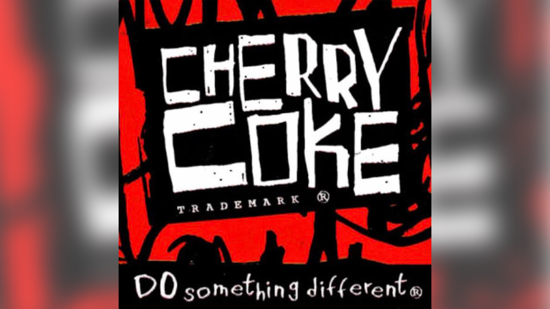
The logo has recently resurfaced on X, and it's taking users back to what can certainly be described as a characterful era for graphic design. With its grungy 'You wouldn't steal a car' typeface and edgy 'DO something different' tagline (slightly deflated by the accompanying registered trademark symbol), the logo is about as 90s as it gets. Coca-Cola might have one of the best logos ever, but its retro Cherry Coke branding was truly something else.
Cherry Coke tasted better with this logo don't question my logic it just did. https://t.co/wu4Qp8c2tcFebruary 10, 2025
The hardest any soda branding has ever went tbh https://t.co/09JJRYLkJcFebruary 10, 2025
"90s marketing was so extreme!" one Redditor comments, while another adds, "A lot of people think society began to decline after 9/11, but I think the changing of this logo played a huge role as well."
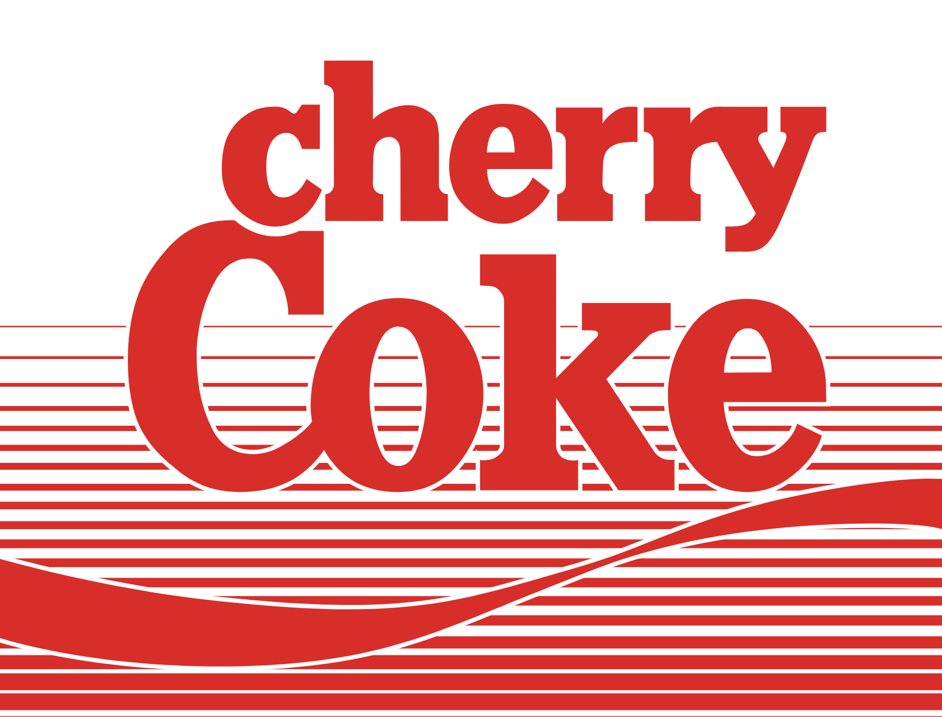
Cherry Coke was launched in 1985, and featured a pretty conventional logo back then, with a lowercase sans serif 'cherry' sitting atop the standard Coke wordmark.

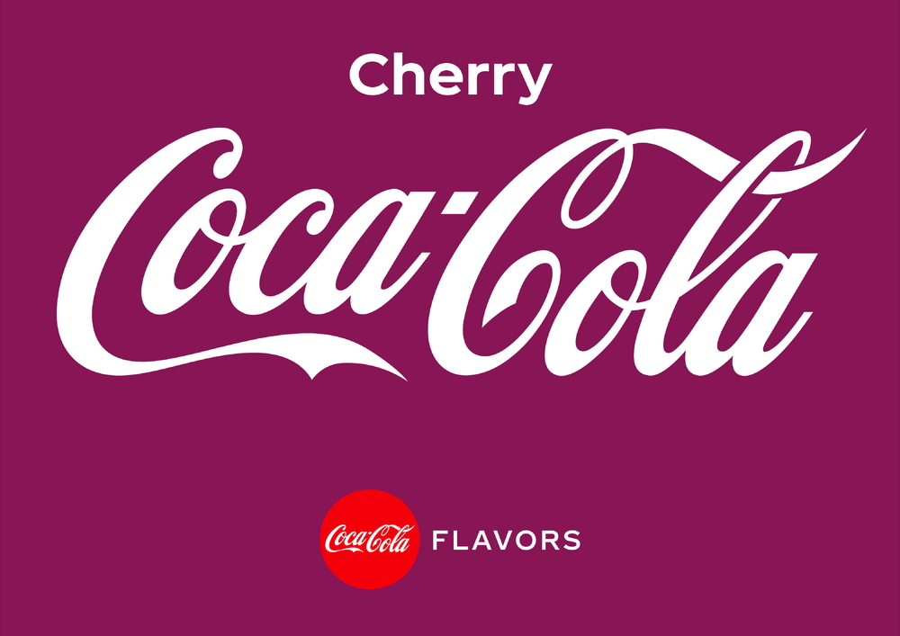
But while the original might look plain next to the spicy 90s design, it positively pops against today's impossibly dull design, with its plain corporate text and, erm, aubergine background?

Still, while the world of logos has arguably become duller (and flatter), there are signs that things are starting to change. Not only are icons finally becoming textured again, but we're also seeing a lot of brands revive their old logos. Is it too much to ask Coca-Cola to bring back its grungy 90s logo? Is it too much to suggest it might make everything ok? Probably. But every great dream begins with a dreamer.
Get the Creative Bloq Newsletter
Daily design news, reviews, how-tos and more, as picked by the editors.

Thank you for reading 5 articles this month* Join now for unlimited access
Enjoy your first month for just £1 / $1 / €1
*Read 5 free articles per month without a subscription

Join now for unlimited access
Try first month for just £1 / $1 / €1

Daniel John is Design Editor at Creative Bloq. He reports on the worlds of design, branding and lifestyle tech, and has covered several industry events including Milan Design Week, OFFF Barcelona and Adobe Max in Los Angeles.
You must confirm your public display name before commenting
Please logout and then login again, you will then be prompted to enter your display name.
