The new Slipknot logo is a real Disasterpiece
Fans aren't loving the brand new 'S'.

Music fans can be fiercely protective of their most beloved bands, and as the team behind Slipknot's new merchandise recently found out the hard way, that extends to their branding too. A limited edition set of T-Shirts features a new take on the 'S' from the heavy metal band's wordmark – and fans aren't happy about it.
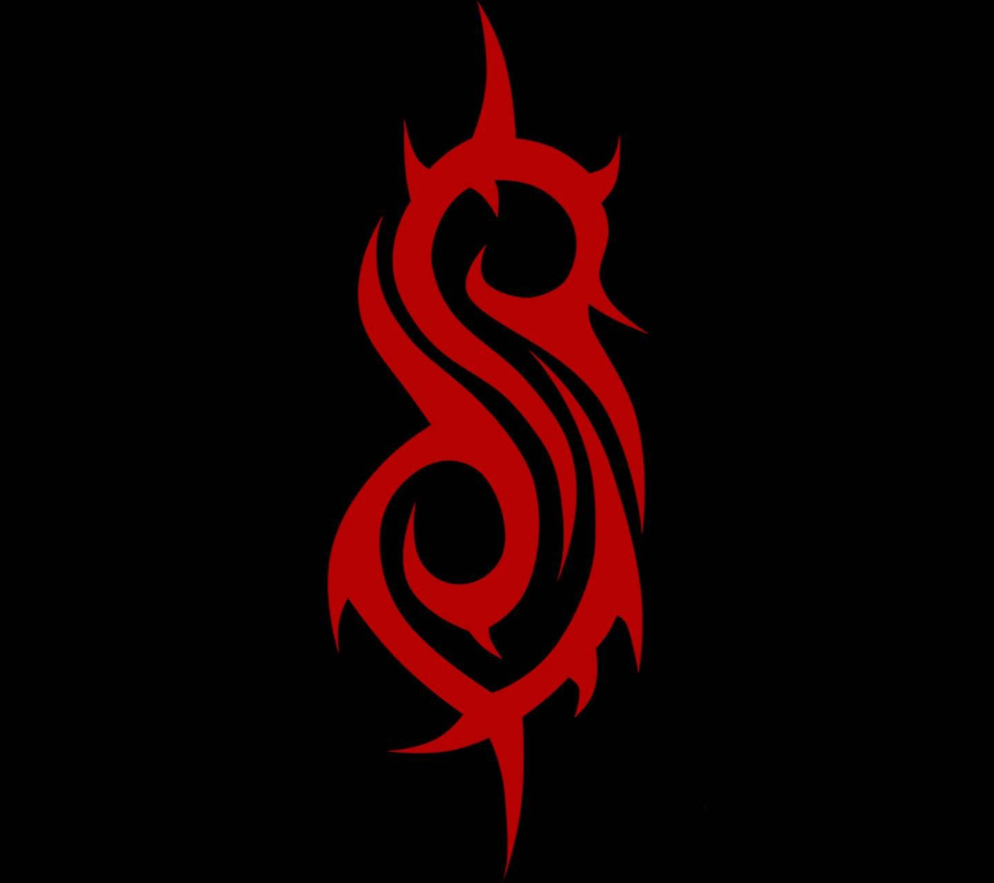
The merch, shared via the official Slipknot Instagram page, features an adapted version of the standalone tribal 'S' logo created by the band's original drummer Joey Jordison. And since the original wasn't broke, nobody can quite understand why somebody decided to fix it. One of the best band logos of all time, this ain't.
A post shared by Slipknot (@slipknot)
A photo posted by on
The new 'S' is much more vertically elongated, and features smoother edges, without the barbed, spiked look of the original. In short, it's a somewhat sanitised version of the original design.
One Instagram user declares that the new 'S' "HAS to be a social experiment," while another adds, "Do NOT change the S design to that please." Another puts it succinctly, "These all look like bad bootlegs." Indeed, it's hard to find a single positive comment about the new design.

With any luck, it'll turn out that this is simply a one-off design for this particular set of merch. Let's face it, unlike the new Coldplay logo, this one's hardly likely to end up on a football shirt.
Get the Creative Bloq Newsletter
Daily design news, reviews, how-tos and more, as picked by the editors.

Thank you for reading 5 articles this month* Join now for unlimited access
Enjoy your first month for just £1 / $1 / €1
*Read 5 free articles per month without a subscription

Join now for unlimited access
Try first month for just £1 / $1 / €1

Daniel John is Design Editor at Creative Bloq. He reports on the worlds of design, branding and lifestyle tech, and has covered several industry events including Milan Design Week, OFFF Barcelona and Adobe Max in Los Angeles. He has interviewed leaders and designers at brands including Apple, Microsoft and Adobe. Daniel's debut book of short stories and poems was published in 2018, and his comedy newsletter is a Substack Bestseller.
