One logo design trend that's caused a bit of controversy in recent years has been taking minimalism to extremes with the omission of parts of letter forms. We wrote (a lot) about how the KIA logo, which continued to be pilloried, and then the Nokia logo after it.
I have a feeling comparisons with these designs will crop up today following the reveal of the new logo for Sandisk, the maker of some of the best external hard drives. But in Sandisk's case, the more minimalist rebranding has a clever inspiration and makes for a dynamic animated logo.
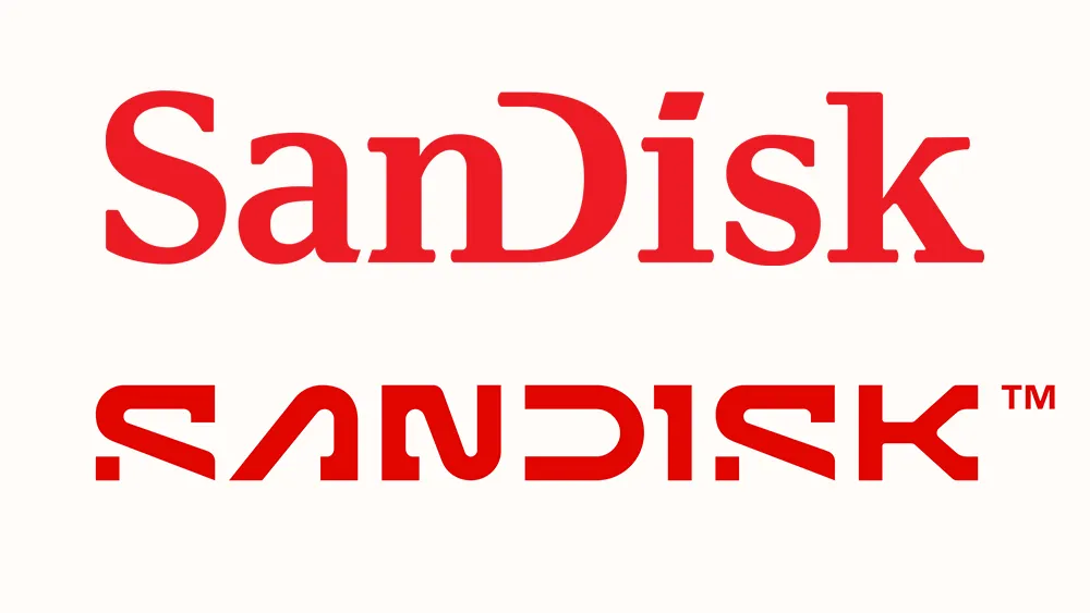
Data loss? The Sandisk logo before and after (Image credit: Sandisk Corporation)
Sandisk's logo was already quite quirky. Unusually for a tech company, it used an old-fashioned-looking slab serif typeface but combined it with the minimalist twist of that stemless 'D'.
In the new logo, the D remains open, but now more data has been lost: the crossbar on the 'A' and a chunk of the two 'S's. The 'I' looks like it's been designed to intentionally resemble a number 1, or even an 'L', and the combination of straight and curved edges on the 'N' make it look like a number 2 on its side.
But while some legibility may have been sacrificed, the new design has a lot going for it. That single point forming the end of the 'S' is intended to represent the concept of a pixel – "a single point of data that transforms into a kinetic symbol of flash technology". The unusual forms of the 'I' and the 'N' also convey the idea of masses of data being stored.
The Sandisk Corporation's rebranding comes ahead of its separation from Western Digital to launch as a standalone Flash and memory technology brand in 2025. We're told the new creative direction was defined by a ‘Mindset of Motion’, and it's clear that the need for movement was considered from the beginning of rebranding.
That single pixel turns out to be a powerful and versatile anchor for the identity's kinetic typography – the little flicker that accompanies the audio logo in the video above has a surprising amount of personality and does make the logo more memorable. It also works as an unique brand asset underpinning the whole new identity across digital pieces, billboards and more.
Get the Creative Bloq Newsletter
Daily design news, reviews, how-tos and more, as picked by the editors.
The Sandisk rebranding revolves around the power of a single pixel (Image credit: Sandisk Corporation)
Joel Davis, vice president of creative, at Sandisk, says of the rebrand: “Enabling people to experience the potential of their data and move forward in making aspirations real is at the heart of what we do and we were very intentional in creating a mark that embodies the spirit of this thinking.
“Our visual brand philosophy is inspired by the future and all the diverse ways our customers consume data. Starting with a single pixel, the new Sandisk mark uses bold visual language while being rooted in the idea that progress is not an end point but a way of being.”
Joe is a regular freelance journalist and editor at Creative Bloq. He writes news, features and buying guides and keeps track of the best equipment and software for creatives, from video editing programs to monitors and accessories. A veteran news writer and photographer, he now works as a project manager at the London and Buenos Aires-based design, production and branding agency Hermana Creatives. There he manages a team of designers, photographers and video editors who specialise in producing visual content and design assets for the hospitality sector. He also dances Argentine tango.