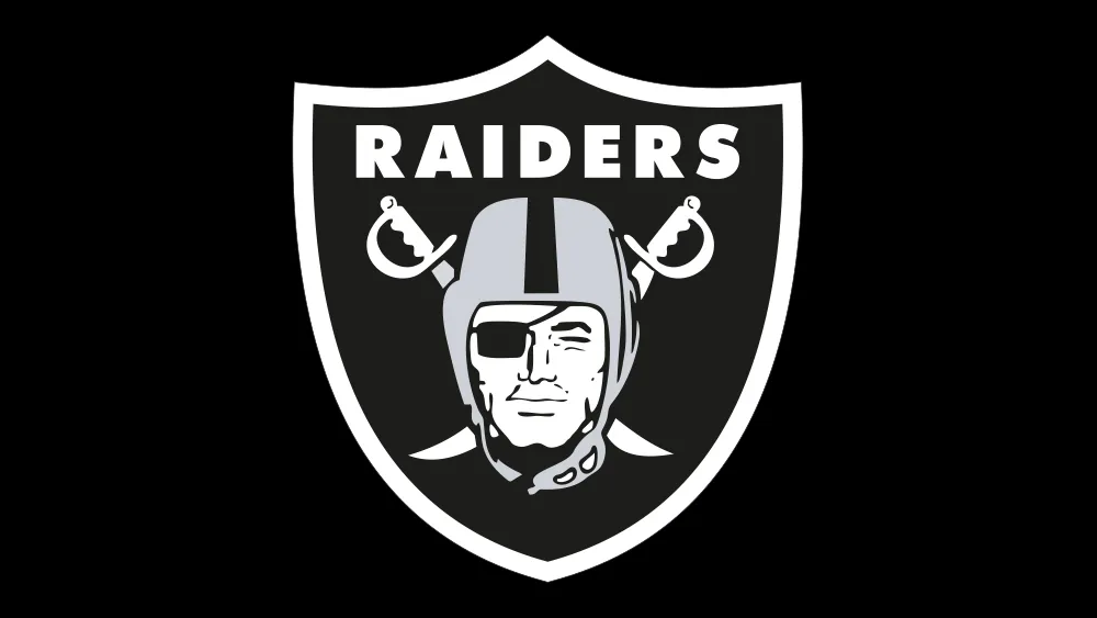
The Raiders logo has stood the test of time (and multiple relocations). But even the teams with the best NFL logos are knocking out temporary anniversary logos with increasing frequency. It's not just the decades that deserve new logos now: it seems every quinquennium warrants a commemorative design and corresponding new merchandise.
Or maybe the Las Vegas Raiders just saw an opportunity that it couldn't let pass to deliver a clever 65th anniversary logo (well timed for the start of its training season). It's made nifty use of its traditional crossed swords motif, using it to form the 'X' in 'LXV'. But the sharp design is dividing fans.
X marks the spot? The Las Vegas Raiders logo for the new season (Image credit: Las Vegas Raiders)
The Raiders anniversary logo makes use of the NFL team's traditional black and silver (grey) colours and puts the crossed swords at the centre of the design. With the 'X' and the swords in white, and the 'L' and 'V' in grey, the new logo is easy to interpret (though the Raiders shared a post explaining, just in case – see below).
Latest Videos From Creative Bloq
More than a logo. More than a shield.#RaiderNationhttps://t.co/7AYFnGG0w9July 15, 2024
See more
The usual Raiders logo is embedded within the new design at the bottom along with the years 1960 and 2024. That's technically a span of 64 years if we're going to pick holes, but many fans are impressed by the design – and by the pirate's chest for season ticket holders.
The Raiders 2024 season ticket holder boxes are setup like a pirate's chest with the 65th year anniversary logo. Now that's pretty dope!! 🏴☠️☠️⛓️🔥 pic.twitter.com/yJb7bSgrJ7July 18, 2024
See more
However, some fans aren't so sure. Some think the design would have worked better if it used the crossing swords alone without the literal X to make it obvious. Others think the repetition of the shield and sword motif makes the design too busy. "We heard you like shields and swords, so we put some shields and swords inside your shields and swords," one person quipped on X.
Others still haven't got over the team's relocation from Oakland to Las Vegas. "The L shoulda been California shaped if they was really 'paying homage' to the first 60 years," one person suggested. "What city will they be in during their 75th?," someone else person asked. "Technically it's not 65 years. Wouldn’t the franchise start over at 0 after relocating?" was another opinion. Others are just tired of so many logo changes. "I hate anniversary logos unless it’s a biggie, i.e.,10, 25, 50, 75, 100, etc. Everything else is just a cash grab," someone wrote.
Raiders itself said in a statement that the logo "stands as a testament to resilience and tradition in the world of professional sports." We presume players will wear the new logo as a patch during the season.
Get the Creative Bloq Newsletter
Daily design news, reviews, how-tos and more, as picked by the editors.
Joe is a regular freelance journalist and editor at Creative Bloq. He writes news, features and buying guides and keeps track of the best equipment and software for creatives, from video editing programs to monitors and accessories. A veteran news writer and photographer, he now works as a project manager at the London and Buenos Aires-based design, production and branding agency Hermana Creatives. There he manages a team of designers, photographers and video editors who specialise in producing visual content and design assets for the hospitality sector. He also dances Argentine tango.