I never thought the song contest would make me question the purpose of logo design.
(Image credit: Eurovision Song Contest)
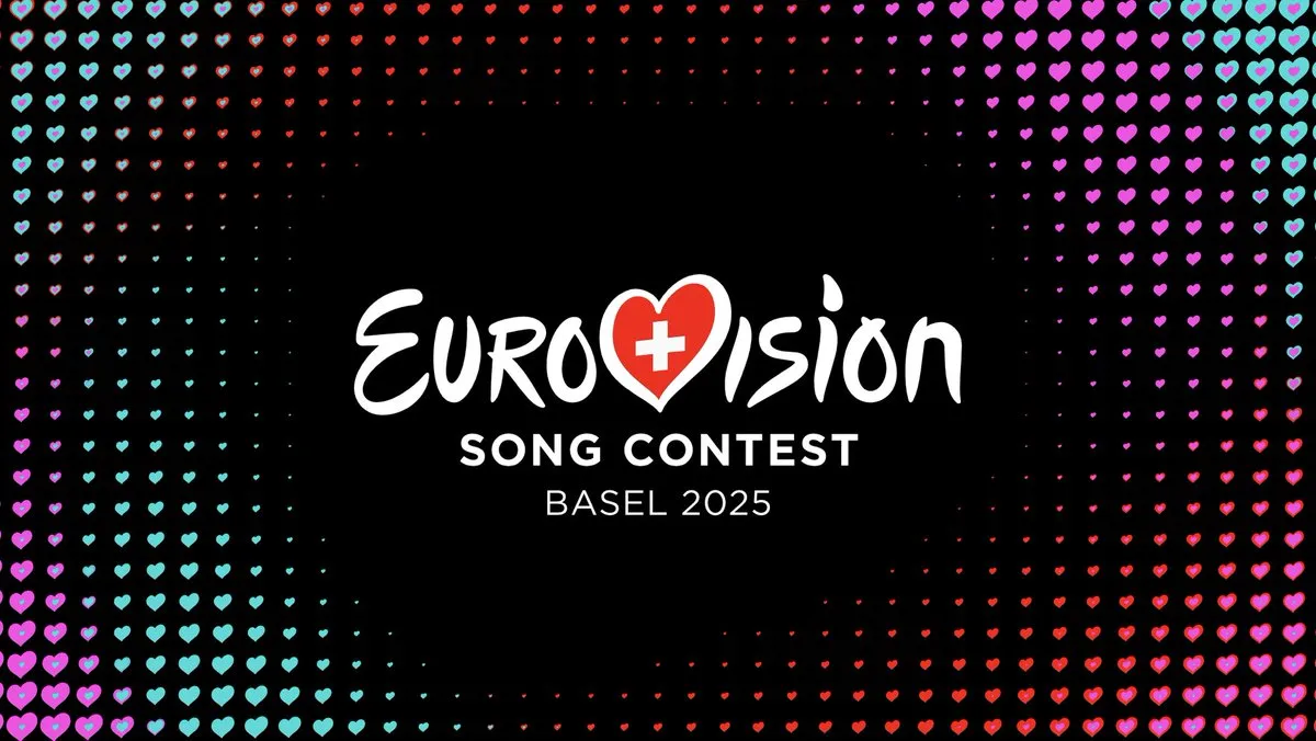
The Eurovision Song Contest has always stoked controversy, but usually related to the songs and the voting, not the branding. But the big reveal of the new logo for Basel 2025 has a lot of fans asking the same question: what new logo?
The logotype for Basel 2025 is the essentially the same as it was for Malmö 2023 but with a different flag. And that's causing some people to pine for the days of the best Eurovision logos, when the design would change each year. The debate raises an interesting question about the purpose of logo design.
'Unity Shapes Love' is the name art director Artur Deyneuve has coined for his brand identity for 69th Eurovision Song Contest. He says he was inspired by the Swiss tradition of direct democracy, which led him to choose 'listening' as the central guiding theme for the concept. "If we listen to one another, we find love," he says.
But the reactions on social media haven't all been unity and love. Some people think the tradition of a big logo reveal has lost its relevance if the logos all look the same.
The downgrade of Eurovision logos in recent years needs to be studied.I mean look at how creative and artsy the theme art used to be and how it became extremely simplified and cheap-looking in recent years.. pic.twitter.com/L60PoW8ZFtDecember 16, 2024
See more
Eurovision would point those asking 'what identity?' to look beyond the logotype, which has become standardised. The logotype is no longer the branding of the event but Eurovision as an entity. The identity of each individual event now appears in the elements around the logo: the colour palette, the backgrounds, the motion graphics and the increasingly elaborate stage designs.
That focus on love led Artur to go all in on the existing Eurovision heart symbol, which has been in use since Istanbul 2004. The motion graphics for Basel 2025 make clever use of the motif, multiplying the heart to create pulsating points that move with the music (the audio identity combines various elements of Swiss music, from yodelling to alphorns). Meanwhile, production designer Florian Wieder's "revolutionary stage concept" is inspired by Switzerland's mountains.
Image 1 of 2
(Image credit: Eurovision Song Contest)
(Image credit: Eurovision Song Contest)
Logo design is about branding, not entertainment, and branding is intended to create a consistent, recognisable identity. For events, that often means standardisation rather than treating each event as a new entity, particularly if the aim is to gain more recognition internationally.
Get the Creative Bloq Newsletter
Daily design news, reviews, how-tos and more, as picked by the editors.
The problem is that the public liked the novelty that came with the previous approach of revolving logo designs, each with their own personality. We've seen similar reactions to the Super Bowl logos in recent years – and it looks like the World Cup logo is going to go the same way starting with LA 2026.
The challenge for designers is to obtain the necessary brand consistency while creating something novel and different enough to give an event its own identity too – and to make a brand reveal like Eurovision's this week feel interesting. I think the Basel 2025 identity achieves that, but many will disagree.
Thank you for reading 5 articles this month* Join now for unlimited access
Joe is a regular freelance journalist and editor at Creative Bloq. He writes news, features and buying guides and keeps track of the best equipment and software for creatives, from video editing programs to monitors and accessories. A veteran news writer and photographer, he now works as a project manager at the London and Buenos Aires-based design, production and branding agency Hermana Creatives. There he manages a team of designers, photographers and video editors who specialise in producing visual content and design assets for the hospitality sector. He also dances Argentine tango.