The most controversial logos ever, from Gap and ebay to London 2012
Designers choose the bold, the bad and the bland of logo design.
From brave and different, to misguided modernisations, embarking on a new logo design can mean facing a deluge of both admiration and abuse. While some brands may admit defeat and backtrack, others have held onto new designs, which often proves more memorable in time. Although sales have taken a hit in some cases, controversial logo choices clearly get a brand noticed – whether it’s curiosity and enthusiasm from fans or criticism from the sceptics. Or even sparking a slew of parodies or anti-logos.
There are plenty of lessons to be learnt – don’t jump on a trend, don’t make it bland, don’t throw away your heritage, do break new ground and do try something daring. But, crucially, the best logo choices should be authentic, strategic, culturally sensitive and innovative – and never employed as a means to paper over a brand’s deeper issues.
Here, in no particular order, are the most controversial logos ever, as chosen by designers and industry experts.
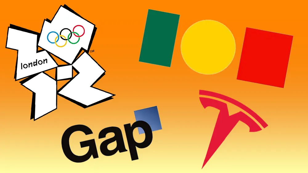
01. London 2012 Olympics

Despite this not being a ranking order, the London 2012 Olympic Games logo, designed by Wolff Olins and launched in June 2007, was top of the list for many of the designers and industry folk we spoke to (we should note that it was also popular in our best rebrands of the 2000s roundup and made it to our pick of the best Olympics logos).
“When the identity for the London 2012 Olympics was launched, it was widely mocked. Critics derided its childish, jagged form and luminous colour palette. Some even likened it to an inappropriate image of Lisa Simpson,” says designer Mike Kus. “Additionally, the accompanying typeface, reminiscent of torn bits of sticky tape, further fuelled the discontent.”
“It was the first time I’d been exposed to this kind of vitriol aimed at designers,” says Leigh Chandler, creative director of creative agency Sister Mary. “The Sun and other tabloids at the time expressed outrage at this ‘terrible waste of taxpayers’ money’, stating that the branding cost £400,000 without recognising the work that goes into a rebrand of this scale. For the first time, I felt terrified about being a designer – how is it possible to create such contempt with my selection of a logo, colour, and typography?
“But, of course, the Olympics hold such national regard that it is always going to be an identity design that garners a lot of attention,” Leigh continues. She remembers hearing about the press setting up outside the Wolff Olins studio, and even following designers home, desperate to catch a shot of those behind this “outrage”. “After the logo was revealed, a petition was circulated to have the logo scrapped and redesigned – it was signed by over 48,000 citizens.”
Get the Creative Bloq Newsletter
Daily design news, reviews, how-tos and more, as picked by the editors.

Ian Paget, graphic designer and founder of design firm and blog Logo Geek, agrees. “The radical and controversial identity still sparks debate 12 years later,” he says. "The controversy peaked in Iran, where the logo was interpreted as spelling the word ‘Zion’, a term associated with Jerusalem, leading Iran to threaten a boycott of the Games. Despite – or perhaps because of – its unconventional appearance, the logo has cemented its place as one of the most memorable and impactful in Olympic history. After all, isn’t being memorable part of a logo’s purpose?”
“[At first] it shocked and shook the nation. It was a questionable design with some creative interpretations by the public," says Abigail Baldwin, director at design agency Buttercrumble. “Yet, it was ahead of the curve and broke free from the usual trope of the Olympic rings – designed to reflect the vibrancy and dynamism of London, while appealing to a younger audience by bringing fresh joy and energy to the Games.”
What is important to factor in is that Wolff Olins designed a logo for the future
Leigh Chandler
“What is important to factor in is that Wolff Olins designed a logo for the future – for an event happening five years after it was designed. This approach required a significant leap of faith and meant they were setting trends rather than following them,” Leigh says. “Of course that was always going to make everyone feel a little uncomfortable. It made me feel uncomfortable, but I also respected what they were doing. I was shocked by it, but felt it perfectly represented London at that time – a city of hope, excitement, renewal, diversity, and cutting-edge creativity. And, I was pleased to see that by the time it was launched in 2012, it felt completely at home – and absolutely perfect.”
02. Portugal

This short-lived logo for the Portuguese government got caught up in a culture war in Portugal was chosen by John Owens, creative director of Instruct Studio, which has been working in placemaking for the last 20 years.
“Encapsulating the economic, social, political, and cultural elements of a place in the era of social media can be a thankless task. Like many polarising brand launches, it feels as though agencies either nail it or get nailed,” says John. “Familiar patterns of dissent emerge, with complaints about the waste of public money and the loss of tradition needing to be balanced against the new brand’s relevance in a modern world. Unfortunately, these arguments rarely receive a fair hearing."

The Portugal logo controversy and subsequent rebranding shows clients, in pursuit of reputation management and influence over external audiences, often capitulate easily. Political interventions can complicate matters, John says. “After nearly a year in the public domain, the new brand became embroiled in the ‘woke’ war led by the newly elected Conservative government, which vowed to scrap it. This backtracking led to the designer receiving death threats for a minimalist, modern approach to design that may have been the right solution but the timing wasn't.”
03. Airbnb
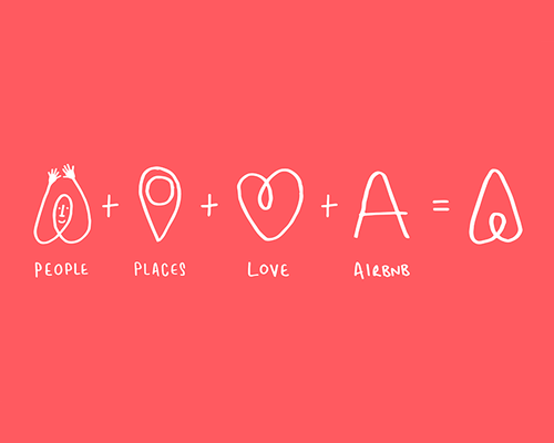
In 2014, Airbnb introduced ‘the Bélo’ logomark, created by DesignStudio. It featured a triangle with a loop extending inward from the base, aiming to symbolise the concept of ‘belong anywhere’ by representing people, places, love and the letter ‘A’ of Airbnb. It faced significant backlash on social media, leading to viral anti-logos and spoof designs highlighting its likeness to particular parts of the human body, the film character E.T., and even to cartoon character Peter Griffin’s chin.
“As part of the launch campaign, Airbnb invited the world to personalise the Bélo. However, this invitation quickly led to an influx of inappropriate and humorous modifications shared on social media,” Ian says. “These modifications overshadowed the intended message, with the logo being likened to various rude shapes rather than its symbolic vision.”

"Despite the negative attention, Airbnb chose to embrace the situation rather than retract the design. The campaign ultimately proved to be a massive success, trending on Twitter, winning numerous awards, and significantly boosting the company's valuation to $29 billion, surpassing their nearest competitor within four years,” Ian continues. “In hindsight, Airbnb's decision to stand by its design serves as a powerful case study. It highlights the importance of embracing a design, regardless of public reaction, and demonstrates how initial criticism can be transformed into a significant branding success.”
You can read more about how DesignStudio responded to Bélo's launch with our piece by one team member.
04. Ebay

In the hyper-digital age, the drive for efficiency and modernisation can mean death of originality in design, for the sake of functionality and convenience. In 2012, ebay redesigned its bubbly, playful wordmark to a new, slimmer version – a less characterful, more corporate design as many saw it.
“It’s hard to single out a controversial logo design, as most things that received backlash when first introduced tend to grow on people as they are given time to get used to the change and understand why it was needed. To achieve ‘most controversial logo ever’ status, I think the irritation needs to be enduring,” says Connor Edwards, a designer at Jack Renwick Studio. “ebay’s logo redesign, changing from a fun mismatched logo evoking the wide range of products on the online marketplace, to something some people complain ‘looks too much like Google’ is an early example of a general trend of homogenisation in branding – a trend that has recently centred around the rebranding of famous fashion houses and is causing a lot of controversy in the design community.
“As ebay’s user base grew it’s easy to understand that they must have felt the need to present themselves as a more trustworthy facilitator for people’s transactions, but does this mean the answer is to shed any sense of brand personality?,” Connor continues. “While the logo change of an online marketplace may not jump out as violently controversial as perhaps other examples, I think it was an early indicator of a wider, more contentious matter that still prevails in the industry.”
05. Tropicana

“When I think of the most controversial logos, the Tropicana rebrand from 2009 comes to mind – especially since they’ve just rebranded for the UK market again,” says Hua Chen, senior designer at Team. “The attempt at modernisation falls into the trap of disregarding the context that the brand exists in. The cultural presence and history that consumer brands like Tropicana command make tackling a rebrand much riskier.”
PepsiCo, its owner at the time, dropped the brand’s classic arched logo and fruit pierced with a straw for a new identity and packaging that was, as many saw it, bland and cheap-looking. The subsequent outcry was so bad that, within a year, the company had made a complete U-turn. Read more about it in our most hated logos piece.
06. Gap

“From the classic all caps serif ‘Gap’ inside a blue box, to the san serif, sentence case with a little blue box accent – what a $100 million disaster that was!” says Nick Sonderup, executive creative director of StrawberryFrog. “And, they tossed aside their custom typeface to use… Helvetica. I know, I know. At the time, everyone was all about Helvetica. There was even a movie about it that appealed to more than design nerds. But, in this case, it was the wrong choice. Thankfully they recognised their ‘gap’ in judgement and changed it back within a week.”
The online outcry even included websites like makeyourowngaplogo.com (see below). After taking on board customer criticism, the rebranded logo was consigned to the rubbish heap of dodgy corporate arrows, out-of-place squiggles and bland emblems.

“No disrespect to Laird + Partners. They had a really hard brief to crack on this one,” Nick adds. “If you’re being asked for reinvention, you’ve got to take risks and go for it. But, maybe the lesson here is that wholesale change is the biggest risk, and a more fruitful path is asking the question, ‘What stays and what goes?’ And having answers to both.”
07. Visalia, California

“As I write this, the town of Visalia, California, is going through its own protracted and now very public process of place branding after an uproar from its citizens against their new place brand,” John says, of the recent redesign, which faced criticism for being “generic”, “a huge downgrade” and that “they probably got AI to do it”.
“The usual complaints on social media of loss of tradition, Microsoft paint and of course the cost. The process had seen over 800 conversations, surveys and interviews with local people before the unveiling, but the council crumbled and decided to come up with another solution.
“That solution was crowdsourcing, asking anyone to submit designs, even if design was ‘just a hobby’ for the creator,” John continues. “They received almost 100 entries from the public. I cannot fathom how the incumbent agency felt seeing this all play out in the media, but by all accounts, they followed the brief and process well, they just had a client not willing to stand alongside them. Still at least anyone with Microsoft Paint could finally have a go.”
08. Tesla

“I can imagine the brand's logo applied on an oriental food delivery bag,” says Diego Limberti, chief design officer at Soko, of Tesla’s logo, which unlike most of the others on the list, has been a part of the company’s logo since it was founded in 2003.
“Although some defences about the construction of the logo were inspired by a cross-section of an electric motor invented by the man who gave Tesla its name – Nikola Tesla, in my opinion, the brand conveys a language reminiscent of Eastern symbolism,” Diego continues. “Not necessarily the ‘T’ symbol, but the designed typography has pointed ends that resemble lines made from an ancestral typography. The simplification of the letters ‘T’, ‘E’, and ‘A’ also remind me of pictograms of a torii (traditional Japanese gates).”

The Tesla 'T' symbol faced controversy of its own – being likened to an IUD contraceptive device, only to be met with cries on social media of “get more women onto your marketing team”.
For more logos that made a splash, see our best logos of the decade and best rebrands of the decade series.

Thank you for reading 5 articles this month* Join now for unlimited access
Enjoy your first month for just £1 / $1 / €1
*Read 5 free articles per month without a subscription
Join now for unlimited access
Try first month for just £1 / $1 / €1

Antonia Wilson is a freelance writer and editor. Previous roles have included staff writer for Creative Review magazine, travel reporter for the Guardian, deputy editor of Beau Monde Traveller magazine, alongside writing for The Observer, National Geographic Traveller, Essentialist and Eco-Age, among others. She has also been a freelance editor for Vogue and Google, and works with a variety of global and emerging brands on sustainability messaging and other copywriting and editing projects — from Ugg and Ferragamo to Microsoft and Tate Galleries.