The Jaguar rebrand is already the most divisive of 2024
Even Elon Musk is mocking the new look.
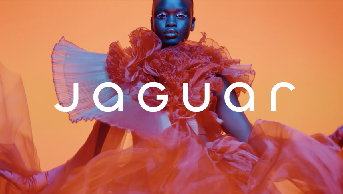
Car rebrands are always big news in design circles, particularly when they involve brand new logos. So when Jaguar yesterday debuted not one, but three new designs, comprising a wordmark, monogram and tweaked version of its famous leaping animal, it certainly made a splash. And, as you might expect, the reactions have been strong with this one.
With a minimal wordmark featuring a mixture of upper and lowercase letters, and cyperpunk-esque marketing imagery, this isn't what people expected from the luxury sports car brand. While others are opting for a heritage look, Jaguar is leaning into 'modern'. And it's proving too much for many, with commentators across the whole of social media sharing their thoughts – including Elon Musk.
Taste aside — from a purely strategic perspective, this brand marketing is disastrous for Jaguar.For context, Jaguar sales have been plummeting (down 70% in the US in five years). It’s a crisis. Their #1 strategic imperative for comms and marketing should be to sell cars. So… https://t.co/5E59IleGVlNovember 19, 2024
To get a quick sense of how customers are feeling about a brand, one only needs to take a look at its Reddit page. Currently, the Jaguar subreddit is awash with swipes at the 'glossy' new look.
Oh dear from r/Jaguar
👇This is how you advertise a Jaaag. Not whatever that new stuff is. from r/Jaguar
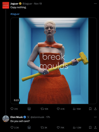
And even the bastion of taste that is Elon Musk has had something to say about the rebrand – and to be fair, he's reiterating what seems to be the main complaint among the Jaguar community, which is that the new branding doesn't seem to represent a car brand, with people variously suggesting it resembles that of a vegan smoothie company, or trendy underwear brand.
Still, time will tell whether the dust will settle on this one – after all, some of the most hated rebrands of all time, such as Airbnb's controversial 2014 refresh, have proven to have impressive staying power.
Get the Creative Bloq Newsletter
Daily design news, reviews, how-tos and more, as picked by the editors.

Thank you for reading 5 articles this month* Join now for unlimited access
Enjoy your first month for just £1 / $1 / €1
*Read 5 free articles per month without a subscription

Join now for unlimited access
Try first month for just £1 / $1 / €1

Daniel John is Design Editor at Creative Bloq. He reports on the worlds of design, branding and lifestyle tech, and has covered several industry events including Milan Design Week, OFFF Barcelona and Adobe Max in Los Angeles.
