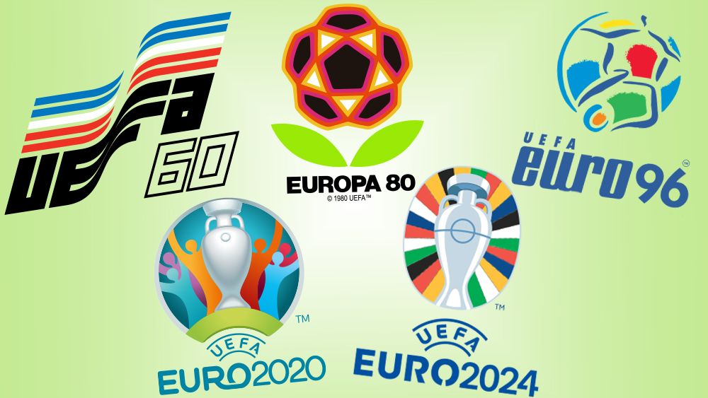
The UEFA European Championship 2024 is underway, and the clever Easter eggs in the Euro 2024 logo may have you wondering how it compares to previous designs. Well, this is the place to find out because we've pick apart every Euro logo, from Euro 1960 right through to Euro 2024 in Germany.
In recent years, each European Championship has had a different logo design. The last three events have settled on UEFA's trophy as the main motif, but the years before that saw a range of very different, sometimes quite wild abstract designs, while the first 30 years of the Euros saw a surprisingly uniform approach to logo design. Read on for the history of the Euros logo (also see our pick of the best sports logos).
The first UEFA Euro logo: 1960 – 1992
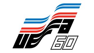
What we now know as the UEFA European Championship began in 1960 as the UEFA European Nations’ Cup. The first event, hosted by France, featured a strikingly dynamic-looking logo design that comprised the text 'UEFA' and the host nation’s flag forming the shape of a flag flapping in the wind. The last two digits of the year appear below in an outlined italic font that was very much on trend for the time, giving it a vintage feel today.
It wasn't exactly the most legible of designs as the ‘E’ and the ‘F’ of 'UEFA' merge into one elongated shape, but the design was clearly judged to be a success because it was subsequently used for seven more Euros over three decades, with only the flag changing to reflect that of each host nation.
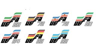
It’s something of the reverse of the trend we’ve seen in some other sports competitions, which have gone from having wildly different designs for each event to using more standardised branding. Fans have complained about the uniform Super Bowl logos of recent years, and Fifa says it intends to now use the same base design for the World Cup logo, starting from 2026. The Euros went the other way, rocking standardised branding for 30 years until giving way to the more of a free for all approach that we'll see below.
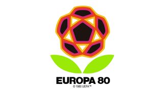
The only exception was in 1980, when Italy hosted the event for a second time. On this occasion, a second logo was created as an alternative design. With a football placed above two leaves to make it look like a flower, this design was presumably developed because it was realised that the repetition of a host nation meant that the main logo was the same as the 1968 logo.
Euro 96 logo
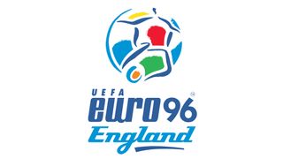
The reign of identikit Euro logos would only come to an end when England hosted Euro 96. This logo design was a massive departure. Thestrict geometric lines and national colours were replaced with a vibrant, impressionistic drawing of a football divided to make it also look like a player kicking a ball. It retained the idea of dynamism conveyed in the previous designs, but in a very different way, with a hand-crafted look that feels more athletic and visceral. The busy wordmark below features three typefaces, underlined with a brushstroke for still more dynamism.
Get the Creative Bloq Newsletter
Daily design news, reviews, how-tos and more, as picked by the editors.
Euro 2000 logo
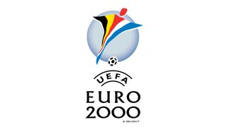
National colours made a comeback four years later for Euro 2000, but this event saw two host nations for the first time. The solution was a design featuring a player who appears to be wearing a poncho comprising the colours of both the Belgian and Dutch flags. Since both flags feature red, this was used in the centre for the player's body and head, connecting the two flags and making the shape of the footballer's body clear.
Again, the logo has a strong sense of physical movement, with the figure looking a lot like a kite while also being a surprisingly convincing representation of the shape of a player going to kick the ball. The design also has a surprising combination of symmetry and asymmetry: the player has a lot of weight on one side, but this allows the ball to placed directly centred, anchoring the design. Add a more classic-looking serif typography for a neater finish, and it feels more institutional than the Euro 96 design.
Euro 2004 logo
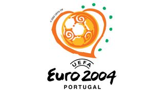
Designed by EURO RSCG Wnek Gosper, the Euro 2004 logo saw the use of a very different colour palette, almost entirely orange and yellow with green highlights. There was no player this time. Instead, the design features the more immediate and universal motifs of a heart and a football. The result is a warm, welcoming if not exactly subtle design for the Portugal-hosted event.
There's no immediate allusion to the host nation, but the green dots take one of the colours from the Portuguese flag, and the fact that there are seven of them echoes the seven castles on the country's coat-of-arms, which also adorns the national flag (see the Portugal logo controversy). The script font for the 'Euro 2004' text adds to the welcoming and informal feel.
Euro 2008 logo
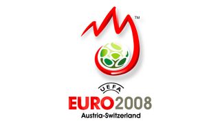
Euro 2008 saw two host nations for a second time: Austria and Switzerland. It was decided that the thing they have in common was mountains and the colour red in their flags, and so we have a logo with three red peaks scooping up a football. The green ball is presumably intended to conjure up ideas of alpine forests. Personally, I think this was the worst Euros logo to date. It was quite a change to focus on the geographic features of a host nation, and I'm not sure it worked. The design feels strangely centred and off balance to me. The spiky mountains with a big tail make me think they're supposed to represent letters, and that drop shadow made the logo date almost instantly.
Euro 2012 logo
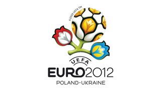
The Euro 2012 logo retained the football championship's discovery of the natural world and is perhaps one of the most unusual designs. It's presents the football as a flower, something we saw before with that alternative Euro 1980 design. This time it's more elaborate, with two additional flowers carrying the colours of the host nations Poland and Ukraine. The shape of a human figure with arms raised in celebration is repeated within the ball and the flowers. It's a complex design with a lot going on, but it certainly stands out.
Euro 2016 logo
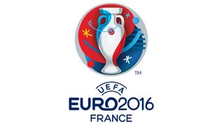
The France Euro 2016 logo introduced a major new element that continues to feature in Euro logos today. And interestingly, it's a move we've also seen in the Fifa World Cup logo and the Super Bowl logos: it depicts the tournament trophy, in this case the Henri Delaunay Cup.
There's no footballer, no ball, but there is a little Easter egg perhaps. The badge on the cup is overlaid with what appears to be the centre marking from a pitch, which curves into a corner marking at the top right. The placing of these elements feels a little unsual almost, as if this were a Kandinsky painting of a football pitch, but it sparked an idea that would resurface in a more symmetrical form for the Euro 2024 logo, which we'll see shortly.
I'm not entirely sure why sports competitions have started making the trophy the focus of logo designs, but it is a distinguishing characteristic that separates them from other competitions in the same sport, and it's less potentially divisive than using national symbols. However, the colours in this case are those of the French flag. Note that we finally returned to some uniformity in the typography, retaining the wordmark from the previous tournament.
Euro 2020 logo
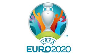
Designed by Young & Rubicam Portugal, the Euro 2020 logo again features the Euro trophy, the Henri Delaunay Cup. It added a bridge motif, chosen to reflect a unique aspect of this edition of the tournament: there was no single (or even double) host nation. Instead, 11 countries hosted matches for the Euro 2020 finals, which would eventually be held in 2021 due to the Covid-19 pandemic.
The branding for the tournament also introduced a new tradition, which has been continued in 2024: individual logos for each host city. In this case, each host city logo featured a bridge to mirror the main design, and the logos were revealed one by one at individual launches. The design for London (the final and semi-finals were held at Wembley Stadium) depicted Tower Bridge.
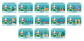
Hélder Pombinho, Y&R creative director, said that the symbol of the bridge was chosen as "the common denominator that brings host cities together as one." While the designs have a very 2020 cartoonlike design look, it's the most developed concept we've seen yet for a Euros logo system, accompanied by a series of branded illustrations around a "Euro for Europe" theme.
Euro 2024 logo
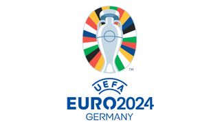
That brings us up to date to this year's Euro 2024 logo for the European Football Championship in Germany. At first glance, the logo again shows Henri Delaunay cup with the addition of pitch markings and a colourful backdrop. But there are some little Easter eggs that reward closer inspection.
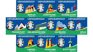
Those aren't random colours behind the cup. There are 24 stripes to represent the 24 teams taking part in the tournament, and the colours themselves are taken from the flags of UEFA’s 55 member associations, a design decision that's also intended to promote diversity. The shape of the design was inspired by the roof of the Berlin's Olympiastadion, which will host the Euro 2024 final on July 14. Again, each host city also has its own illustration.
For more European logo inspiration, see our pick of the best Eurovision logos.

Thank you for reading 5 articles this month* Join now for unlimited access
Enjoy your first month for just £1 / $1 / €1
*Read 5 free articles per month without a subscription

Join now for unlimited access
Try first month for just £1 / $1 / €1
Joe is a regular freelance journalist and editor at Creative Bloq. He writes news, features and buying guides and keeps track of the best equipment and software for creatives, from video editing programs to monitors and accessories. A veteran news writer and photographer, he now works as a project manager at the London and Buenos Aires-based design, production and branding agency Hermana Creatives. There he manages a team of designers, photographers and video editors who specialise in producing visual content and design assets for the hospitality sector. He also dances Argentine tango.
