Glastonbury Festival 2024 is in full swing at Worthy Farm, promising five days of music, pagan rituals and toilet horror stories. People might be questioning the lineup this year (as every year), but who goes to Glasto for the lineup? The festival is as legendary for what happens away from the main stage as much as for any big names who might happen to play. And the 2024 Glastonbury Festival logo and poster design perfectly encapsulates that.
Glastonbury is so famous, and tickets sell so fast, that it perhaps doesn't need to do much in terms of brand design, and often it hasn't. Glastonbury logos and posters have ranged from the iconic to the unreadable over the years (see our pick of the best and worst further below), and yet the festival has forged a recognisable visual identity while avoiding modernising too far (see our roundup of the best poster designs for more inspiration).
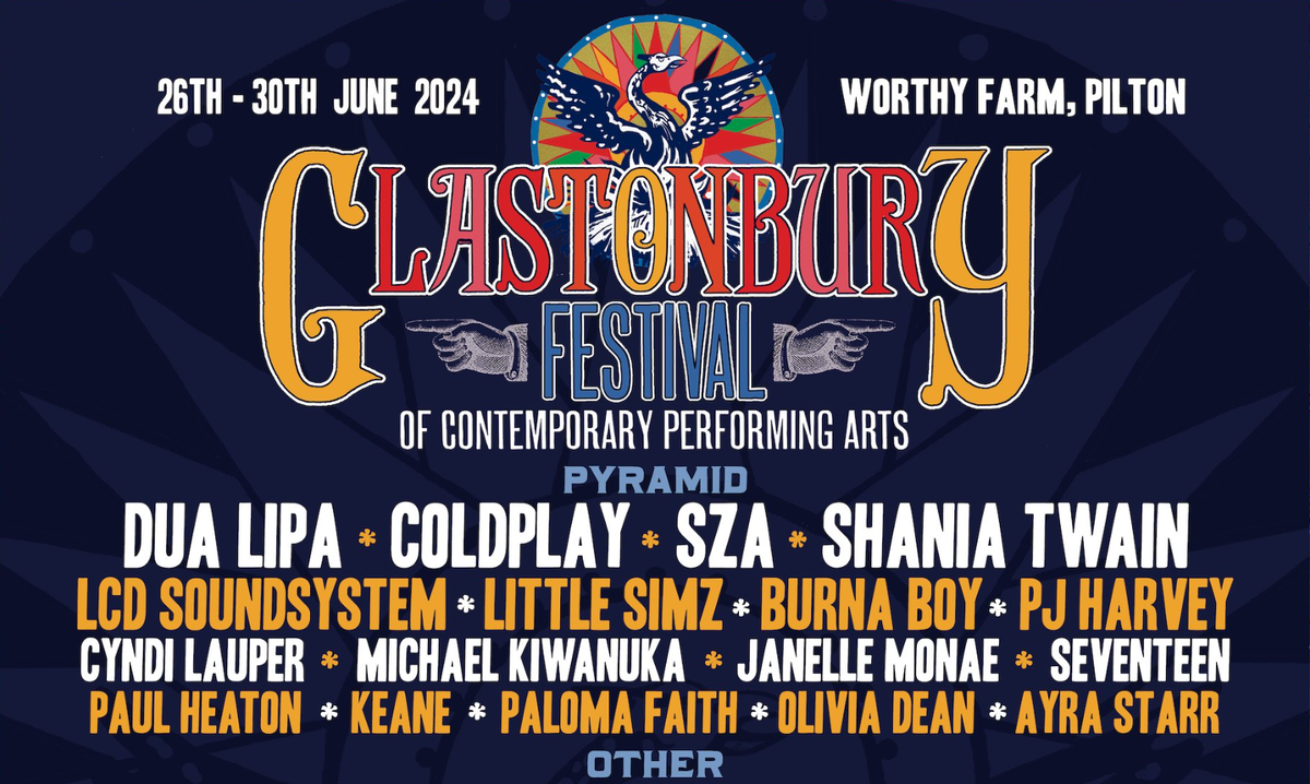
The 2024 Glastonbury Festival logo and poster design
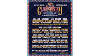
Glastonbury hasn't really had a tradition of using distinct logos for each festival, but that's started to change in recent years with the use of icons in addition to a logotype on the lineup poster. This year's design features a phoenix, presumably referencing the wicker structures burned during the festival (or maybe a cryptic reference the Rolling Stones' Pyramid Stage appearance in 2022?).
Coupled with the elaborate lettering of the logotype, with its low-hanging 'G' and 'Y', and ball terminals, it perfects the vintage folksy vibe that the festival has long channeled while employing a more sophisticated execution than we've seen in some previous years. Colours are another big part of the Glastonbury's identity: usually lots of them. This year's design retains that tradition to an extent while toning things down with a more muted palette. How does it compare to the Glastonbury logos and posters over the years? Let's take a look back.
The first Glastonbury poster
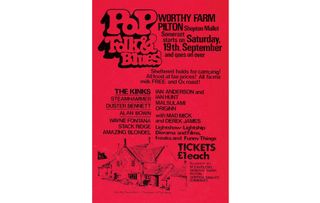
The first Glastonbury Festival in 1970 was a relatively low-key affair compared to today's multi-stage, 200,000-capacity event. That said, it still had the Kinks on the line up. The poster design was wonderfully quaint, announcing a 'Rock, Pop & Blues' event with a hand-drawn illustration of organiser M Eavis Esq's farmhouse. Groovy! Tickets were priced at £1 and included free milk, which seems very reasonable even taking account of inflation.
The 1982 Glastonbury poster
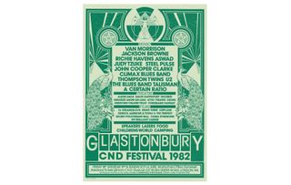
It would be several years before Glastonbury Festival adopted what could be considered a logo or recognisable branding, but the annual lineup poster quickly became its main design collateral. This outstanding design from 1982 was an early highlight. Using just two colours, it managed to pack in the Vitruvian Man, pentagrams, a radiation symbol, peacocks, flowers and the shape of the Pyramid stage without feeling overloaded with too many symbols.
The 1986 Glastonbury poster
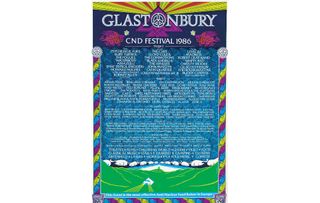
The distinctive shape of Glastonbury's main stage has long been a recognisable feature of the festival, and many of the posters since the 1980s have featured it in some form. This design from 1986 came closest to turning it into a logo of sorts, overlaying an illustration of the stage with the CND logo (see our piece on the best logos of the 1950s). By this stage, the lineup was already getting quite epic, making the poster look a little like an eye test. Speaking of which...
Get the Creative Bloq Newsletter
Daily design news, reviews, how-tos and more, as picked by the editors.
The 1989 Glastonbury poster and Glastonbury logo
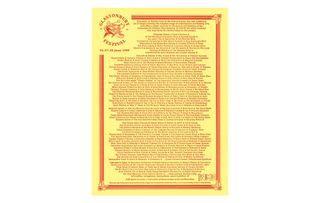
The 1989 Glastonbury poster is notable for two things. First, it introduced the main Glastonbury logo. Designed by Hilary McManus, the dancing figures motif is still used today for many of the festival's official announcements and its social media avatar.
But besides that milestone in festival branding, the poster is hardly a feast for the eyes, looking more like a district council planning notice you might find pinned up on a wall. This was an era when people would mainly see the poster as a full-page ad in NME, at which size the text would at least be legible. The line up was great. You'll just have to take my word for it.
The 1993 Glastonbury poster
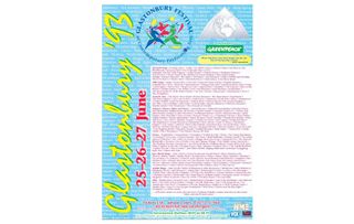
The Glastonbury logo featured prominently on the posters for the next few festivals, including this gem from 1993. Very much of its era, it threw everything on the page: multiple fonts and symbols, loads of colours and even more text behind the text behind the long line-up. This approach lasted several years.
The 2003 Glastonbury poster
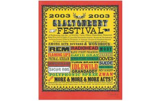
Perhaps realising that the internet would require a more visually appealing design that could be read at smaller sizes, festival organisers opted to highlight only the biggest acts in 2003. The work of Stanley Donwood, best known for Radiohead's artwork, the design adopts bigger type, bolder colours and an old showbill style, adding manicules as a new visual device. These are still used today.
Glastonbury 2020 poster
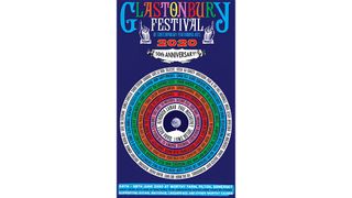
The poster design was very different in 2020, shaking up the traditional list format of line-up posters by putting the names of artists in a circle. It also introduced the logotype that would make a comeback in 2024.
Glastonbury branding today
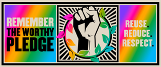
One of the things that was always so appealing about Glastonbury was that it was less corporate event than the other big music festivals in the UK. In place of Virgin, or Tenants or Carling, there were the logos of Oxfam and Greenpeace. It was welcomed that the branding was rough around the edges and often had a homemade feel.
Responding to a more digital age, the festival today communicates more regularly on social media between as well as during the events, and it's developed more consistent branding to promote initiatives like the Worthy Pledge, asking festivalgoers to commit to following a few ground rules. But this year's poster design stays true to the festivals roots in the traveller and peace movements and avoids modernising too far.
For more branding news, see the new Verizon logo.

Thank you for reading 5 articles this month* Join now for unlimited access
Enjoy your first month for just £1 / $1 / €1
*Read 5 free articles per month without a subscription

Join now for unlimited access
Try first month for just £1 / $1 / €1
Joe is a regular freelance journalist and editor at Creative Bloq. He writes news, features and buying guides and keeps track of the best equipment and software for creatives, from video editing programs to monitors and accessories. A veteran news writer and photographer, he now works as a project manager at the London and Buenos Aires-based design, production and branding agency Hermana Creatives. There he manages a team of designers, photographers and video editors who specialise in producing visual content and design assets for the hospitality sector. He also dances Argentine tango.
