New logos for sports teams and tournaments are often among the most divisive. After all, sport tends to inspire more vehement passion than, say, a fashion brand or a consumer product, and rightly so. Nevertheless, organisers may have been surprised by the scale of the backlash against the new Six Nations logo.
The new identity is intended to represent the tournament's "electrifying action" and its "vital spark of connection". But that spark has landed on the dry tinder that is social media and caught light to form a blazing pyre of derision that now threatens to engulf the men's tournament (see our pick of the best sports logos to extinguish the flames).
A post shared by Guinness Men’s Six Nations (@sixnationsrugby)
A photo posted by on
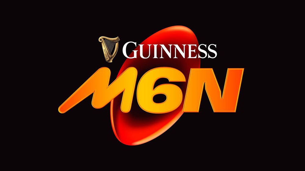
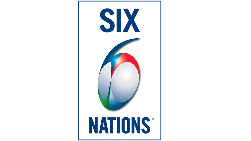
So what's so bad about the new Six Nations logo anyway? Well the clever ball in a number six has been dropped completely. Instead the design comprises an orange rugby ball that looks like it's formed from molten material extracted from the Earth's core. The type reads M6N, which sounds like a postcode or the name of a television news channel, but stands for Men's Six Nations. "The modern brand signifies the optimism fans feel when they come together at the end of winter to experience the Six Nations," we're told by organisers. "The ugliest thing I've ever seen" we're told by fans on X (Twitter), who have compared it to everything from Mars bar branding to the credits for the 1996 comedy Space Jam.
"Decision to rebrand - good. Calling it M6N with a clip art logo - weak AF," one person wrote on Instagram. "No issues having men's and women's in the title, I'm not fragile and insecure in my masculinity. But the logo looks like it should be for Crash Bandicoot," was another opinion.
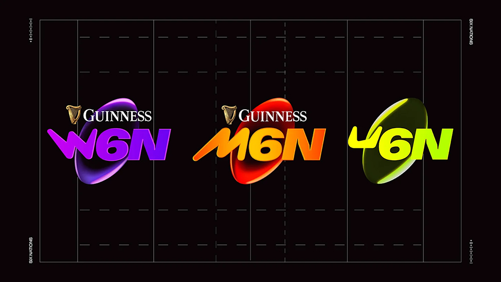
But is it really that bad? Like any new logo, it's going to a bit of getting used to, but it fits with the logos for the Women's Six Nations and the Under 20s Six Nations (U6N), creating a more consistent branding for the overall competition (I think the latter is the wildest logo. That 'U' is simply not a 'U'). And it might just be because I've been looking at for way too long, but it already seems highly memorable.
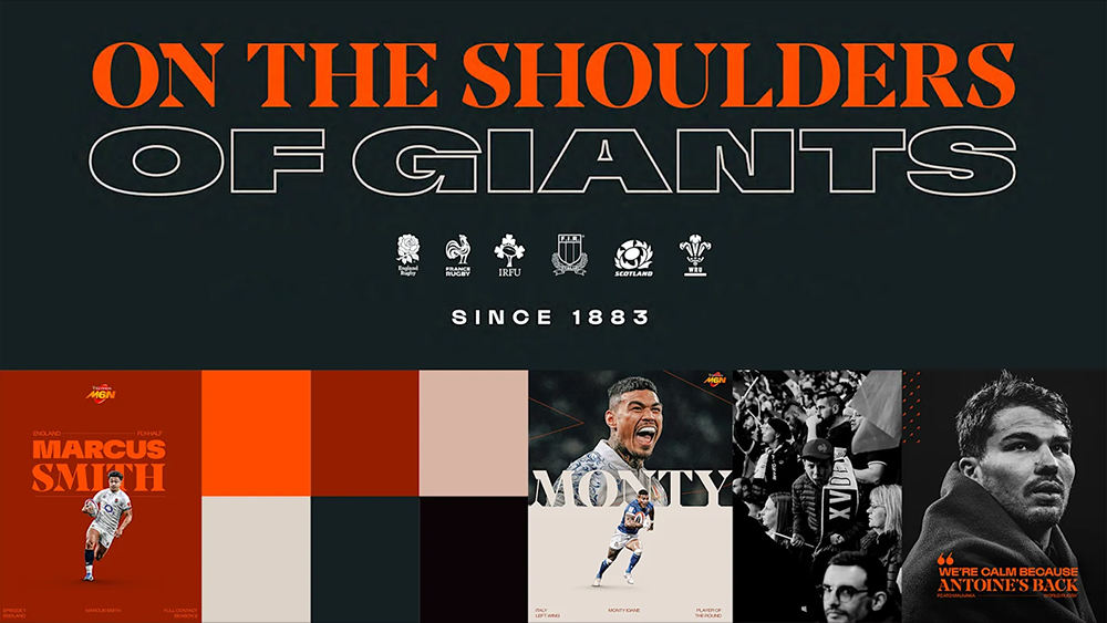
I was unsure about the random-looking shape of the bevel on the 'N', but in the context of the broader brand typeface, I think it perhaps works, making display text look bold and distinctive, particularly when combined with a serif for dual-type headers. The colours also work well as part of the overall colour palette of oranges and reds.
If the aim is to reach a new demographic, a radical departure could be just what the Men's Six Nations needed. Just like the controversial new Jaguar Type 00, it polarises, but it has people talking and it may just reach the target its after.
Get the Creative Bloq Newsletter
Daily design news, reviews, how-tos and more, as picked by the editors.
The Men's Six Nation begins in Paris with France vs Wales on 31 January, so we've got almost two months to get used to it.
For more sporting logo inspiration, see the Kansas Chiefs logo history and the UEFA logo history.

Thank you for reading 5 articles this month* Join now for unlimited access
Enjoy your first month for just £1 / $1 / €1
*Read 5 free articles per month without a subscription

Join now for unlimited access
Try first month for just £1 / $1 / €1

Joe is a regular freelance journalist and editor at Creative Bloq. He writes news, features and buying guides and keeps track of the best equipment and software for creatives, from video editing programs to monitors and accessories. A veteran news writer and photographer, he now works as a project manager at the London and Buenos Aires-based design, production and branding agency Hermana Creatives. There he manages a team of designers, photographers and video editors who specialise in producing visual content and design assets for the hospitality sector. He also dances Argentine tango.
