We still haven't got over the last HBO MAX rebrand, which controversially dropped the 'HBO' part of the name, leaving us with 'Max' alone. But reports now suggest that the steaming service may be planning to put a bit more HBO back into its branding – just not in the way that would make most sense.
The idea of dropping the HBO from Max was to communicate that the streaming platform is more than one network's library alone – it also hosts the libraries of Warner Bros, Discovery, Cartoon Network, TBS, TNT. But the move lost it a lot of brand recognition, which the latest rumoured change might not be able to make up for.
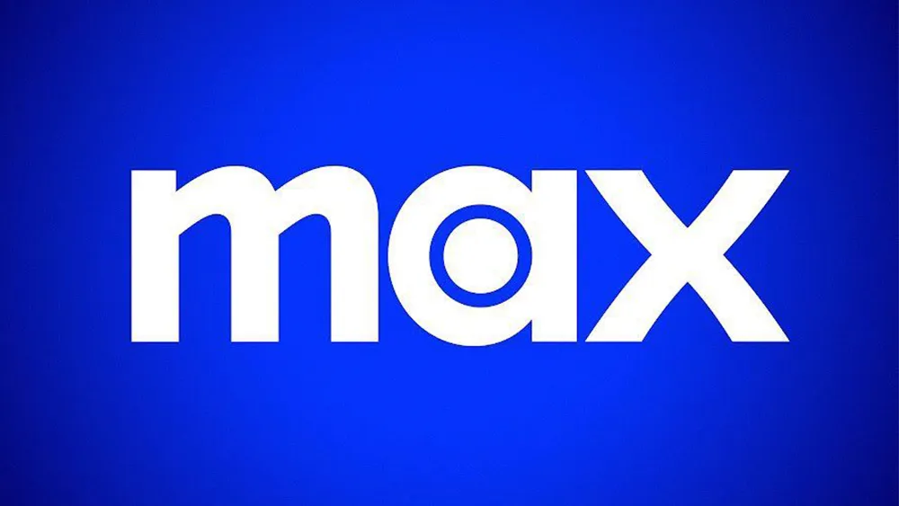
The HBO logo (left) and a mock up of what the new Max logo could look like (Image credit: Warner Bros. Discovery / Future)
It's not a name change that's being discussed this time, but a change to the colour palette. Bloomberg's Screentime newsletter claims the current blue will be "replaced by something more neutral, likely some combination of black and white". So Apple TV then?
Latest Videos From Creative Bloq
Bloomberg says the plans aren’t final, but suggests that the new chief marketing officer, former Netflix executive Shauna Spenley, is keen to make the change, which would bring the MAX brand in line with HBO's own black and white palette. So it's not HBO MAX anymore, but it will have HBO's colours in addition to the dot from the HBO 'O'.... why not just get it over with and call it HBO Max?
The rebrand to Max got roasted on social media back in 2023. Peacock even threatened to call itself Cock. And it seems adopting HBO's colour palette isn't going to make people forgive.
"Nothing will ever undo the massive, hilarious, extremely dumb and unforced error of deliberately giving up the well-known, loved and powerful HBO branding. onw person wrote on BlueSky. "Just go back to being HBO. Why waste decades of brand recognition? 'Max' looks like a dog treat subscription service," someone else wrote. "Why are companies so obsessed with being so boring?" another person wants to know.
Joe is a regular freelance journalist and editor at Creative Bloq. He writes news, features and buying guides and keeps track of the best equipment and software for creatives, from video editing programs to monitors and accessories. A veteran news writer and photographer, he now works as a project manager at the London and Buenos Aires-based design, production and branding agency Hermana Creatives. There he manages a team of designers, photographers and video editors who specialise in producing visual content and design assets for the hospitality sector. He also dances Argentine tango.
You must confirm your public display name before commenting
Please logout and then login again, you will then be prompted to enter your display name.