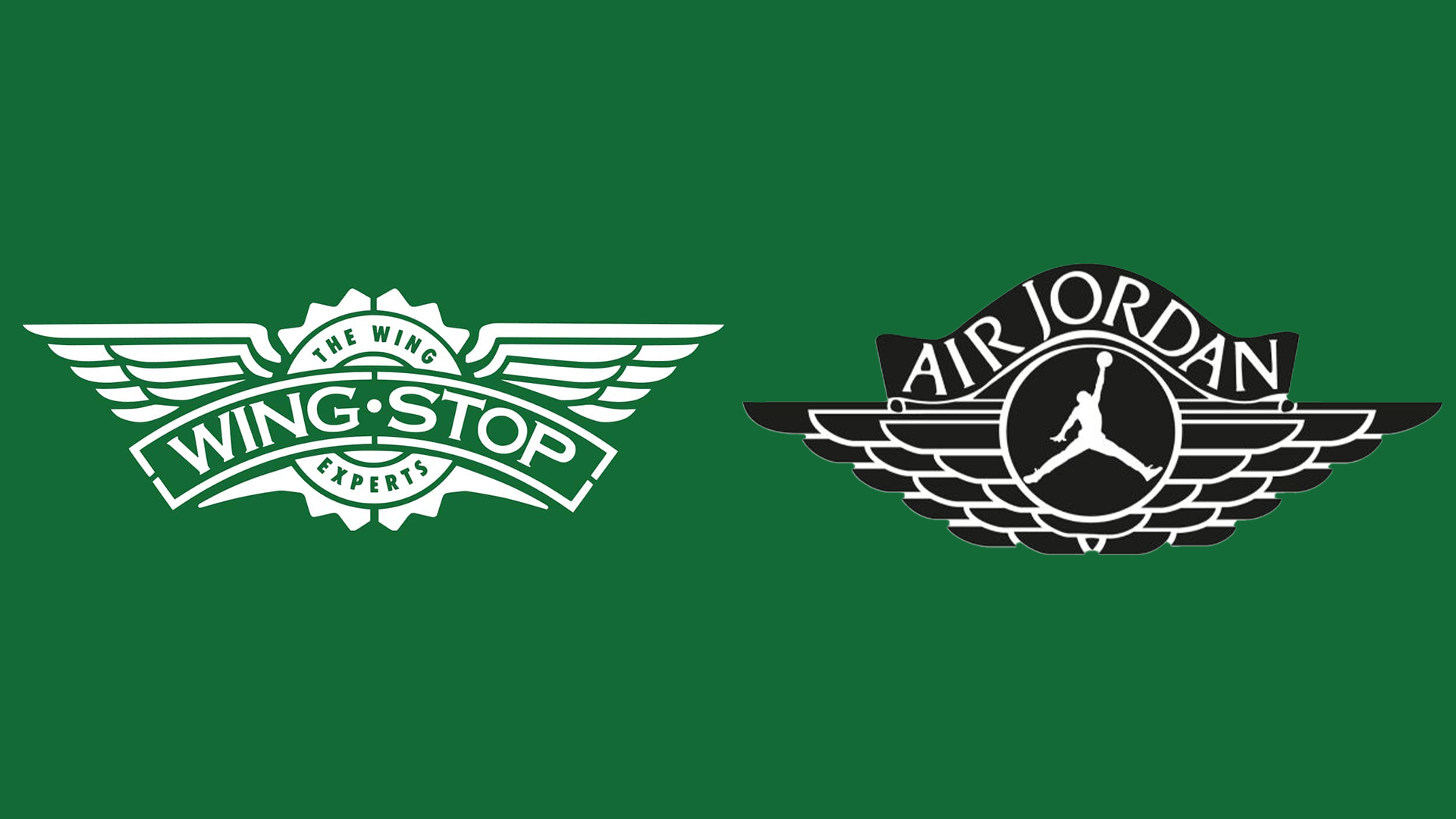
People are still mistaking this Nike Air logo for the Wingstop emblem
But the fast food chain had the last laugh.

Foodies and sneakerheads have been perplexed for years by the bizarre similarity of these completely unrelated logos. While there are countless big brands with ridiculously similar logos, one of the most unexpected cases involves the iconic Air Jordan sneaker and the humble fast food chain, Wingstop.
While on closer inspection, the two intricate winged logos have their differences, it hasn't stopped fans from poking fun at the similar designs. What started as an internet meme became a golden marketing opportunity for Wingstop and although there's no evidence of it becoming a reality, I'm still waiting for the official Nike collab to drop.
Realized today that Wingstop has a low-key Nike + Retro Air Jordan look with their branding.Also the lemon pepper wings are incredible pic.twitter.com/SYz60fG62CJuly 16, 2023
While the general composition of the logos is fairly similar, the design differences are undeniable. The retro Air Jordan logo features a basketball framed by its signature wordmark, alongside a tiered wing design, while the fast food chain features a flat, emblem-style logo.
Capitalising on the meme, Wingstop went so far as to commission custom 'Lemon Pepper 1's' from sneaker customiser The Shoe Surgeon. The green and white low tops feature the Wingstop logo alongside tactile embroidery to mimic the texture of the fast food chain's signature fried chicken. Given away to fans as part of a promotional competition, the custom kicks were a playful way to embrace the viral logo mixup, but for now, it looks like this is the closest we're going to get to an official Wingstop x Nike Air Jordan collab.
.@wingstop has officially unveiled its Lemon Pepper 1s 😋🔥👟🍗 pic.twitter.com/W0mr5EN8oYJune 3, 2022
For more logo design news, check out the Iowa school logo dispute that's aiming to settle who really deserves the ‘D’. If you're after more bizarre branding news, take a look at the new Nottingham Building Society logo that everyone seems to hate – even the city's official Robin Hood actor (and yes, that's a thing).
Get the Creative Bloq Newsletter
Daily design news, reviews, how-tos and more, as picked by the editors.

Thank you for reading 5 articles this month* Join now for unlimited access
Enjoy your first month for just £1 / $1 / €1
*Read 5 free articles per month without a subscription

Join now for unlimited access
Try first month for just £1 / $1 / €1

Natalie Fear is Creative Bloq's staff writer. With an eye for trending topics and a passion for internet culture, she brings you the latest in art and design news. Natalie also runs Creative Bloq’s Day in the Life series, spotlighting diverse talent across the creative industries. Outside of work, she loves all things literature and music (although she’s partial to a spot of TikTok brain rot).
