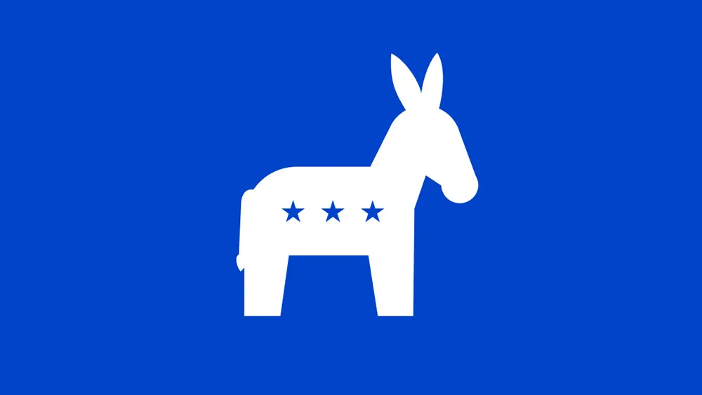
It seems the US Democratic Party has a new logo, or at least a new profile pic on social media. The design is instantly familiar because a donkey icon has long been associated with the party, even if it's never been the Democrats' official logo, but the move is still stoking a bit of controversy.
As the party organises its opposition to Donald Trump's presidency, was a new donkey logo really a priority? Some supporters are wondering. But for all the criticism, a new visual identity was needed, even if it isn't one of the best logos of all time.
The apparent new Democrats logo is being mocked by Republicans for looking like a piñata and by some Democrats for seemingly giving the party a ratings drop from four stars in previous designs to just three (just like the Republicans' elephant).
Latest Videos From Creative Bloq
Some people are reading perhaps too much symbolism into the fact that donkey is now facing to the right rather than left, while other Democrats are unhappy the absence of the colour red. Blue is considered the colour of the Democrats, but some feel that losing the red is ceding the US flag to the Republicans. Others see the design as another example of trend towards the "oversimplification of logos".
What's annoying Democrats most is that that the party would spent any time making a new logo at all. "The secret to reviving the democratic party: more donkeys," one person joked on X.
Sure, a new logo might not seem the most urgent thing the Democrats should be putting effort into, but a party needs a visual identity – perhaps any visual identity – if it's to regroup and reorganise after an election defeat. As we've seen with the new Green Party logo in Canada, new political branding can provide fresh impetus for supporters to rally behind.
But it's hard to get right. A completely new design for an established party that was founded almost 200 years ago would risk turning back on a legacy, alienating grassroots supporters and coming across as unfamiliar. Refreshing an existing icon is a safer bet.
Get the Creative Bloq Newsletter
Daily design news, reviews, how-tos and more, as picked by the editors.
The most recent Democratic Party logo (left) and a previous donkey election emblem (Image credit: Democratic Party)
A donkey might not seem the most fearsome animal to take on the Republican's marauding elephant, but it is familiar, and it has more character than a letter 'D' in a circle, which is what the Democrats have been using as their official logo. And don't forget: donkeys can deliver a powerful kick.
Why is the Democrat logo a donkey anyway?
Strangely, the traditional icons of the Democrats' donkey and the Republicans' elephant seem to have been heavily inspired by the same cartoonist. And the animal mascots weren't exactly intended as compliments.
The logo of the Democratic Party in some states is still a rooster, but the party's association with donkeys goes way back to Andrew Jackson, the seventh US president, who was dubbed a "jackass" by his enemies. Apparently, the Democrats liked the term's common-man implications. But it was Thomas Nast, a political cartoonist at Harper’s Weekly from 1862 to 1886, who seems to have popularised the donkey as a representation of the party.
A two-horse race. The official Republican Party logo and this previous Democratic Party donkey look almost comically similar (Image credit: Democratic Party / Republican Party)
Nast supported the Democrats himself, but he ridiculed both political parties in his wood engravings, which portrayed American politics as a chaotic menagerie, with an elephant for the Republicans and a donkey for the Democrats. It's strange that both parties ended up embracing these satirical representations. It's not clear if they didn't get the joke or just decided to co-opt the insults.
(Image credit: Harper & Brothers)
For more of the week's branding news, see the new Audi billboards that show how to sell an electric car properly without having to resort to the White House lawn, and don't miss the debut appearance of the controversial Jaguar Type 00 at Paris Fashion Week. For fictional branding that's as effective as real-world examples, see our article on Severance prop design.
Thank you for reading 5 articles this month* Join now for unlimited access
Joe is a regular freelance journalist and editor at Creative Bloq. He writes news, features and buying guides and keeps track of the best equipment and software for creatives, from video editing programs to monitors and accessories. A veteran news writer and photographer, he now works as a project manager at the London and Buenos Aires-based design, production and branding agency Hermana Creatives. There he manages a team of designers, photographers and video editors who specialise in producing visual content and design assets for the hospitality sector. He also dances Argentine tango.
You must confirm your public display name before commenting
Please logout and then login again, you will then be prompted to enter your display name.