The iconic design is back for the Oasis 2025 tour.
(Image credit: Oasis)
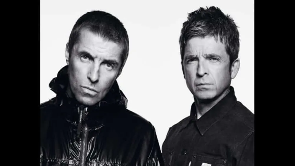
With the Oasis reunion confirmed, the band could have gone with a new logo design, or it could have gone with the Noel Gallagher-designed logo from the late 90s. But the Gallagher brothers have seen sense and gone with the design that will always be most associated with the band.
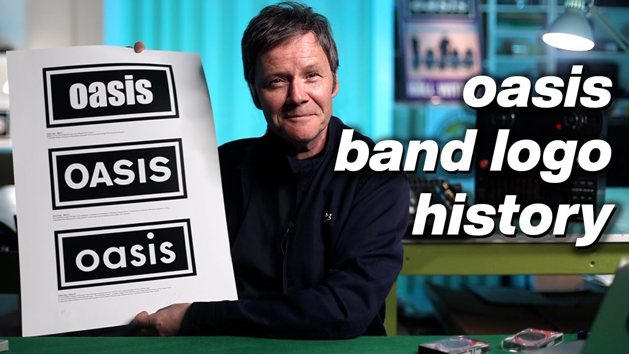
The Oasis logo that accompanied the band's initial rise to fame features the band's name in white text on a black rectangle with white and black borders. Adorning their first three albums, it was simple, and effective. And it looks just as bold promoting the 2025 reunion tour dates (for more inspiration, see our pick of the best band logos).
Image 1 of 2
The iconic Oasis logo is back(Image credit: Oasis)
The Oasis logo used between 1999 and 2005(Image credit: Oasis)
The iconic Oasis logo was designed by Brian Cannon of Microdot back in 1993 when the band was still unknown. It wasn't the first logo the band had: Noel had previously commissioned Tony French, a friend of Liverpool band the Real People, to create the Oasis 'Union Jack Swirl’ for a demo tape. French has used Quark Xpress to distort the image of a union flag and add the band's name in Univers Black italic.
After the band was signed to Creation Records, they needed a more versatile design that would work in different types of media, including black and white press ads. That's where Cannon came in. Having previously worked for The Verve, he took charge of all Oasis artwork. He took the inspiration for his logo design from the boxed Decca Records logo on the Rolling Stones' second album. Cannon talks about the design in the video below.
After a change in the band's lineup, Oasis moved away from the iconic logo for Standing on the Shoulders of Giants in 2000. The band adopted an idea that Noel sketched himself (quite the designer, Noel more recently created a font for Manchester City) and passed to Creation Records' design team based around type with a horizontal line through the band's name, a little like the Asus logo. A variation of the Cannon's design returned for Don't Believe the Truth in 2005.
Image 1 of 2
The first Oasis album, Definitely Maybe, and the Rolling Stones album that inspired the logo design(Image credit: Creation Records / Decca Records)
Later Oasis albums used variations on the iconic design(Image credit: Oasis)
Oasis have announced that they will play a 14-date tour of the UK and Ireland in July and August 2025. Shows will be held in Cardiff, London, Manchester, Edinburgh and Dublin, and tickets go on sale at 9am on 31 August.
Joe is a regular freelance journalist and editor at Creative Bloq. He writes news, features and buying guides and keeps track of the best equipment and software for creatives, from video editing programs to monitors and accessories. A veteran news writer and photographer, he now works as a project manager at the London and Buenos Aires-based design, production and branding agency Hermana Creatives. There he manages a team of designers, photographers and video editors who specialise in producing visual content and design assets for the hospitality sector. He also dances Argentine tango.