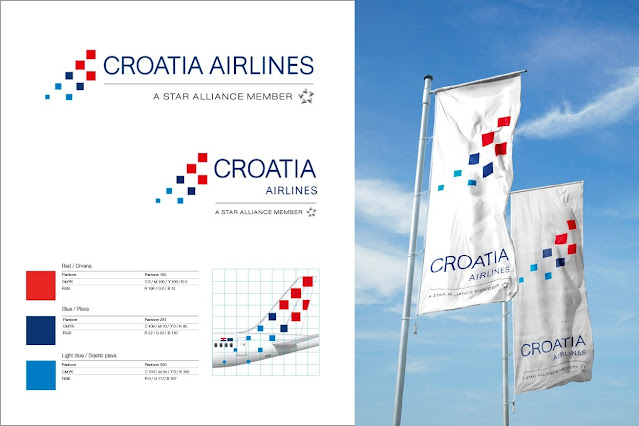
Croatia Airlines has a new logo, and it's generating some strong opinions. The graphic part of the new design is a bolder, more striking design than it's predecessor, and it's similar to the airline's existing tail design with its sequence of pixel-like squares inspired by the shield on the Croatian flag.
But where the design falls apart is when it's placed on planes themselves, which is kind of an important application for the best airline logos.
The old Croatia Airlines logo (top) and the new logo design (bottom) (Image credit: Croatia Airlines)
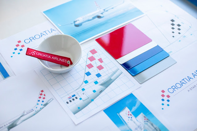
Designed in house, the new logo is intended to be a simplification and modernisation of the previous design. It's still clearly influenced by the Croatian flag, but it reduces the number of squares and adds a lot more white space. The logotype remains largely the same but a is a shade darker.
Latest Videos From Creative Bloq
While the Croatian flag features red and white squares, the new Croatia Airlines logo adds squares in two shades of blue, which is present in other elements in the national flag. The whole design is intended to be organised in such a way as to represent the tail of a plane. But there's a problem. Aeroplanes have windows. And squares look like windows. People are saying that because of the different colours, the shape of the logo, and the placement one the planes themselves, some of the design gets lost when used in situ.
The new Croatia Airlines logo on a plane (Image credit: Croatia Airlines)
According to the company, "the new design, which is based on clear and simple forms, ensures even better visibility and recognition, while the tail of the aircraft is harmonised with the sign itself and becomes the most recognisable part of the company's visual identity. Not least, the sign and logo are compositionally balanced with the Star Alliance logo, through a modern design in which the squares on the logo are placed so as to form a tail of the aircraft, which certainly sends a clear message. In short, the new design is fully focused on the future, while Croatia Airlines remains, according to renowned experts, one of the best brands in world aviation."
Image 1 of 5
(Image credit: Croatia Airlines)
(Image credit: Croatia Airlines)
(Image credit: Croatia Airlines)
(Image credit: Croatia Airlines)
(Image credit: Croatia Airlines)
However, not everyone is convinced. Several people commenting on the news on the aviation site EX-YU Aviation think that half of the logo is almost invisible when it appears on planes. In mock ups of how the the airline's A220-100 and A220-300 will look, the red squares of the logo are clearly visible, but the blue squares are harder to spot because they fall below the line of the logotype and below the planes' windows.
"A dot between two windows is a miss, it is too busy in the front and it creates confusion what is what," one person wrote. "Creating a curved surface shouldn't be a problem for an experienced head of design," one person suggested. There is a chance it will look clearer in 3D when seen from the ground. Maybe.
Get the Creative Bloq Newsletter
Daily design news, reviews, how-tos and more, as picked by the editors.
Joe is a regular freelance journalist and editor at Creative Bloq. He writes news, features and buying guides and keeps track of the best equipment and software for creatives, from video editing programs to monitors and accessories. A veteran news writer and photographer, he now works as a project manager at the London and Buenos Aires-based design, production and branding agency Hermana Creatives. There he manages a team of designers, photographers and video editors who specialise in producing visual content and design assets for the hospitality sector. He also dances Argentine tango.