We've covered a lot of airline rebrands here at Creative Bloq, and new logos in the sector tend to generate strong opinions, especially when it's a country's flag carrier that's involved. The Air India and Air Croatia rebrands were two recent ones. But we've seen few examples that have been torn apart as harshly as the new Aeroméxico logo.
Mexico's biggest airline is rolling out a rebrand that aims to modernize its identity and visual language with tweaks to both its logotype and its icon Aztec eagle warrior symbol. But some people are making unfortunate comparisons, suggesting that it's ditched a proud warrior for Birdman, a sensuous cowboy, or even worse.... El Chavo del 8. One of the best airline logos it ain't.

The new logo is the most significant redesign for Aeroméxico since 1998, and it comes as the airline celebrates its 90th anniversary. That milestone could be as good as time as any for a rebrand, but this one seems strangely timed when Mucho overhauled the company's wider visual identity only recently.
Article continues belowThe company says the new design aims to inject dynamism, warmth and modernity to the brand and reflect a more contemporary Mexico. I think the new brand colour palette hits the mark there, taking the predominant blue a few shades darker and swapping the red previously used on livery for fuchsia, which feels more modern and also distinguishes the brand from a whole bunch of other airlines (British Airways, Air France and American Airlines all use the blue and red from corresponding national flags).
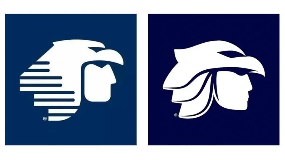
Less convincing is the redesign of the logo itself (it isn't up to the standard of the best logos out there). The previous emblem drew from traditional Mexican art, where geometric shapes are more common than organic ones. That gave the logo a distinct look that had become iconic. The new design aims to make the human head look more realistic, even giving it lips. But the eagle becomes less visible as a result, and people are making all kinds of unfortunate comparisons.

As well as being likened to the popular comic character El Chavo del Ocho, the new face of the airline has been compared to the Knights of the Zodiac, a cyclist with long hair, and much more besides. "He's not an eagle warrior anymore, but Prince Charming from Shrek!" one person wrote on YouTube. "There was no need to touch something so incredibly memorable," the designer Karina Soto Martínez wrote on Instagram. "Why didn't they just put it in gold. Why did they want a cowboy with keratined hair?"
One of the most in-depth responses to the new logo has come from Marco Creativo, a Spanish video creator with a popular YouTube channel dedicated to graphic design. As well as picking apart the new symbol, he identifies what he calls "beginner errors" in the typography of the new logotype, including bad kerning and a lack of overshoots to optically adjust the type, particularly on the curves in the Os.

Marco takes his analysis all the way back to the airline's original eagle design from 1934 and the addition of the Aztec eagle warrior in 1960. One of his conclusions is that the redesign might have made sense out of context but not when considering the airline's legacy and its place in Mexican culture, and I have to agree. The new Birdman/cowboy's softer factions could be considered warmer and more contemporary in many contexts, but sometimes there's more warmth in the timelessness of a iconic design even if it's technically colder.
For more logo design controversies, see the new unreadable logo for the fashion designer Katarzyna Konieczka and Meghan Markle's logo rejection.

