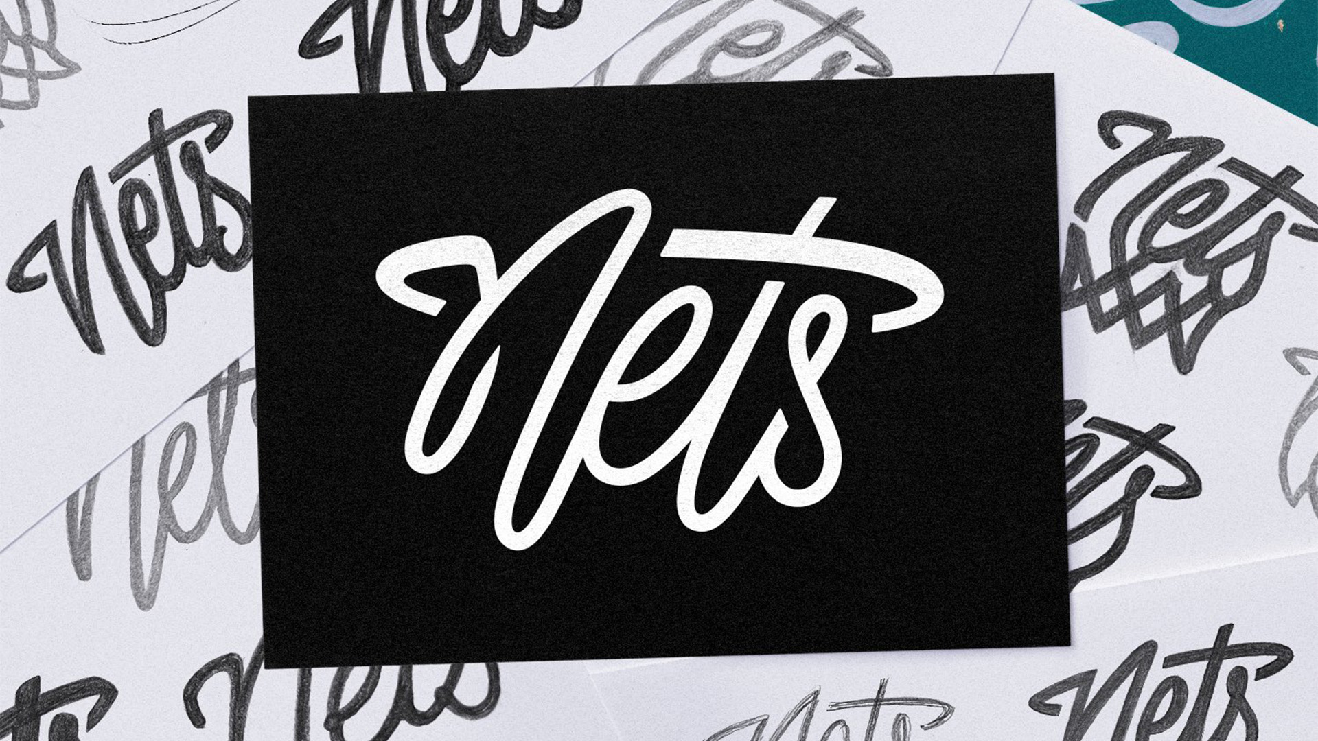
I love the subtle design detail in the new Brooklyn Nets logo
It’s a stylish addition to the team's identity.

Sign up to Creative Bloq's daily newsletter, which brings you the latest news and inspiration from the worlds of art, design and technology.
You are now subscribed
Your newsletter sign-up was successful
Want to add more newsletters?
Basketball team the Brooklyn Nets have unveiled a brand new logo, and gauging by fan reactions it's safe to say it's a slam dunk. Receiving praise from supporters and design fans alike, the new secondary logo design features "nods to Brooklyn’s unique style" with a stylised cursive wordmark that's contemporary and clean.
Sports logos are more than just a design – they're an emblem of a fanbase's identity – so it's integral that a new logo wins the hearts of supporters. With its crafty hidden design and stripped-back look, the new Nets logo is a stylish expansion of the team's already iconic identity.
Introducing: our brand new official Brooklyn Nets secondary logo. The logo is the result of a 2+ year long process - from researching, to hand-drawing and crafting this mark after dozens and dozens of iterations. A standalone NETS swish wordmark… with a Brooklyn flair! pic.twitter.com/WrD2qOGB1HJuly 10, 2024
According to Jessie Kavana, art director for the Brooklyn Nets, the new design was part of a "2+ year long process". The "Nets Thread" logo acts as a sleek standalone wordmark that's "stylised for the borough", embracing the team's New Jersey roots. The swooshing cursive font gives the design a sense of dynamism, forming a subtle basketball hoop design integrated into the letter "t".
Article continues belowDesign fans on the subreddit r/DesignPorn shared their praise for the hidden design, with one user commenting "It’s just literal enough to kinda imply it is but abstract enough to not make it tacky". Another called it a "perfect logo", adding "Simple and straight to the point. Perfect 10". Similarly high praises were sung on X, where one fan commented "This should be the primary logo," while another claimed: "This is extremely good. The best wordmark I’ve seen in ages."
A New Set for Nets WorldDive into the details ✍️ https://t.co/3pEOEbn0sA pic.twitter.com/5eBfa2SR2HJuly 10, 2024
For more sporting design inspiration, check out the brilliantly simple new logo for the National Football Museum. For more branding news, check out basketball star A'ja Wilson's new Nike logo that divided fans.
Sign up to Creative Bloq's daily newsletter, which brings you the latest news and inspiration from the worlds of art, design and technology.

Natalie Fear is Creative Bloq's staff writer. With an eye for trending topics and a passion for internet culture, she brings you the latest in art and design news. Natalie also runs Creative Bloq’s 5 Questions series, spotlighting diverse talent across the creative industries. Outside of work, she loves all things literature and music (although she’s partial to a spot of TikTok brain rot).
