It’s the banking brand’s biggest multi-channel ad campaign to date.
(Image credit: Lloyds)
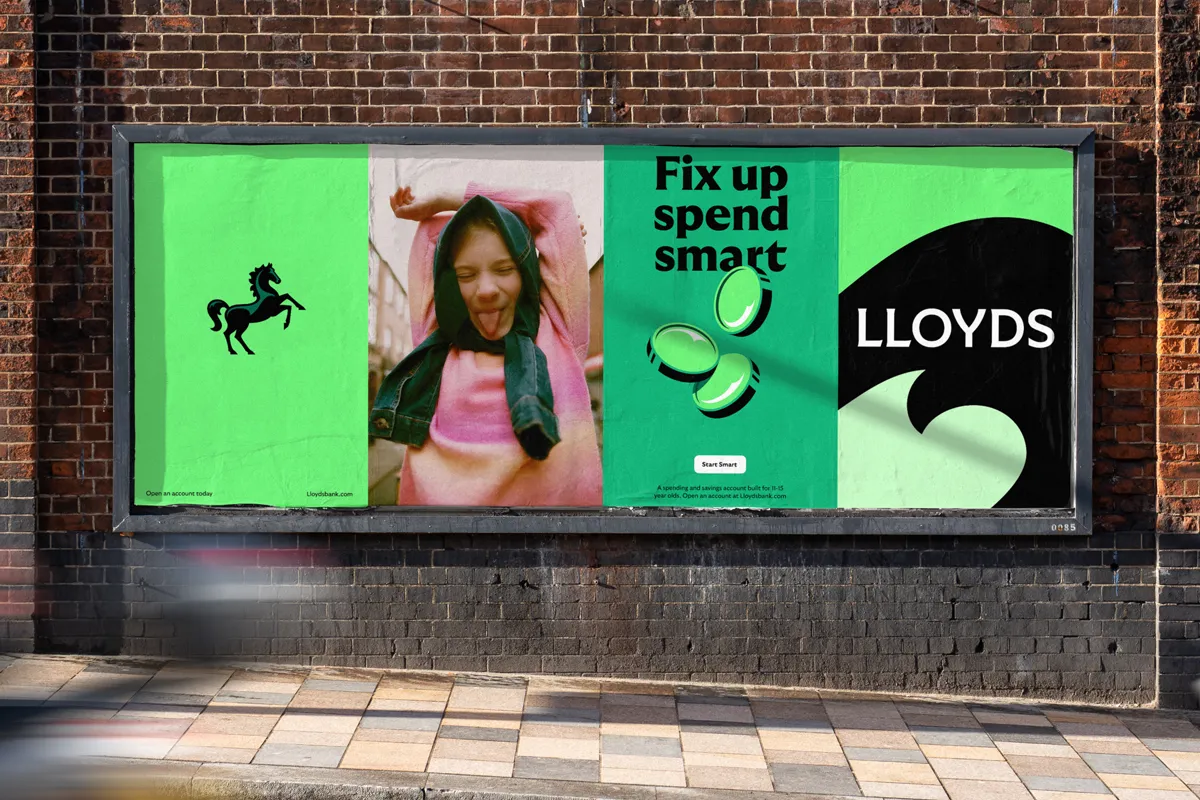
Lloyds Bank has unveiled its biggest ad campaign to date following the launch of its revamped mobile app. Evolving for the digital era, Lloyds' latest campaign is accompanied by fresh visuals including an invigorated colour palette, sharpened tone of voice, new typography and dynamic visual assets.
When we think of the best rebrands throughout history, we often think of a grand metamorphosis, yet Lloyds' slow rollout of its new identity has displayed a more nuanced and considered approach. Punctuating its strong new look with an equally powerful campaign, Lloyds stands out as a front-runner in the financial sphere, with heart and community at its core.
(Image credit: Lloyds)
Created by Wolff Olins in collaboration with adam&eveDDB and Zenith, the campaign centres around the new brand positioning 'Lloyds moves everyone forward’, reflecting the app's innovation and Lloyds' wider brand experience. The powerful campaign combines over 500 unique assets, spanning the "app, campaign executions and activations" alongside digital strategy including "AV, audio, outdoor, social, digital, influencer and gaming channels."
Built upon the revitalised forward-facing logo launched earlier this year, the new motion assets take inspiration from the powerful movements of the horse, mimicking gallops, flicks and canters. The dynamic motion principles are complemented by a broadened colour palette and a custom sans serif typeface created in collaboration with Grilli Type.
For Wolff Olins' senior creative director, Tom Carey, the project captures a unique sense of British character. "We worked closely with the Lloyds Design teams to make the brand more flexible, expressive and effective - and we're all excited to see it come to life. Tonally, that sense of Britishness has been brought to the fore and with it a touch of humour. It’s still the Lloyds we know and love, but redesigned for the future: bolder, wilder and with a charming British twist."
Miranda Hipwell, CEO at adam&eveDDB added: “It’s been a privilege to partner with Wolff Olins, Zenith and the Lloyds team to move the brand forward whilst staying true to its DNA. This new, totally integrated campaign is the biggest yet and marks a fresh creative direction - bringing a little humour and levity, all grounded in the effortless power of the app experience.”
The visual refresh coincides with Lloyds' latest ad campaign ‘The Power to do it all’. Placing "the power of finance in people’s hands", the campaign reflects the real-world benefits of Lloyds' innovative features, taking a personable approach to advertising.
Get the Creative Bloq Newsletter
Daily design news, reviews, how-tos and more, as picked by the editors.
For more inspiring designs, check out JKR's rebrand for Chime which proves financial branding doesn’t have to be boring. If you're after some logo inspiration that's as iconic as the Lloyds horse, take a look at thesuper minimalist Deutsche Bank logo that has a surprising meaning.
Thank you for reading 5 articles this month* Join now for unlimited access
Natalie Fear is Creative Bloq's staff writer. With an eye for trending topics and a passion for internet culture, she brings you the latest in art and design news. Natalie also runs Creative Bloq’s Day in the Life series, spotlighting diverse talent across the creative industries. Outside of work, she loves all things literature and music (although she’s partial to a spot of TikTok brain rot).