That 'underwhelming' Harris x Walz logo is more nuanced than you might think
It’s a symbol of authority in a climate of uncertainty.
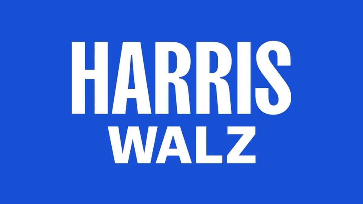
Democratic Party candidate Kamala Harris has unveiled her new logo after announcing Minnesota Governor Tim Walz as her running mate in the upcoming election. While on the surface the Harris x Walz logo appears plain and practical, underneath it stands as a symbol of strength, paying homage to the women who paved the way before her.
When we think of the best logos of all time, there's no formula for achieving an iconic design, what's integral is that it must speak to the viewer through commanding visuals alone. Despite the backlash (and some gentle mockery from graphic designers), the Harris x Walz logo delivers exactly what's required of it – class and authority in a climate of uncertainty.
A post shared by Kamala Harris (@kamalaharris)
A photo posted by on
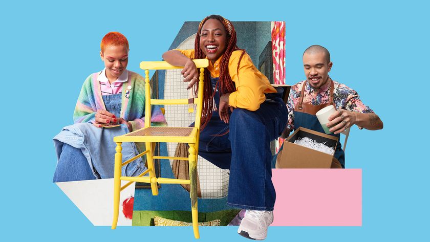
The logo itself is a bold yet practical design featuring a clean, capitalised typeface that appears in a patriotic blue and white colour palette, as well as an authoritative black and white monochromatic style. Kamala's supporters may notice that the campaign has a certain subdued appeal in comparison to the presidential candidate's old branding created by Wide Eye, which features a brighter palette of yellows and purples and a more visually dynamic design. While the 'Kamala Harris for the People' campaign marked an era of innovation, the new Harris x Walz logo chooses a more subtle design approach while maintaining the nuance of the old campaign.
Noted by Fast Company, Kamala's old campaign was created as a nod to U.S. congresswoman Shirley Chisholm, a pioneering black woman from New York who made history by becoming the first woman to run for a major party presidential nomination in 1972. Kamla's campaign has continued to sport a bold, capitalised typeface similar to Shirley's 'Unbossed and Unbought', campaign slogan – a striking font that the Harris campaign refers to as "Fearless Medium" and "Fearless Bold".

Undoubtedly, the Harris x Walz logo has a more grounded feel, drawing on the subdued design of the Biden campaign. Beneath its practical design, it stands as an evolution from Biden's Democratic Party while honouring an important figure in America's political history. Without feeling derivative, it's a powerful homage that signifies a revitalised yet secure future for the Democrats. That being said, it didn't stop creatives on the r/graphic_design subreddit from offering their own logo alternatives – it seems Kamala can't escape Charli XCX's brat branding.
Don't worry guys, I fixed it from r/graphic_design
It's been a chaotic electoral race so far, with Biden eventually bowing out to make way for Ms Harris (strikingly commemorated in this iconic Time Magazine cover design). Building a presidency-ready brand in 24 hours is no mean feat, proving that Kamala is a fierce candidate capable of adapting to such a tumultuous presidential race.
Get the Creative Bloq Newsletter
Daily design news, reviews, how-tos and more, as picked by the editors.

Thank you for reading 5 articles this month* Join now for unlimited access
Enjoy your first month for just £1 / $1 / €1
*Read 5 free articles per month without a subscription

Join now for unlimited access
Try first month for just £1 / $1 / €1

Natalie Fear is Creative Bloq's staff writer. With an eye for trending topics and a passion for internet culture, she brings you the latest in art and design news. Natalie also runs Creative Bloq’s Day in the Life series, spotlighting diverse talent across the creative industries. Outside of work, she loves all things literature and music (although she’s partial to a spot of TikTok brain rot).
