Jaguar knows its bold new logo won't please everyone
The sports car brand says it's "not afraid to polarise."
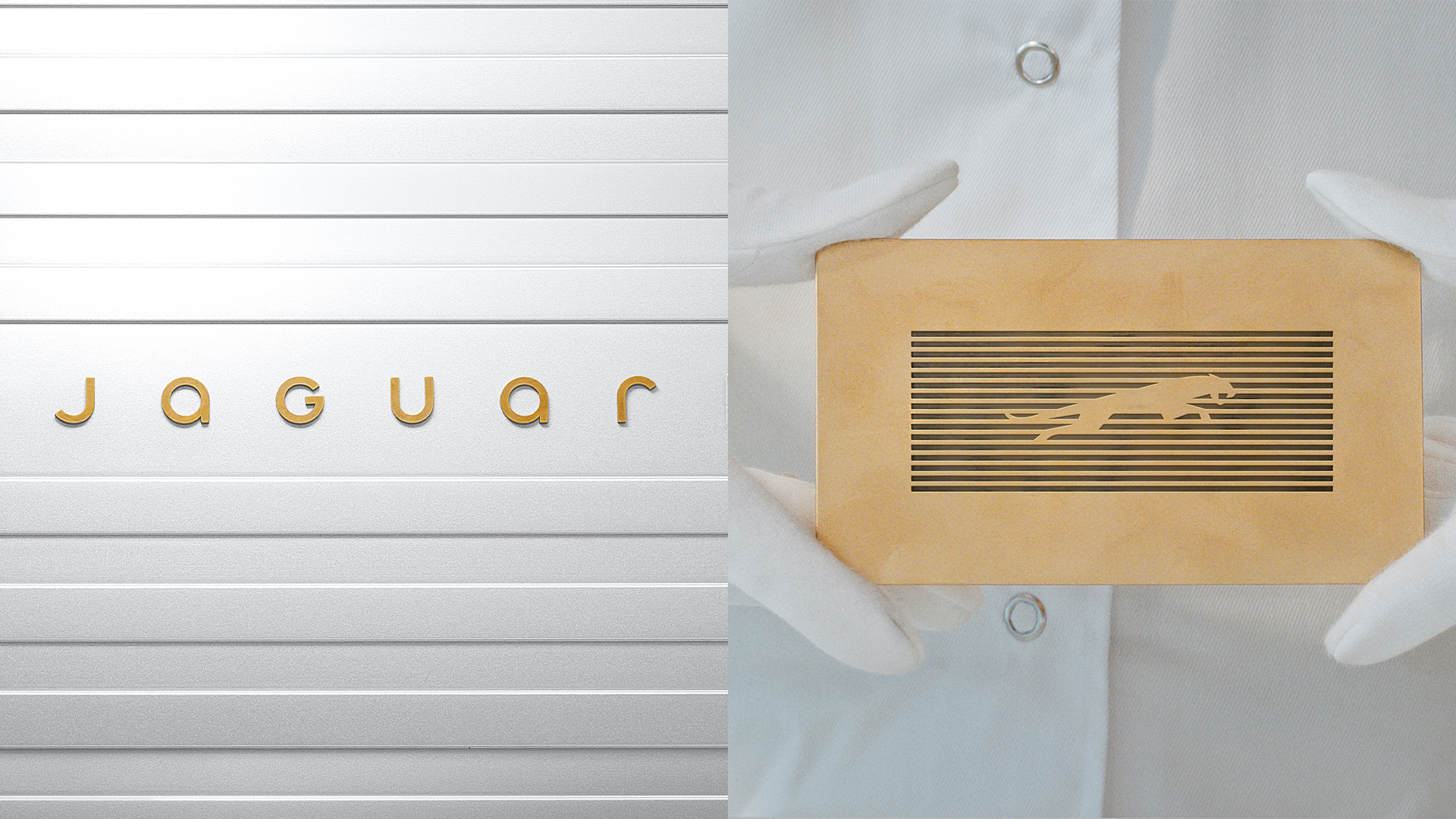
We've seen a huge amount of new car logos hit the road over the last few years, with everyone from the likes of Kia to Rolls-Royce debuting new identities. And now, Jaguar has presented what might be the boldest reimagining yet, complete with a brand new logo, wordmark and typeface.
During a media briefing today, Jaguar unveiled what it calls an "exuberant, modernist, and compelling" new look. And perhaps anticipating the controversy such a comprehensive rebirth might prompt, the brand added that when it comes to its visual identity, it is "not afraid to polarise". So while the new wordmark, which combines upper and lowercase letters might look like one of the best logos for some, it could prove too much to stomach for others.
"A new era begins today for Jaguar," the brand announces. "A completely transformed Jaguar brand recaptures an ethos to Copy Nothing that can trace its roots back to the words of its founder, Sir William Lyons. Jaguar’s transformation is defined by Exuberant Modernism, a creative philosophy that underpins all aspects of the new Jaguar brand world. It embraces bold designs, unexpected and original thinking, creating a brand character that will command attention through fearless creativity." And in a further acknowledgement that the logos might not please everyone, Jaguar's managing director Rawdon Glover insists the brand is "always at its best when challenging convention."
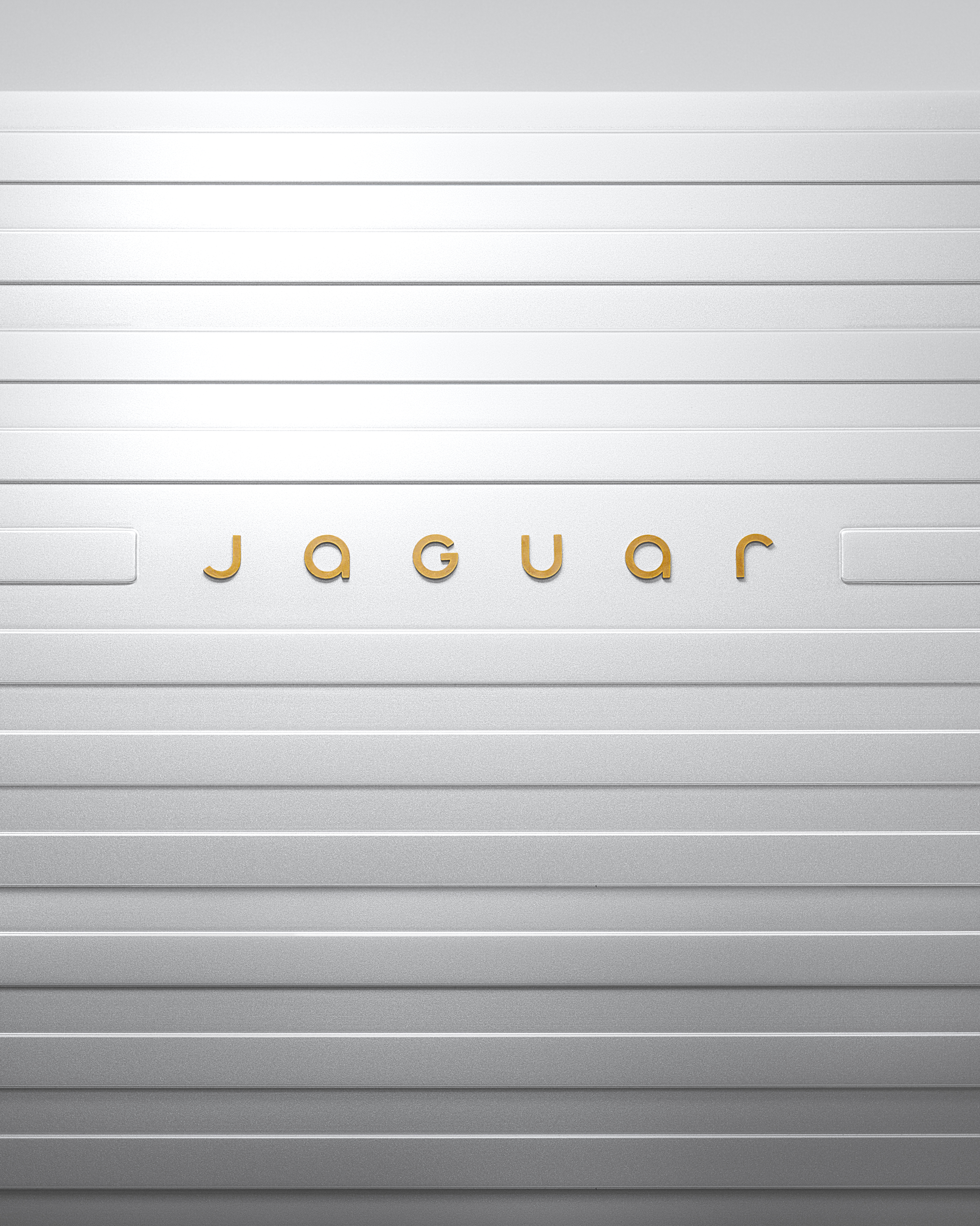
Article continues belowAt the heart of the new look is two new logos. Most notable is the minimal new wordmark which, with its slim, curved letters, somewhat resembles the logo for the Dune movies. Jaguar calls the wordmark "a powerful celebration of modernism – geometric form, symmetry and simplicity – demonstrating the unexpected by seamlessly blending upper and lowercase characters in visual harmony."
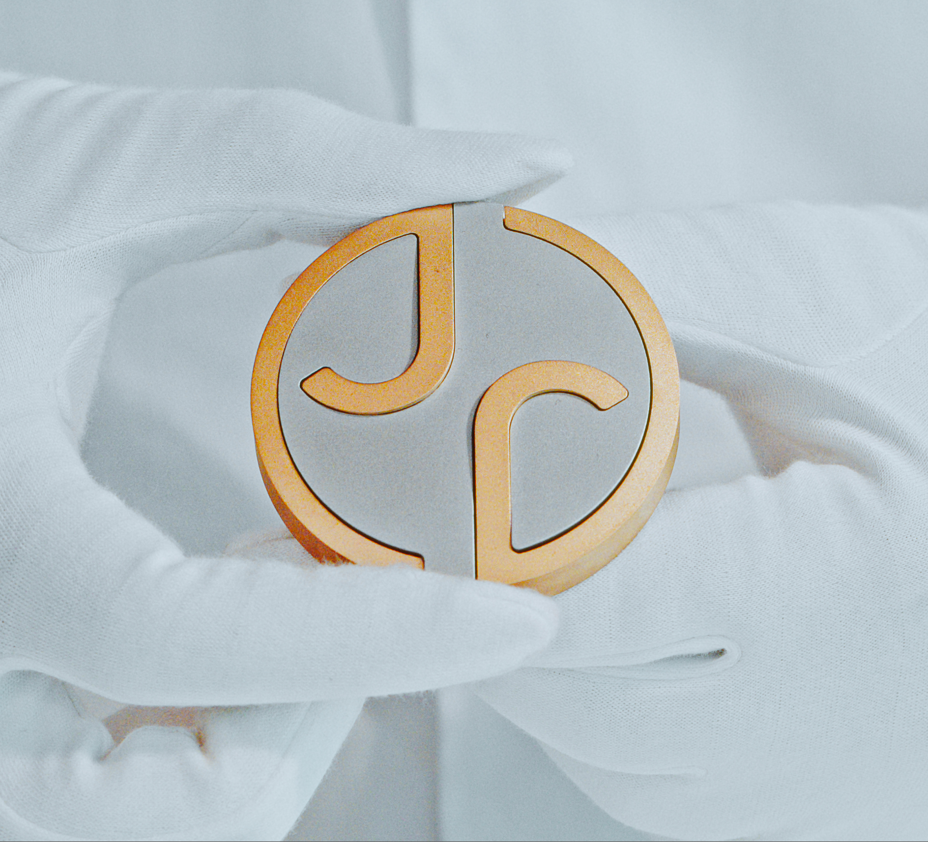
Also present is a circular 'JR' monogram that looks like it belongs on a signet ring. "The monogram is a code for expression and a signifier of a completed work. It is used as a flourish or finishing touch," Jaguar says.
The cars themselves will continue to feature the classic 'leaper' logo, which is good news since it's one of the best car logos on the road today. But this fresh iteration incorporates the new brand identity's 'strikethrough' graphic code, in which it's rendered on a series of horizontal lines.
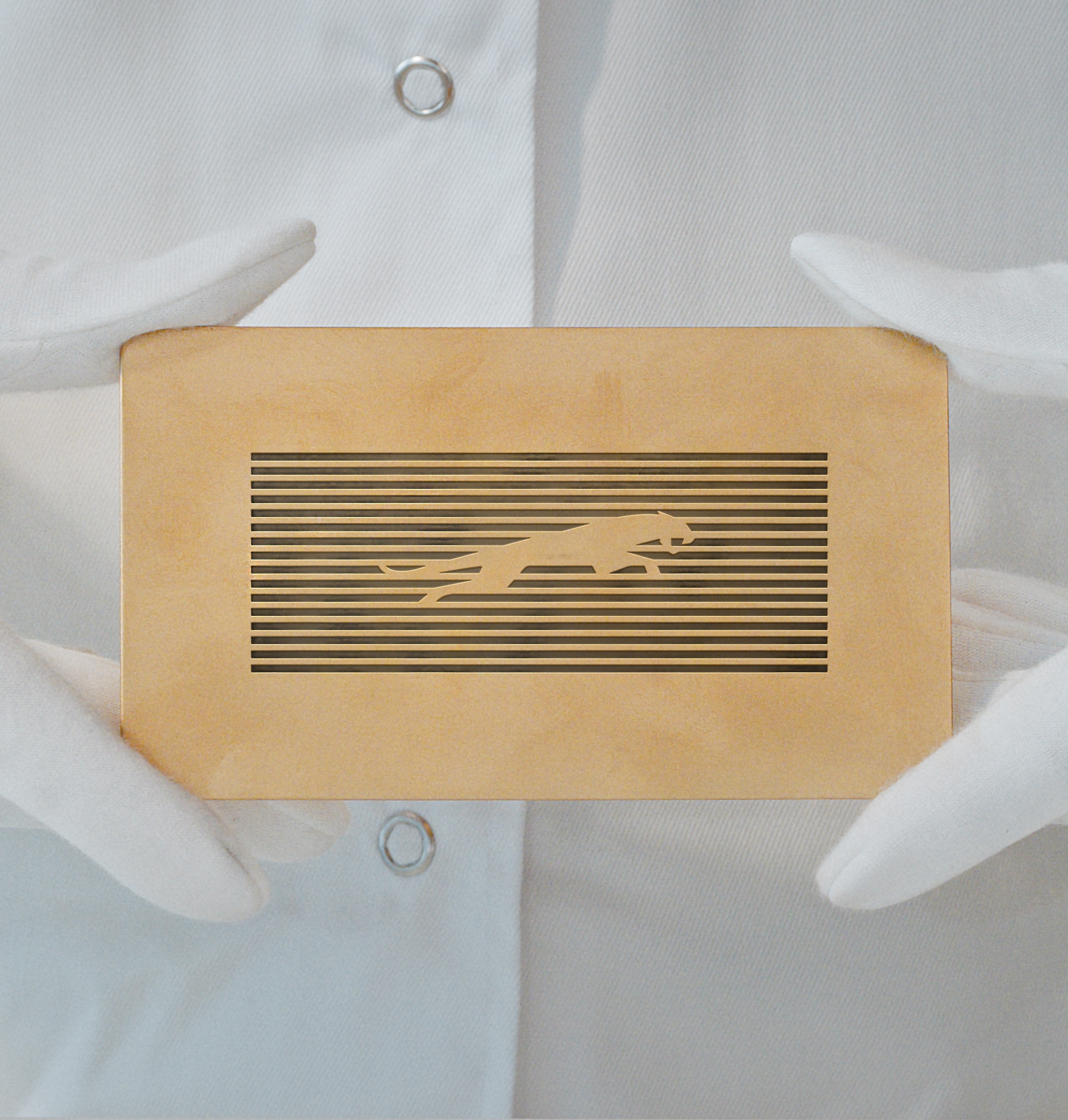
"We're here to delete ordinary. To go bold. To copy nothing," Jaguar announces on its website. And indeed, it's certainly an extraordinarily bold rebrand. That minimal typeface is a far cry from the heritage design resurgence we're seeing from other luxury brands such as Rolls-Royce and Burberry, which has involved the revival of older logos. Jaguar's new branding is very much of the minimal, flat design style that was all the rage a few years back.
Sign up to Creative Bloq's daily newsletter, which brings you the latest news and inspiration from the worlds of art, design and technology.
But with Jaguar claiming that the new visuals revealed today "provide clues for what is to come," it seems this is just the first step of the luxury brand's new identity. Time will tell how the rebrand is represented on the cars themselves. And hey, at least we can actually read the new wordmark, which isn't always the case when it comes to new car logos.

Daniel John is Design Editor at Creative Bloq. He reports on the worlds of design, branding and lifestyle tech, and has covered several industry events including Milan Design Week, OFFF Barcelona and Adobe Max in Los Angeles. He has interviewed leaders and designers at brands including Apple, Microsoft and Adobe. Daniel's debut book of short stories and poems was published in 2018, and his comedy newsletter is a Substack Bestseller.
