In recent years, it's often seemed like Tesla CEO Elon Musk has been too busy auditioning for the role of the next James Bond villain to pay much attention to his various companies. From Cybertruck design fails to the disastrous rebranding of Twitter to X, many of Musk's decisions have seemed capricious and poorly thought out.
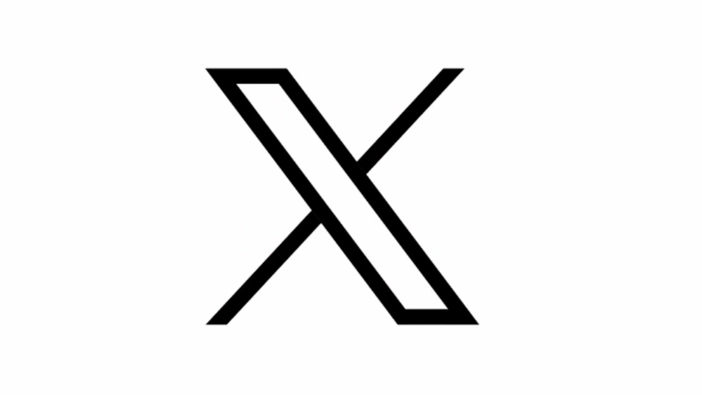
The adoption of a generic unicode character as the X logo seemed a particularly half-hearted effort. X quickly aborted attempts to make the logo look more grungy to reflect the personal taste of a billionaire in the middle of a midlife crisis, but it seems that an actual designer may have since tweaked the logo design to at least correct an inbalance caused by an optical illusion.
To recap, it seems Musk didn't initially realise that the X logo was a unicode character. That's because the design was put forward by a follower on X after Musk invited proposals for a new brand identity overnight. Former podcast hosts Alex J. Tourville and Sawyer Merritt proposed the logo, generously allowing Musk to use a free, publicly available design for free.
But the designer Will Paterson quickly pointed out that there was a problem with the design (other than the cheap off-the-shelf look and sinister slightly fascistic feel). That's because of an optical illusion – the Poggendorff illusion to be precise. This causes the brain to misinterpret the position of intersecting lines, making it seem that the top-right stroke of the X wasn't aligned with its lower portion.
As Peterson points out in the new follow-up video above, logo designers and typographers often tweak alignments and the positioning of different elements to make them 'look right' even if they're mathematically wrong. "Typography is an illusion," he says, giving a clear demonstration in Affinity Designer for iPad.
Correct.This is the logo I designed and, if @elonmusk wants, he can have it for free. pic.twitter.com/9KxIWHc90vJuly 23, 2023
A year on, there's no sign of X becoming the 'everything app' that Musk intended, or even managing to retain its existing customers. But it seems Musk has at least got someone to fix the problem with the alignment in the logo. Will notes that X went made the fix in a different way to how he had recommended, moving part of the X upwards more rather than to the right of the main stem.
It's a subtle but significant improvement. Although I can't agree that X is anywhere closer to becoming an "iconic brand", Will's example shows how the smallest most minor modification can transform the balance and harmony of a brand identity.
Get the Creative Bloq Newsletter
Daily design news, reviews, how-tos and more, as picked by the editors.
The X logo isn't the only one of Musk's brand assets to have been roasted by designers. The hastily launched xAI logo was also torn apart, and let's not forget the unfortunate Tesla logo resemblance.

Thank you for reading 5 articles this month* Join now for unlimited access
Enjoy your first month for just £1 / $1 / €1
*Read 5 free articles per month without a subscription

Join now for unlimited access
Try first month for just £1 / $1 / €1

Joe is a regular freelance journalist and editor at Creative Bloq. He writes news, features and buying guides and keeps track of the best equipment and software for creatives, from video editing programs to monitors and accessories. A veteran news writer and photographer, he now works as a project manager at the London and Buenos Aires-based design, production and branding agency Hermana Creatives. There he manages a team of designers, photographers and video editors who specialise in producing visual content and design assets for the hospitality sector. He also dances Argentine tango.

