The change follows the trend in car logo design, but it's a better fit with the brand's new direction.
(Image credit: Ryno Marais via Unsplash)
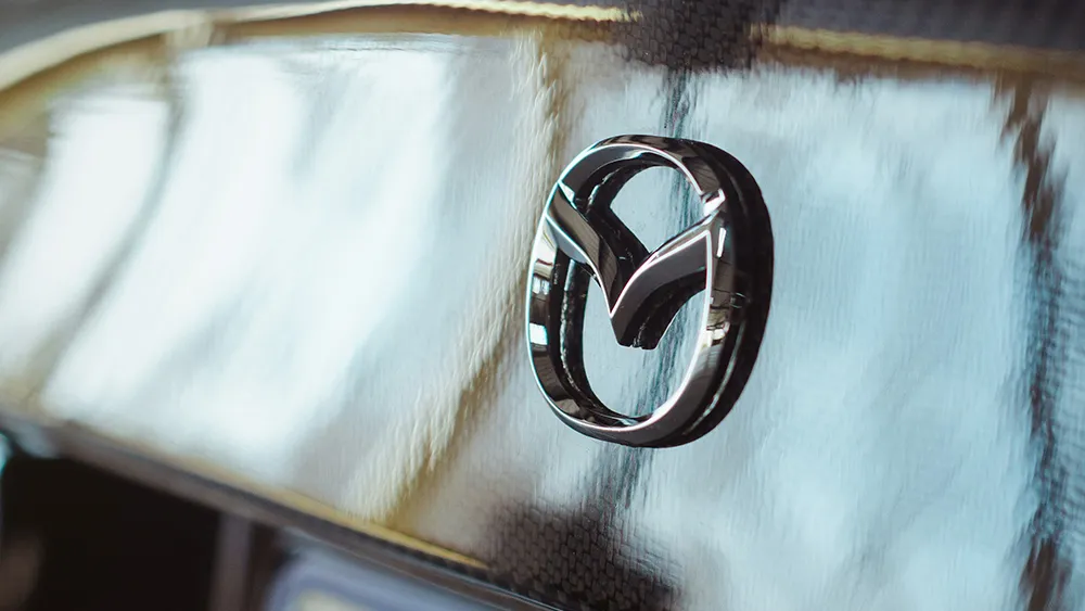
The new Mazda logo may not break the mould, but it's very necessary. The Japanese brand has been trying to move upmarket, but it's been doing so with a logo that's starting to look very dated. The new design follows the trend in recent car logo redesigns, but it's a much better fit.
Based on trademark documents the new logo is flatter and has a slightly different shape. We've seen this flattening of logos in pretty much every other car logo redesign of the past five years, but it makes sense for a brand that aims to modernise.
The current Mazda logo (left) and the new flatter design (right) (Image credit: Mazda)
The trademark application in Japan suggests that the new Mazda logo design will retains the existing winged 'M' but with more angular wings and a more circular outer ring. The company hasn't confirmed whether this will become its main logo, but I expect it will be part of a general global rebrand.
Latest Videos From Creative Bloq
Minimalist logos are the order of the day, partly because of fashion but mainly because of digital platforms and the need for a logo to be easy to reproduce at small sizes (see our pick of the best car logo designs overall). We've seen everyone from BMW to Citroen and Skoda ditch the three dimensional look for a flat design.
Mazda's new logo might not be exciting, but it does the job. It's recognisable (unlike the Kia logo), and it would serve Mazda's efforts to shift its brand appeal from a young audience to focus on a higher-end market. Mazda's existing logo was tweaked slightly in 2015, when the logotype was shifted under the mark, but the brand symbol itself hasn't changed since 1997, something that's fairly apparent in the dated 3D look. A more stripped down minimalist look is a better fit for the luxury market that it's now aiming at.
Joe is a regular freelance journalist and editor at Creative Bloq. He writes news, features and buying guides and keeps track of the best equipment and software for creatives, from video editing programs to monitors and accessories. A veteran news writer and photographer, he now works as a project manager at the London and Buenos Aires-based design, production and branding agency Hermana Creatives. There he manages a team of designers, photographers and video editors who specialise in producing visual content and design assets for the hospitality sector. He also dances Argentine tango.