Video game console branding isn't always the most exciting, as proved by the recent Switch 2 logo (what a yawn, right?). But there's one logo that keeps coming back into discussion because of it's clever design – the Nintendo GameCube logo. It's not one we haven't covered before, but its design is blowing minds again so I thought it was time for another deep dive.
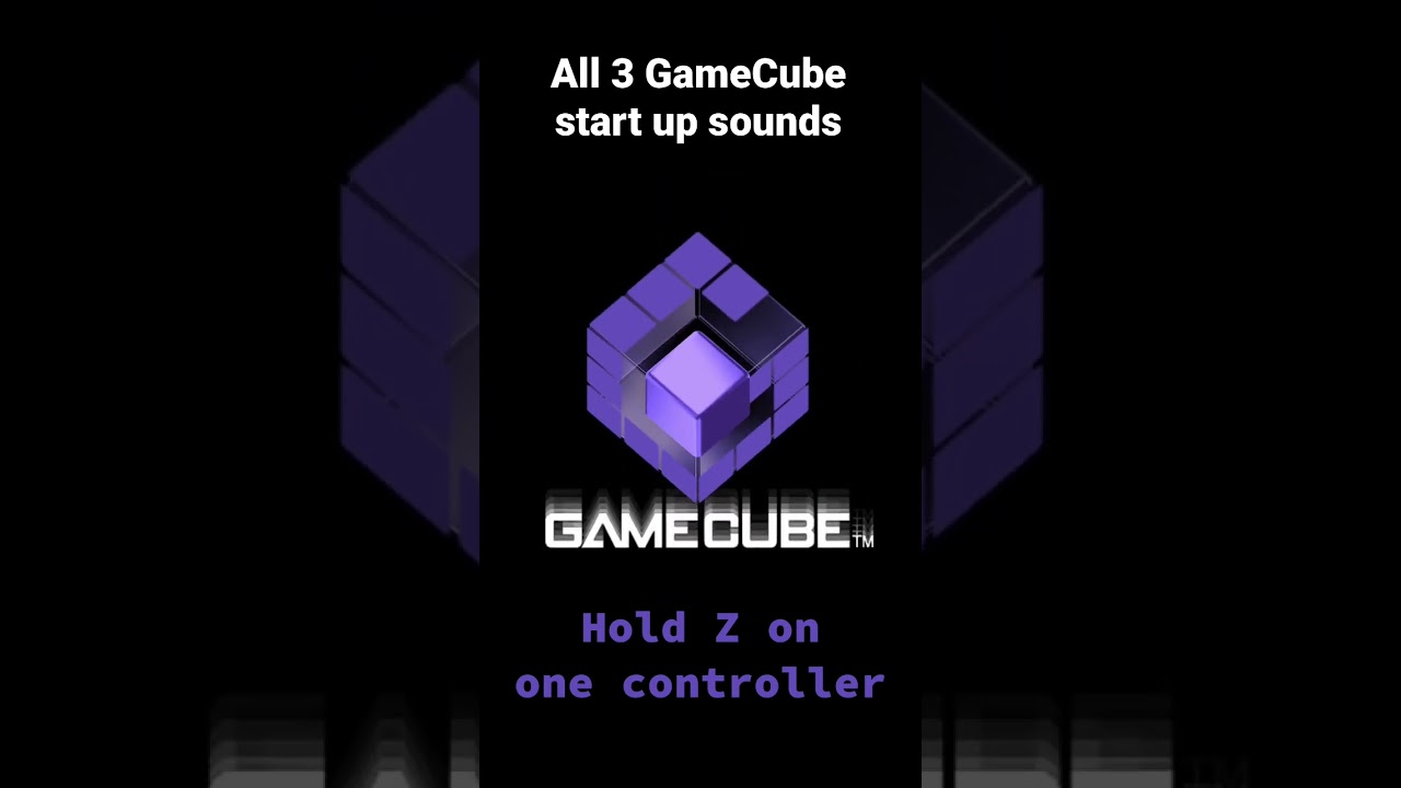
Created alongside the purple box that is the GameCube in 2001, the GameCube logo has got it all – a G, a C and a cube, all packaged beautifully into an optical illusion. It looks so 3D it's delicious – and certainly in contention for one of the best logos ever.
(Image credit: Nintendo)
In sharp contrast to Nintendo's recent logo offering, which sees a number 2 rather unceremoniously plonked next to the Switch icon, the GameCube logo is a joy to behold – mirroring the design of the actual console whilst hiding references to the name.
Latest Videos From Creative Bloq
Over on Reddit, video game enthusiasts are convinced it's the best video game console logo ever, and I have to agree. The design elements carry over into the game itself, too, as one user remembers:
"The fact they programmed it into the GameCube, rather than it being a video that played was a fun extra," they said.
"For those who never owned a GameCube, the console settings menu could be accessed during the logos animation. This would spin the “G” cube until it became a menu. The menu itself utilized the same “cube” style. You would rotate the cube to access whatever settings you’d needed. It was a fun detail that separated the game cubes ui from other consoles."
It isn't only the logo design that's being applauded, but the sonic identity, too. Given sonic design is one of the 2025 trends as named by Monotype, Nintendo was ahead of its time with this element. The sound is gorgeously ASMR-like, but also exciting, and accompanied by a brilliant graphic.
And there's more! One user remembers another fun design quirk – "hold the Z trigger during sound up to hear squeaky clown shoes!" they reminisce. You can hear that delight below.
All in all, the GameCube branding is as fun as I remember early Nintendo games being – and it's a type of fun that's largely missing from the video game branding space now.
Get the Creative Bloq Newsletter
Daily design news, reviews, how-tos and more, as picked by the editors.
Georgia is lucky enough to be Creative Bloq's Editor. She has been working for Creative Bloq since 2018, starting out as a freelancer writing about all things branding, design, art, tech and creativity – as well as sniffing out genuinely good deals on creative technology. Since becoming Editor, she has been managing the site and its long term strategy, helping to shape the diverse content streams CB is known for and leading the team in their own creativity.
You must confirm your public display name before commenting
Please logout and then login again, you will then be prompted to enter your display name.