I really don't get the apparent new Google Shopping logo
Sign up to Creative Bloq's daily newsletter, which brings you the latest news and inspiration from the worlds of art, design and technology.
You are now subscribed
Your newsletter sign-up was successful
Want to add more newsletters?

Five times a week
CreativeBloq
Sign up to Creative Bloq's daily newsletter, which brings you the latest news and inspiration from the worlds of art, design and technology.

Once a week
By Design
Sign up to Creative Bloq's daily newsletter, which brings you the latest news and inspiration from the worlds of art, design and technology.

Once a week
State of the Art
Sign up to Creative Bloq's daily newsletter, which brings you the latest news and inspiration from the worlds of art, design and technology.

Seasonal (around events)
Brand Impact Awards
Sign up to Creative Bloq's daily newsletter, which brings you the latest news and inspiration from the worlds of art, design and technology.
Tinkering with logo designs seems to be one of Google's favourite pursuits. Its decision to create new logos for its apps by adopting the colours from the main Google logo for every design created a uniform identity but made it harder for users to find things.
And now some Google products are on to a second round of logo redesigns, it seems. But I'm not convinced the apparent new logo for Google Shopping would be a positive change.

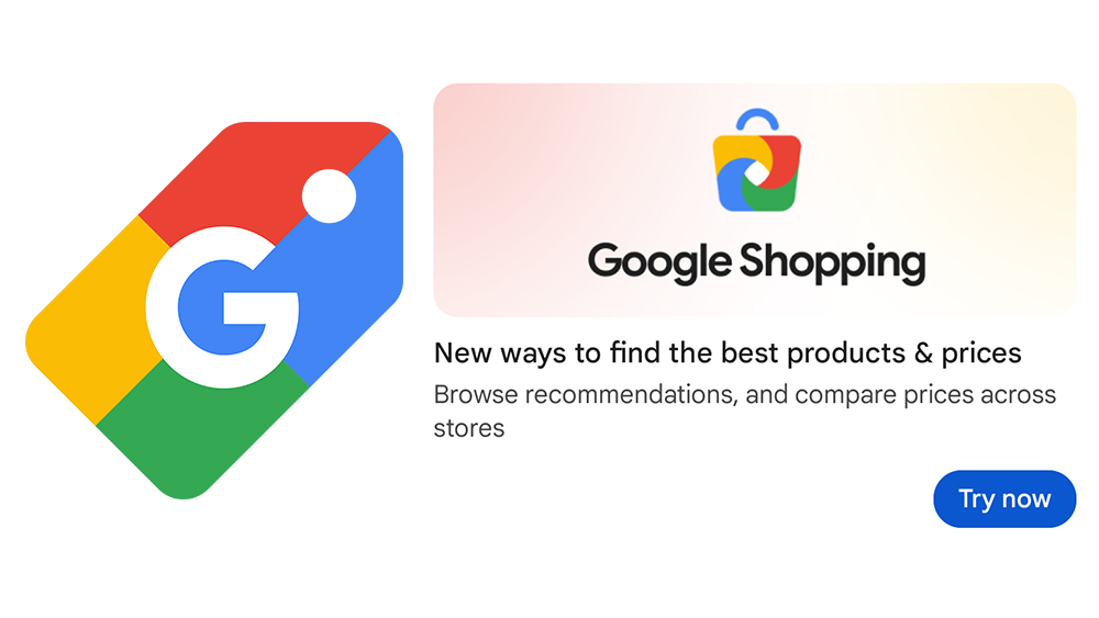
The existing Google Shopping logo comprises a label divided into four sections with the familiar Google red, blue, green, and yellow. A white hole helps identify the shape as a price tag, while the white 'G' makes it extra clear that Google is involved. It's boring, but it's simple and clear.
But, as spotted by 9to5Google, a promo for Google Shopping has popped up showing a new logo for the retailer comparison site. Instead of a price tag, it's a shopping bag icon in the same four colours, now arranged in a spiral. It's still obviously Google, but I'm not sure the shopping bag is a clear an identifier as the existing design. Why does it have a white space in the middle of it? Why are the colours swirling like a colourful version of a laundry symbol on a clothing label? The shopping bag's handle looks like a frown – the antithesis of the smile in the clever Amazon logo.
It's not clear if Google has settled on this design or if it's still conducting testing. If it does roll the logo out, I can imagine the reaction we'll see based on the criticism of previous Google logo design changes like the new Find My Device logo, the Google Chat logo and the Google Fi Wireless logo.
In the meantime, if you're shopping for Amazon Prime Day in October bargains, making sure you're following our roundup of Apple Prime Day deals and the best Prime Day MacBook deals.
Sign up to Creative Bloq's daily newsletter, which brings you the latest news and inspiration from the worlds of art, design and technology.

Joe is a regular freelance journalist and editor at Creative Bloq. He writes news, features and buying guides and keeps track of the best equipment and software for creatives, from video editing programs to monitors and accessories. A veteran news writer and photographer, he now works as a project manager at the London and Buenos Aires-based design, production and branding agency Hermana Creatives. There he manages a team of designers, photographers and video editors who specialise in producing visual content and design assets for the hospitality sector. He also dances Argentine tango.
