Sports logos generate strong opinions at the best of times. And perhaps that's the way it should be. Fans are passionate about their team, and often equally passionate about their rivals, so it makes sense that they should care deeply about the identity that's being used to represent them.
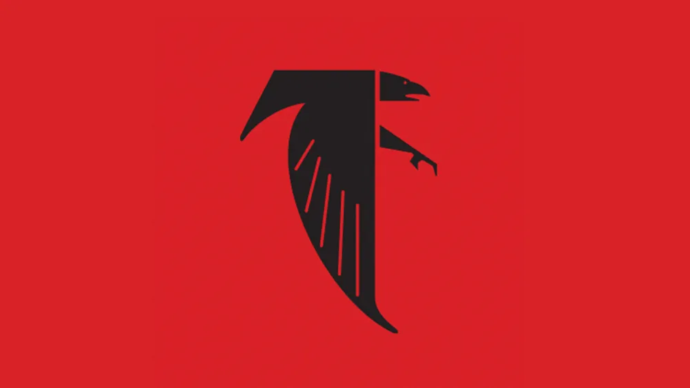
It's perhaps not surprising then, that people have made their feelings known about the new Atlanta Falcons logo. When I say 'new', I mean old. The NFL team has jumped on a bit of a nostalgia trip, temporarily bringing back an old logo design from the 1960s for their helmets in Week 4, which will see them play the Saints on Sunday. But people are getting some dark vibes from the retro design, and I can see why.
This logo 💀 pic.twitter.com/z7SBU3tZQiSeptember 26, 2024
The Atlanta Falcons intended the change to the 1960s logo on social media to be a bit of fun ahead of Falcons vs Saints tomorrow. But many fans are wondering how the team ever adopted such a hard looking piece of graphic design. While the colours and eponymous falcon recall the flag of Albania (technically and eagle, and it has two heads), some are reminded more of Nazi insignia.
Article continues below"What in the 1940s Germany is this," one person responded to a post on X announcing the 'NewProfilePic'. "This looks like the symbol for a flag in a dystopian cyberpunk Video game where the Nazis won WW2," someone else wrote. "December 16th, 1944 and the Falcons are moving through the forest of Ardennes looking to crush the allied forces," was another comment.
👌🏼 pic.twitter.com/kbEWT2QL90September 26, 2024
Nazi symbolism isn't the only thing people are seeing in the design though. Others see an uncanny structural resemblance to the Burj al Arab hotel in the United Arab Emirates. Others are getting Thundercat vibes, while some are clamouring for the logo to be made permanent.
To be fair to the Falcons, Nazi Germany never had a monopoly on using birds of prey as symbols (nor even the swastika, which had a long history before it was adopted by the Third Reich), and the bald eagle is a familiar piece of US iconography.
The logo does show a Falcon in the team's colours, and it makes sense for an NFL team to have an aggressive identity that can instill fear in the hearts and minds of rivals, but with the hard angular lines and such a specific tone of red, the comparisons are inevitable. I guess that back in the 1960s, logo designs weren't picked apart as much as they are today – and we didn't have social media where fans could all express their opinions.

The most disturbing logo in sport. Not quite. That accolade has to go to the old Red Sox logo. Thankfully, it appears that the Falcons' new old logo will only be used this week. Meanwhile, the main Atlanta Falcons logo retains its place in our pick of the best NFL logos.
For more logo design controversies, don't miss designers' scathing opinions on the new Aeroméxico logo, and the differences of opinion on the new Las Vegas Raiders logo.

