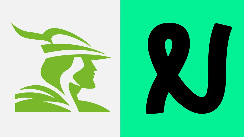
For decades, Nottingham Building Society had maintained a strong visual connection to its home city in the form of a logo design featuring the iconic image of Robin Hood, identifiable by his bycocket. The legendary prince of thieves remains part of the identity of the city in the Midlands, and a big tourist attraction.
But times have changed. The building society (a bit like a credit union for US readers) no longer operates in Nottinghamshire alone, boasting several branches in neighbouring counties. Nor, I presume, does it rob from its richer clients to give to the poor. As a result, it's decided it was time to drop Robin Hood from its brand identity and replace him with... a squiggle. Unsurprisingly, there's an almighty outcry (One of the best logos, it is not).

The Nottingham Building Society rebrand includes a new name (it's added 'Building Society' again), new brand colours and a new tone of voice. There's also a bespoke typeface based on the new logo. But it's that logo that's inevitably getting most of the attention. It features a distinctive loopy N (a knot for Knottingham?).
Article continues belowOn its website, the company says: "We've mixed our rich history with a modern twist. We want to reflect society as it is today. For us, that means championing inclusivity and celebrating financial diversity. Consider it a glow-up, but for a building society, changing to make sure we're fresh and relevant for current and future members."
But a lot of people in Nottingham don't seem to be taking on that recommendation to consider it a "glow up", but rather a dull down. That even includes the city's official Robin Hood actor. Ade Andrews has been playing Robin Hood for tourists in the city for over 30 years and hosts the award-winning Robin Hood Town tour.
"Sad day when old school Nottingham company with ethos of family, tradition and building a better future changes iconic logo to nonsensical, ridiculous child's scribble," he wrote on X, formerly Twitter.
In an interview for GB News (below), he described Robin Hood as a symbol of hope and a better world. "There's a lot of good feeling about Robin Hood: kinship, family, tradition, foundations for a better future," he said.
Meanwhile, some customers and Nottingham residents remain baffled by the new design. Some think it looks like the Vine logo mirrored. Others don't know what it's supposed to represent.
"What is it supposed to be, what does it represent and what does it say about the company?" one person asked on Facebook. "It looks like a twisted bit of pipe – what is it?" someone else asked. "If you want someone to look after your money and finances you want trustworthy and secure, not modern and risk taking," was another opinion.
I've been won over by the idea of unreadable typography in logo design recently, but I have to agree that this feels jarring for a heritage brand with a deep-rooted local connection. Some people are describing the logo as a victim of 'wokeness', which is clearly nonsense. Robin Hood is a woke icon. The prince of woke, if you will.
Nottingham did use the word 'inclusive' in their press release, but it didn't claim that Robin Hood wasn't inclusive. If anything the opposite is the case: the logo was dropped because of late capitalism's obsession with youth and novelty and the incessant demand for change for change's own sake. The building society is totally right that society evolves, and there's sometimes a need to a fresh visual identity to avoid a brand becoming old and staid, but this is a change that's turning off a lot of the brand's core audience.
For more recent logo design controversies, see the confusing new IDW Publishing logo.

