It's rare that designers on Reddit reach a consensus on a logo design, but this note-perfect brand identity is proving to be an exception. Designers often use the platform to share creative inspiration, but opinions are often divided. If one person likes a clever hidden meaning in one particular design, ten other people will be able to pick it apart.
But this logo design for the Instituto Piano Brasileiro has received an almost unanimously positive verdict thanks to its clever execution of an idea that might sound difficult to pull off. It could even be a candidate for our pick of the best 3-letter logos.

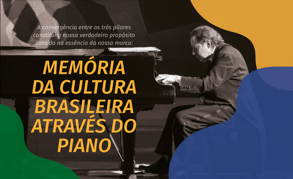
Designed by Brazil's Estúdio Marujo back in 2016, the logo features the organization's acronym: IPB in overlapping letters, with a lowercase 'i' and 'b'. But the letters also form the shape of a grand piano in the colours of the Brazilian flag, communicating the mission to promote piano culture in the country, from editing collections of recordings and scores to organising concerts, auditions and courses.
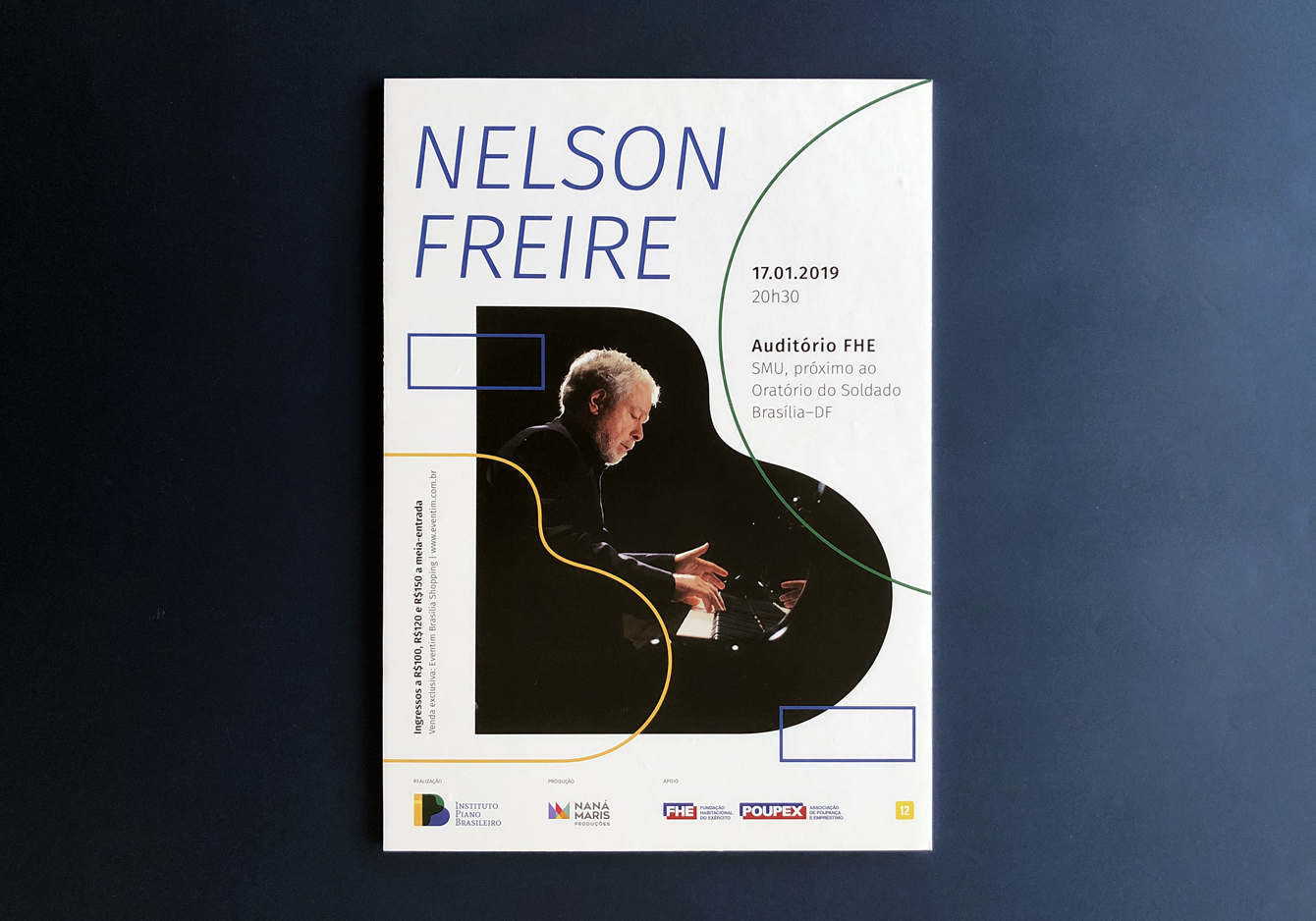
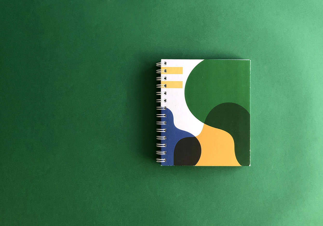
It's a clever concept, expertly implemented with a clean minimalist execution. Although the main logo needs colour to work, the shapes also work well when deconstructed and used across various applications to delimit space as part of the piano institute's broader branding. They're an effective resource for putting the brand's stamp on everything from posters and social media posts to physical collaterals.


It its portfolio, Estúdio Marujo says the visual identity was inspired by the interaction between the "sinuous curves and the striking straight lines" of the piano. "Genuinely a wonderful logo. Clean, clear, incorporating the initials in a clever way that builds identity and feels obvious," one person enthused over on Reddit.
For more logo design inspiration, see our roundup of the best and worst logos of 2024 and the logo design trends for 2025.
Get the Creative Bloq Newsletter
Daily design news, reviews, how-tos and more, as picked by the editors.

Thank you for reading 5 articles this month* Join now for unlimited access
Enjoy your first month for just £1 / $1 / €1
*Read 5 free articles per month without a subscription

Join now for unlimited access
Try first month for just £1 / $1 / €1

Joe is a regular freelance journalist and editor at Creative Bloq. He writes news, features and buying guides and keeps track of the best equipment and software for creatives, from video editing programs to monitors and accessories. A veteran news writer and photographer, he now works as a project manager at the London and Buenos Aires-based design, production and branding agency Hermana Creatives. There he manages a team of designers, photographers and video editors who specialise in producing visual content and design assets for the hospitality sector. He also dances Argentine tango.
