Recent years saw a trend for minimalist logo designs sweep through branding as companies adapted their identities to small digital screens. Just look at the best car logo redesigns for one example after another. But we've recently seen signs of a reversal of the trend in an increasing number of more complex logo designs – in some cases, even unreadable logos (don't worry, I'm not going to talk about the Kia logo again).
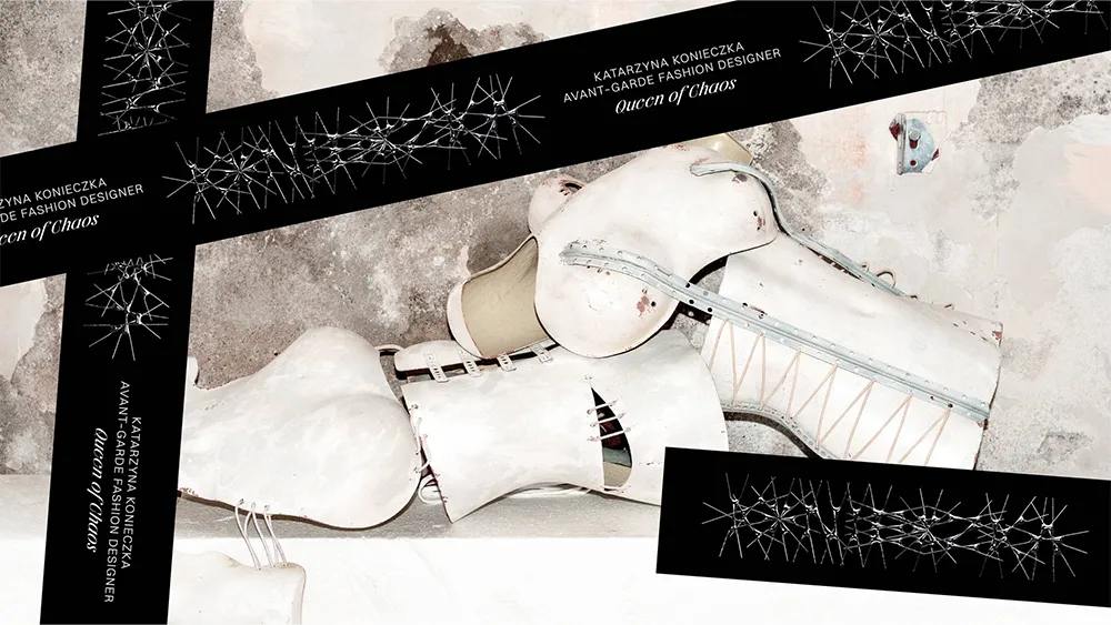
The award for the most illegible logo of the year will surely go to the Polish fashion designer Katarzyna Konieczka. Appropriately dubbed the 'Queen of Chaos' for the extravagant gothic-inspired costumes she's made for the likes of Lady Gaga and Bella Hadid, she's revealed a new identity that breaks perhaps all the rules of logo design apart from the most important one of all: it's totally on brand.
We are currently running Typography Week on Creative Bloq, in association with Monotype. Check out our dedicated page to find out more.
I wrote a couple of years ago about how luxury fashion logos were starting to all look the same. A few months later, almost as if they heard me, Burberry turned the tables in a rebrand that not only brought serifs back to its logotype but also resurrected its 1901 'Equestrian Knight Design’.
Latest Videos From creativebloq
Since then, we've seen a boom in maximalist typography, grungy branding assets, rawer brand photography and more complex logo designs. Puig adopted its Miró-inspired infinite line logo, and Loewe and On launched a weird logo mashup that didn't really make much sense. Massimo Dutti didn't get the message, but generally we've seen brands searching for edge and personality again. And you can't get much more edge and personality than Tofu Studio's new logo for Katarzyna Konieczka.
The concept of the logo was based on the motif of a crown of thorns, intended to reflect Katarzyna's position as the 'queen' of Polish costume designers as well as the style of her work, which often features sharp elements and references to religion, myth and legend. There's also an abbreviated monogram version of the logo, while the wider system of brand design assets include forms based on the logo, including a barbed-wire like logo application and crime scene tape. Switzer is being used as the brand typeface.
Image 1 of 2
An abbreviated monogram version of the logo design(Image credit: Katarzyna Konieczka / TOFU Studio)
Brand visual assets are based on elements of the logo(Image credit: Katarzyna Konieczka / TOFU Studio)
Of course, even fashion logos should be above fashion, and Katarzyna Konieczka is a very particular designer for whom such a chaotic logo makes sense. I don't expect high street fashion brands to go goth on us just yet.
Get the Creative Bloq Newsletter
Daily design news, reviews, how-tos and more, as picked by the editors.
But it does seem like the combination of higher resolution screens and the push back against minimalism that we're seeing in everything from typography design to the nostalgia for Y2K-era early web design is leading brands to loosen the stripped down clean and simple approach to logo design we've seen over the past decade. Even Coca-Cola's loosened up, embracing homemade versions of its logo and warping the classic script design itself for one campaign.
Poor black metal bands. Maybe it's time for the likes of Dark Throne and Rotting Christ to go sans serif (the could read our pick of the best band logos for some inspiration).
Thank you for reading 5 articles this month* Join now for unlimited access
Joe is a regular freelance journalist and editor at Creative Bloq. He writes news, features and buying guides and keeps track of the best equipment and software for creatives, from video editing programs to monitors and accessories. A veteran news writer and photographer, he now works as a project manager at the London and Buenos Aires-based design, production and branding agency Hermana Creatives. There he manages a team of designers, photographers and video editors who specialise in producing visual content and design assets for the hospitality sector. He also dances Argentine tango.