Boston Marathon's new logo didn't need this corporate addition
A design steeped in meaning, but fans are unimpressed.

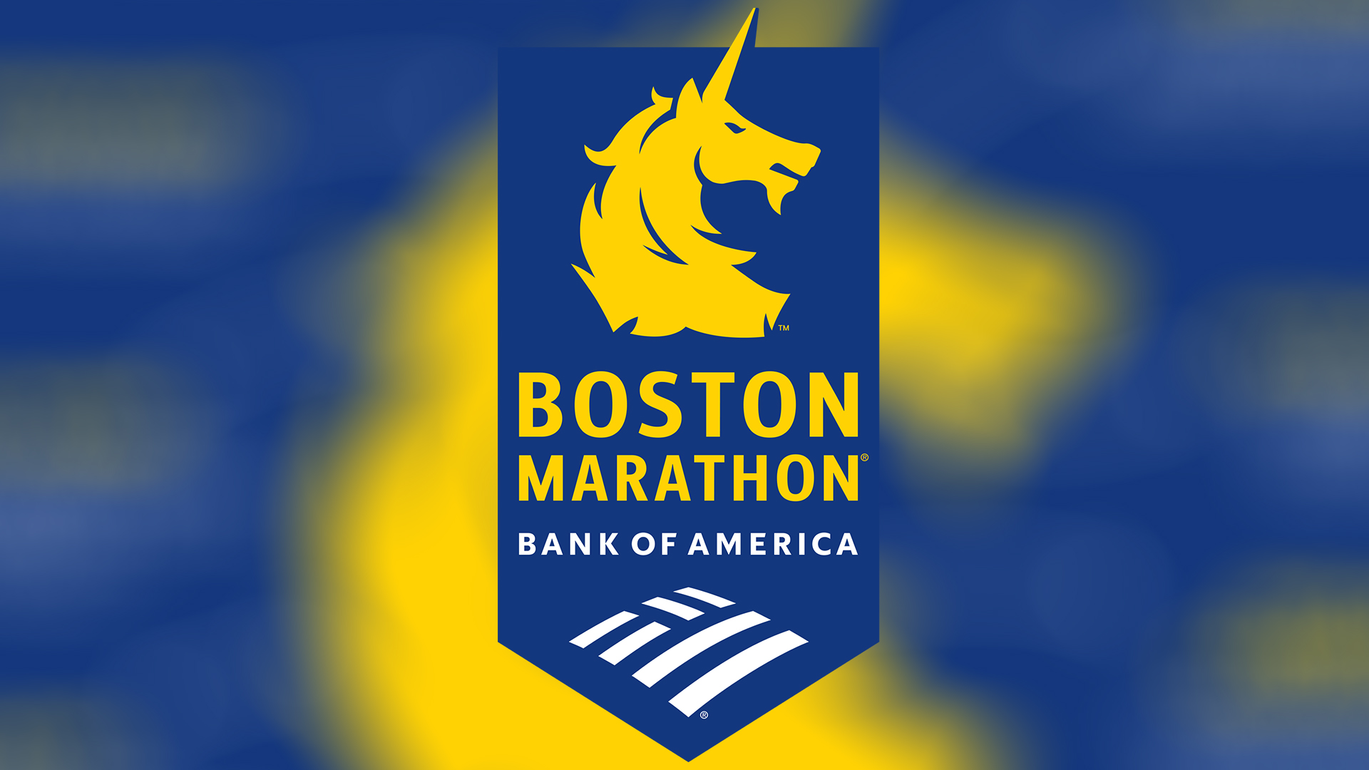
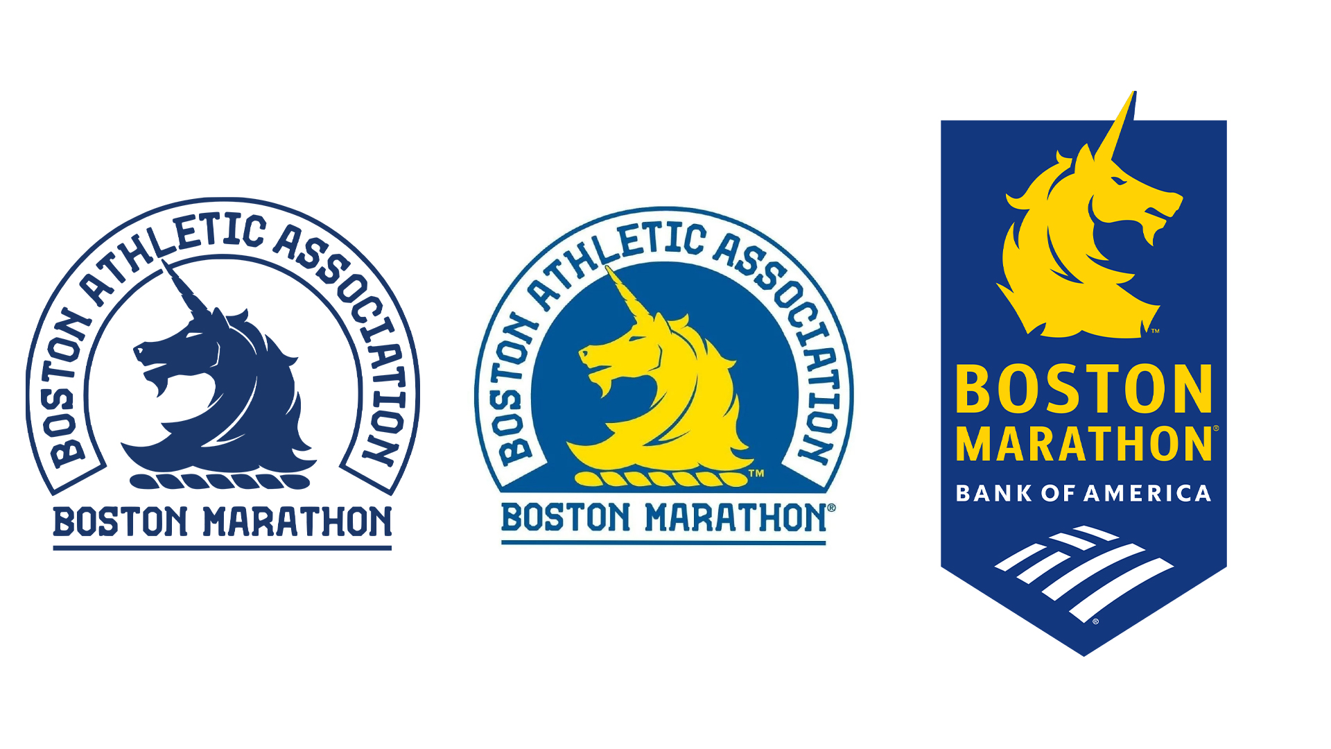
The Boston Athletic Association has unveiled a new logo for the Boston Marathon, featuring Spike (the marathon's iconic mascot) in a bold new direction. With a historic legacy built on strength and perseverance, the new logo aims to honour Boston Marathon's past and inspire its future, but fans aren't convinced by one key addition.
There's no right or wrong way to design a logo, but the most important element is creating a unique and memorable identity that resonates with enthusiasts. With the race's lead sponsor Bank of America added to the beloved design, some fans feel the spirit of the race has become lost to corporate control.

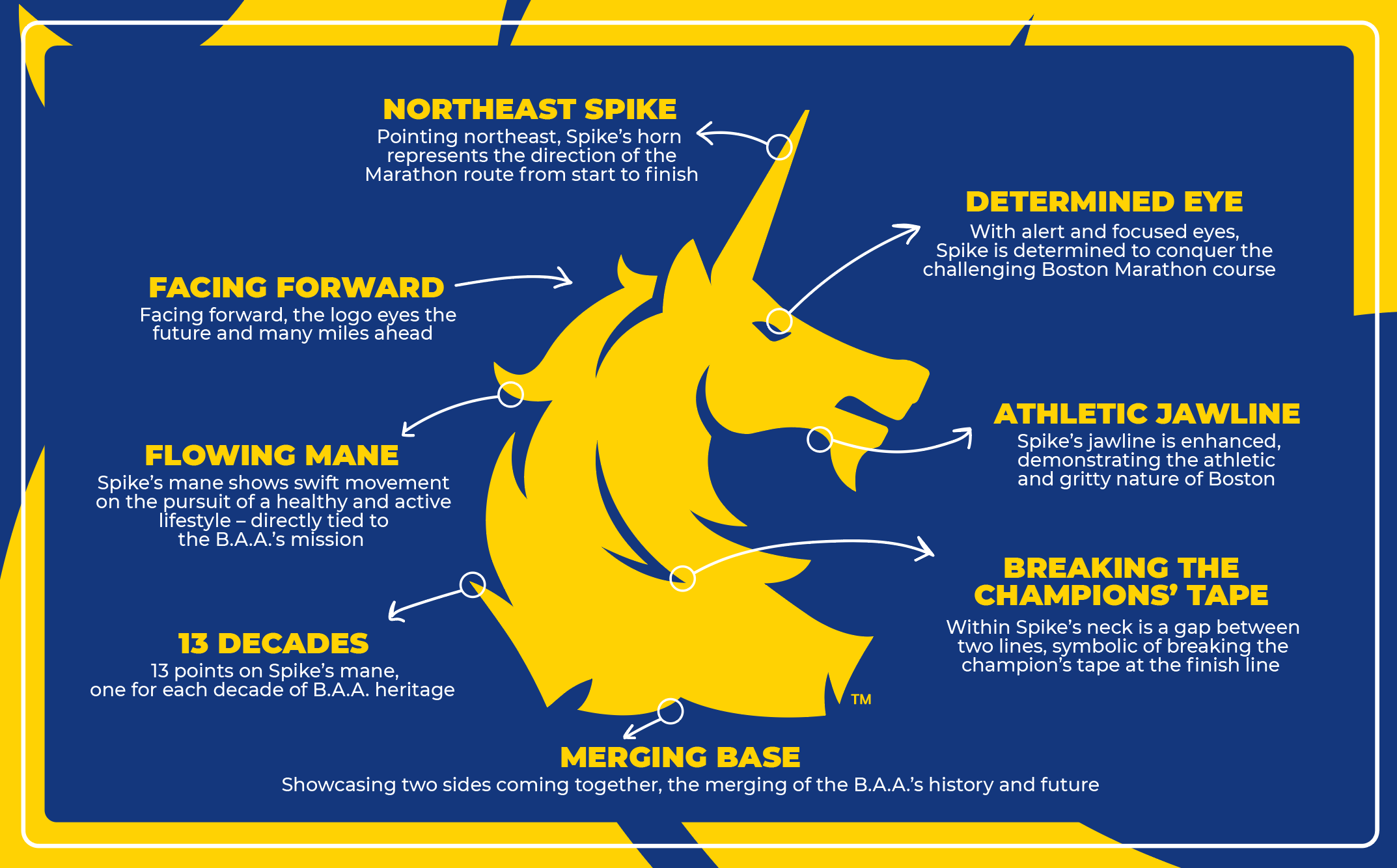
The logo carries many of the motifs of the previous design, maintaining the same blue and yellow colour palette and similar composition. The most prominent change is the flipped design of the unicorn, whose horn now points northeast (the direction of the marathon). The forward-facing logo "eyes the future and many miles ahead," catapulting the identity into a vague, yet progressive new era.
The new design features a new "determined eye" and "athletic jawline" to represent the grit and determination of the marathon's competitors. Spike's flowing mane embodies "swift movement", while the thirteen points integrated into the design represent the marathon's long legacy, symbolising the thirteen decades of B.A.A. heritage.

Fans were quick to show their disappointment at the new design, predominantly due to the large Bank of America logo. "If it ain’t broke don’t fix it," responded a fan on X, while another replied, "Gotta be honest, I hate it." Responses on Reddit were similar, with one disappointed user commenting "Just call it the Bank of America Marathon already and be done with it," while another responded, "I read the press release and I'm still not convinced it's not April 1st."
For more design inspiration, check out the WNBA's Valkyries logo that's full of clever design details. If you're after some design dispute news, check out the recent Harley Davidson logo dispute over a retailer's "copycat" design.
Get the Creative Bloq Newsletter
Daily design news, reviews, how-tos and more, as picked by the editors.

Thank you for reading 5 articles this month* Join now for unlimited access
Enjoy your first month for just £1 / $1 / €1
*Read 5 free articles per month without a subscription

Join now for unlimited access
Try first month for just £1 / $1 / €1

Natalie Fear is Creative Bloq's staff writer. With an eye for trending topics and a passion for internet culture, she brings you the latest in art and design news. Natalie also runs Creative Bloq’s Day in the Life series, spotlighting diverse talent across the creative industries. Outside of work, she loves all things literature and music (although she’s partial to a spot of TikTok brain rot).
