These days, some of the best logos aren't just static; there are often animated versions too. And while that can sometimes come across as gimmicky, there are often good reasons for adding movement to your logo design.
Deciding whether motion is right for a logo involves careful evaluation of your brand's needs and context. As Becca Jones, a designer at award-winning agency Ilk explains, "It really depends on two key factors: where the logo will live, and the core concept behind it."
The first is fairly obvious. "If the logo will mainly live in a digital space, adding motion can add an exciting extra dimension," says Becca. "Environments such as websites, social media platforms and app interfaces naturally lend themselves to animated elements, enhancing the user experience."
The second, though, is a bit more of a challenge. It's tempting to animate a logo because, well, it's cool and fun to show off to your designer friends. But you also need to ask yourself: how it this servicing the brand (as opposed to your own Instragram profile)?
"Thinking about whether motion fits with the brand is a logical necessity," says Rob Gonzalez, partner at Sawdust. "There are plenty of scenarios where an identity simply doesn't need it." But what does that look like in practice? In this article, we'll share nine examples of motion in logo design, and why they work. See out pick of the best animated logos for more examples.
01. Generation Logistics by ilk

Sometimes a brand naturally lends itself to motion, and here's a clear example. Generation Logistics is a government and industry backed recruitment campaign in the UK, designed to encourage young people to pursue a career in the logistics sector. ilk was challenged to name and brand the initiative, as well as executing a cross-channel brand strategy covering digital, PR, OOH advertising and paid and organic social.
"With a younger audience in mind, we had plenty of room to play around with motion and create some energetic visuals to predominantly sit online," explains Becca. "Based on the core idea of logistics— ie, moving things—could there be any better opportunity to add motion to a brand?"
Get the Creative Bloq Newsletter
Daily design news, reviews, how-tos and more, as picked by the editors.
02. Mubi by Spin Studio
Cinema is another area that naturally lends itself to movement: they are called 'motion pictures' for a reason. And here's a great example from Spin Studio.
The equivalent of Netflix for people who like independent film, MUBI is a global streaming service, production company and film distributor dedicated to elevating cinema. Spin were tasked with refining and progressed their identity, and centred the rebrand on giving the logo a more positive, active character. Jack Goozee, brand designer at Taxi Studio, is a big fan.
"Drawing inspiration from cinema history and with a blend of digital animation, projections and high-end digital cinema cameras, the animated logo cleverly connects the analogue and digital worlds," he enthuses. "It is perfectly suited to the identity of digital streaming service that specialises in arthouse films and helps bridge the gap between the two."
03. KRO-NCRV by Thonik
KRO-NCRV is a public broadcasting company focused on serving the needs of Christians in the Netherlands. They turned to Thonik to create a fresh, colourful identity system that ties together 270 individual programs with a unifying, yet distinct, visual language. And the agency put motion at the heart of the redesign.
"Thonik’s work mixes movement in the logo with a broader identity, emphasising how motion can be the key to a wider visual world," explains Jack. "The circle in the logo expands and allows room for a full spectrum; a great demonstration of the company’s work. This motion is then applied across the programming, allowing high recognition between the logo and the actual content that makes up their work."
04. Boitano by Opening Hours
Logistics, cinema and TV are all topics with movement at their core, but that's not the only reason to use motion in design. It can also convey a broader message, and here's a great example of that.
Boitano is an employee-owned consultancy firm with offices in Oslo, Stavanger and Ålesund. When tasked with creating their new visual identity, Opening Hours Studio were inspired by their unique way of operating and viewing the world. So they settled on using a kaleidoscope as a metaphor for their unique philosophy.
"Boitano's beautiful, generative logomark is generated over and over again by a custom digital tool," notes Jack. "This principle highlights the vast kaleidoscope of people Boitano work with and for, constantly shifting, never staying the same. The Graphic User Interface (GUI) was also built to allow each employee to generate their own logo, static or motion, to represent them personally."
05. Tesseract by Sawdust
A post shared by Sawdust (@sawduststudio)
A photo posted by on
Tesseract is a company that collaborates with artists, designers, musicians, celebrities, and luxury brands to create unique digital art. As Rob puts it: "They're creators of new works inspired by humanity’s archetypes — a new space of ownership, distinction and culture."
Partnering with owners of iconic assets through exclusive digital art licences and joining forces with the most influential artists, fashion designers, musicians, celebrities and luxury brands to create new, singular digital art."
This emphasis on pushing the boundaries of the imagination is conveyed wonderfully in Sawdust's animated logo. "We're pleased with our work for Tesseract," reflects Rob. "It shows how you can take a fairly rigid and geometric form and turn it into something beautiful through light, texture and movement."
06. InMotion Festival by Buck and Playgrounds

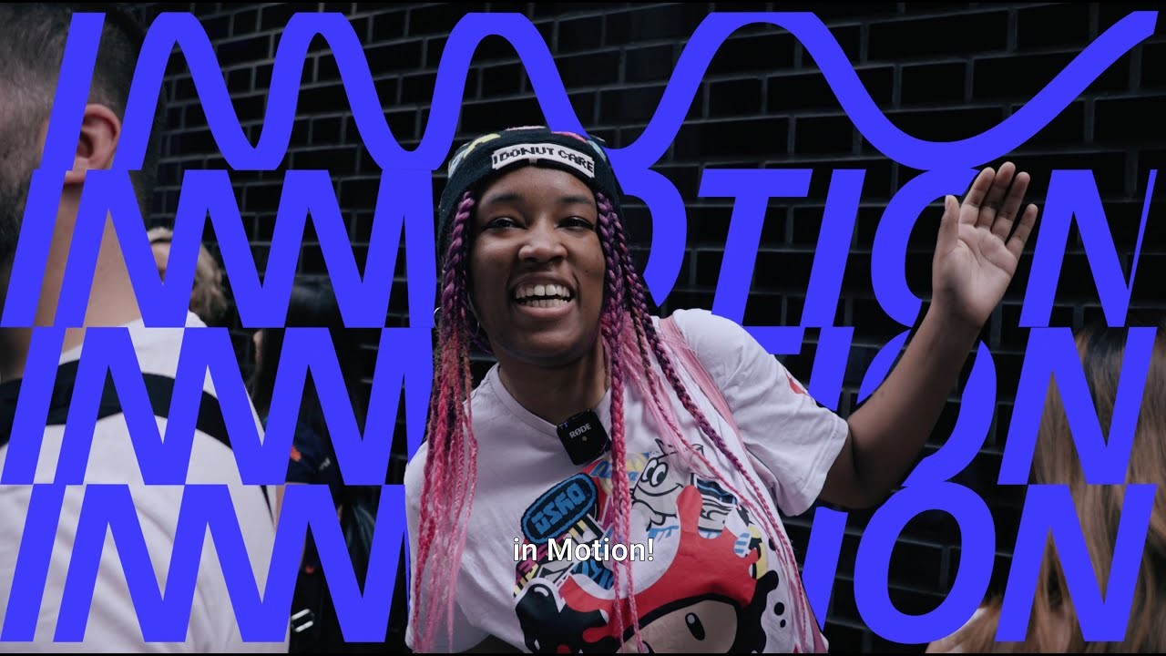
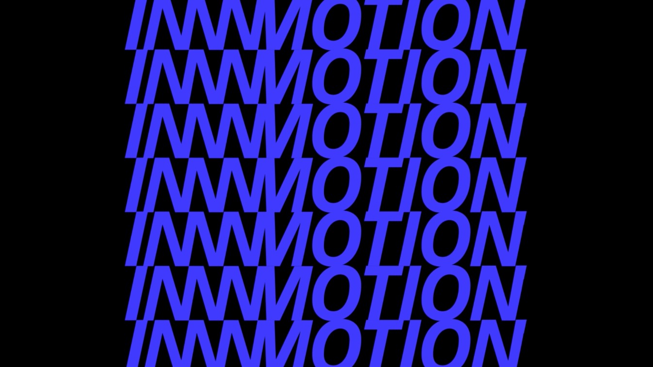
In Motion is a festival in London and Rotterdam celebrating the art of animation, film and moving image. In 2023, Buck partnered with Playgrounds to create an identity for the event. The assets needed to be simple enough to work across a variety of digital and physical deliverables, yet vibrant and stylised enough to imbue the festival with creative energy and build excitement.
This animated logo ticked all of these boxes, and more. "I just love the simplicity of showing something that's inherently dynamic and always moving, while also being unending and infinite," says Doug Hey, motion designer at DixonBaxi.
"It also has a really nice playful nature," he continues, "adding to the excitement and anticipation of the event as a whole and reflecting the eagerness of the audience and their passion for animation and moving image. The wavy line has also been expanded to become a dynamic graphic device, providing a beautiful consistency throughout the brand identity."
07. Sandisk by Daisy Chain
A post shared by Daisy Chain Studio (@daisy_chain_studio)
A photo posted by on
A subsidiary of Western Digital, SanDisk is known for producing a wide range of flash memory products, including memory cards and USB flash drives. Working with ELA on a rebrand for the company, Daisy Chain Studio took the idea of motion in logos and truly ran with it. "There's just something so creative and satisfying about the nods to data and technology in the animation work," says Doug. "It's a beautifully chaotic take on the trope of 'making tech cool' that I can't help but stop and stare!"
Greg Quinton, CCO at Design Bridge, agrees. "Not totally sure why, but I love this," he enthuses. "It’s probably the way the sound and motion combines to tell a mini story. That hints at part Tron, part Atari. But cooler. It makes me smile. On repeat."
08. Google
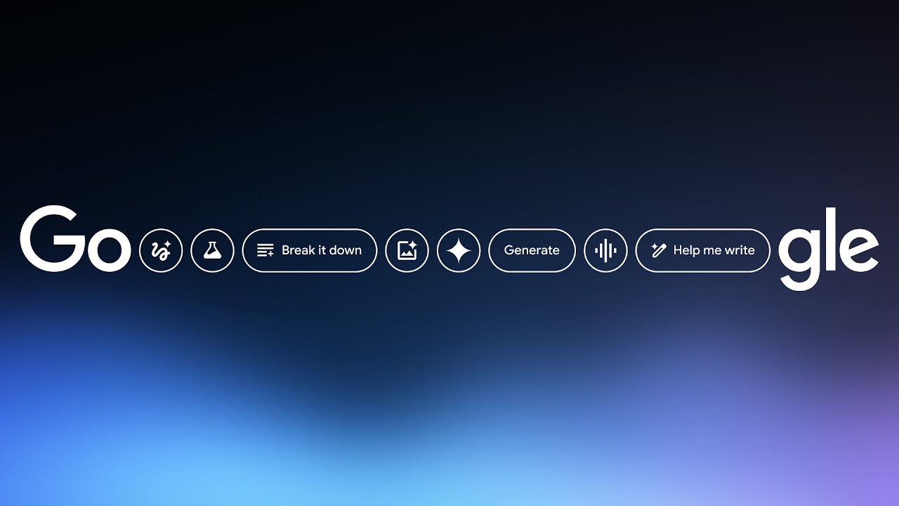
You may feel that the examples we've shown so far have been on the niche side... in which case, here's possibly the most mainstream use of motion in logo design you can think of. As Dan Rose of We Are Awesome says: "How can you not love the Google logomark animation? Its playful feel shows that Google is more of a personable brand and not just a search engine."
The video above shows a recent example of Google's moving logo, to promote its Gemini AI release. "The sense of logo elements jumping into place feels vibrant and fun, but also showcases their extensive services and products," notes Dan. "It feels like they’ve spent a lot of time wanting to get the positioning of their brand right that can lean into different divisions but always feel very 'Google'. After all, it’s modern-day culture’s favourite phrase – 'Google it'. It’s bit like having a reliable mate with you 24/7 who you’re happy to have around and can help with anything."
09. Laravel by Focus Lab
We'll end with one of the most creative uses of motion in logos we've seen for a long time indeed. Laravel is a free and open-source PHP-based web framework for building web applications, and this imaginative logo animation, crafted by Focus Labs, appeared a few years back on their website homepage.
"This was a powerful piece of logo animation," says Dan. "It felt like they understand their purpose of framework for the development industry and it really supported their brand language. It was very clean and technical, and had a building/engineering feel to it, whilst working well as a loop – the engine behind great works created."

Thank you for reading 5 articles this month* Join now for unlimited access
Enjoy your first month for just £1 / $1 / €1
*Read 5 free articles per month without a subscription

Join now for unlimited access
Try first month for just £1 / $1 / €1

Tom May is an award-winning journalist and author specialising in design, photography and technology. His latest book, The 50th Greatest Designers, was released in June 2025. He's also author of the Amazon #1 bestseller Great TED Talks: Creativity, published by Pavilion Books, Tom was previously editor of Professional Photography magazine, associate editor at Creative Bloq, and deputy editor at net magazine.

