Interaction design lessons from sci-fi: Visual interfaces
Make it so is a book for interface designers interested in understanding sci-fi's role in design history and using sci-fi interfaces in their own work. Here we present an exclusive excerpt on visual design, with a focus on typography
This is an edited excerpt from Chapter 3 of Make it so: Interaction design lessons from science fiction, published by Rosenfeld Media
Most fans of the film Jurassic Park remember the tense scene in which two fearsome velociraptors chase the park’s remaining visitors into a computer lab, and while the two adults desperately try to barricade the door, the two children rush to a computer terminal. The young girl, Lex, looks at the screen and proclaims, “It’s a UNIX system. I know this.” It’s a memorable geek moment (Figure 3.1).
Lex then searches for the lab building controls so she can activate the door locks to keep the velociraptors out. (Let’s not inquire, for the moment, why the doors themselves don’t have lock controls on or near them.) As she uses the workstation, we see a spatial user interface at work—an actual Silicon Graphics product from the time the film was made, known as 3D File System Navigator.
As the camera cuts back and forth between the kids at the computer and the adults blocking the door, the filmmakers are careful to show Lex’s hand as she uses the mouse. Although it wouldn’t be necessary today, back in 1993 many audience members would not have been familiar with a graphical user interface (GUI) with a windowing system and mouse.
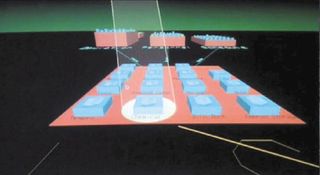
There’s an odd moment, however, as Lex navigates spatially to the block that represents the lab so she can click on it to access the controls. At first, it’s a small block on the horizon, and it only shifts forward slowly as the 3D map is redrawn (Figure 3.2). Once the desired block is in the center of the screen, Lex clicks on it to access its controls. The music swells to increase the tension—will she make it in time before the dinosaurs break in?
But if she can see the block on the screen when it’s on the “horizon,” can’t she simply click on it and activate the locks immediately? Why must she (and the audience) wait until it comes closer to the center of the screen and becomes a bigger target?
The answer is that it doesn’t—or shouldn’t—except that the director and writer needed to create tension in the scene, and this was a novel way to do so. The film sacrifices credibility in order to generate this tension, because, in real life, an interface like this should be quick and easy to use.
Get the Creative Bloq Newsletter
Daily design news, reviews, how-tos and more, as picked by the editors.
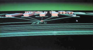
A spatial metaphor is a sensible way to organize locational data. It can even be useful in situations in which the data isn’t geographic (think of a spatial map of the body or of an automobile). While the use of a 3D spatial file system in Jurassic Park highlights an example of how great ideas in interfaces can become misused in films and television to serve the narrative, the more important point is that the novel visual style of the interface was purposely selected for its futuristic look. The director and designers weren’t content with a standard visual interface of the time, such as a floating window with buttons arranged inside. That would not believably establish that the organization was technologically advanced enough to grow dinosaurs from scraps of ancient DNA.
Lesson: the visual design is a fundamental part of the interface
Interaction designers are used to thinking in terms of goals and users navigating complex systems to achieve those goals. The appearance of a system can be relegated to secondary importance. But the visual design shapes the user’s impression of the system—how it compares to competing systems, its desirability, and even how capable and usable it is.1 Designers ignore appearance at their—and their users’—peril.
What counts?
Television and film are visual and auditory media. Cataloging every visual element or style throughout sci-fi would take much more space than we’ve got, so, for brevity, we have limited the elements to the use of graphics and text to convey information and controls.
Text-based interfaces
The visual design of computer interfaces began simply: with text on screens and little else.
Command-line interfaces
Early computer interfaces displayed input prompts, commands, responses, and system status as text. The earliest stored-program computers, such as ENIAC, printed their output on paper punch cards for the programmers to read. Later, time-share systems, which used remote teletype terminals to communicate, typed system status and commands on text-based paper rolls. When cathode ray tubes (CRTs) became more feasible, screens became the primary display technology. All of these were command-line interfaces (CLIs), and CRTs signaled the rapid expansion of computers into all aspects of work. Hollywood wouldn’t catch up to show CLIs on its screens for a few decades, by which time the style of these interfaces was firmly established in the real world.
Beginning in the 1950s, the typography of command-line interfaces was bitmapped and almost always fixed-width capital letters. Although as of the early 1960s ASCII encoding included lowercase letters, many implementations on popular platforms of the time, like CDC (Control Data Corporation) and DEC (Digital Equipment Corporation), didn’t allow for the use of lowercase characters. These screens resembled the output of cheap typewriters with a stuck shift key more than the professional typesetting used in publishing at the time.
Though all-text output had been seen in some prior films like Logan’s Run (1976), the first mainstream CLI in the survey appeared in the 1979 movie Alien, as Captain Dallas communicates to the ship’s control system, named Mother. Mother’s menace is underscored by her inhuman quiet and emotionlessness (Figure 3.3). This interface embodies the look of computer systems three decades old at the time, but it established a style that could be seen for decades to come.
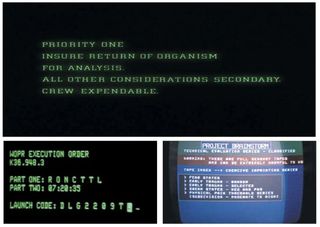
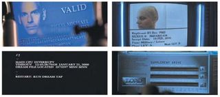
Since the advent of advanced GUIs with more refined typographic details that better resembled the typography in print, these crude bitmapped and fixed-pitch typefaces (and, to some degree, command-line interfaces in general) are used to denote either an older system or a character’s having deep access to a system. Gone, too, are the common use of all capital letters and the limited number of glyphs available in early computer typefaces. Now this style serves to bring to mind a very particular date and time, as seen in the examples from War Games and Brainstorm (Figure 3.4).
Lesson: use all capital letters and a fixed-width typeface to evoke the look of early computer interfaces
Nothing ages an interface like all capital letters, lots of num- bers, little punctuation, and no accents. In addition, the more bitmapped the type is, the older it looks, reflecting a time when screen resolutions were low and computer typefaces were pixel-based instead of constructed from outlines.
Lesson: otherwise, avoid all caps
Because people first read word shape rather than the individual letters in each word, fixed-pitch typefaces and, even worse, text in all capitals are more difficult to read. The variations in letter rhythm and shape make words distinctive and help us to identify them quickly. But it’s still a part of our collective visual language to see this as less sophisticated typography and iden- tify it as more serious and aimed at high-functioning experts, even if it’s much slower to read.
Once established, command-line interfaces were the dominant interface for nearly 50 years and still haven’t gone away entirely, in part because this is how most programmers learned to program, and in part because it’s often faster and more efficient to code in text-based interfaces—since code is text. Although 2D GUIs have risen in prevalence since the 1980s, we still see command-line interfaces in sci-fi. For the most part, directors, writers, and designers today use command-line interfaces when they want to communicate one of two things: that a system is older, or that a user has sophisticated computer skills. Sometimes a character with technical expertise will drop into a command-line interface in a window of a more sophisticated graphical interface for just this reason. One such example occurs in The Matrix Reloaded, when Trinity breaks into the power utility’s control center. Despite the many more-sophisticated graphical interfaces available, in order to defeat the security system and shut down the city’s power grid, she drops into a command-line interface to conduct her sabotage (Figure 3.5).
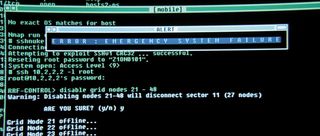
Despite the technical sophistication they convey, command-lines interfaces can be difficult to parse and scan to find a specific line or command, especially when everything looks the same. This is where real systems have excelled past fictional ones. Coding interfaces such as Adobe’s Dreamweaver apply color to HTML code to make it easier to parse (Figure 3.6). Tags are blue. Links are green. Functions are purple. Different coding environments use different color schemes, but it’s a rare system that doesn’t help break up the “wall of code” with color. We only see hints of this in sci-fi, probably because the interfaces are there to embody plot, rather than be used.
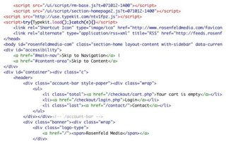
Lesson: help experts display their mastery
These kinds of “Wow, they’re good!” moments work because the interface looks to the novice overfull, undifferentiated, and complex, while the hacker works through it at breakneck speed. Real-world experts enjoy the same social cache when they have mastered a tool that appears dauntingly complex to a novice. The expert is rewarded with respect in these mo- ments, and the need for the services of the expert is reinforced. To ensure that these moments can happen, designers need to include ways for the expert’s mastery to be seen and appreciated—without being too understandable.
Graphical user interfaces
Interfaces that move beyond the command line are considered graphic user interfaces, or GUI. These include those with WIMP interface elements (windows, icons, menus, pointing devices) as well as those with shadows, refined typography, layering, and graphic controls such as buttons. Because there are so many GUIs to consider, this section looks at these interfaces by component.
Typography
We reviewed the main typefaces for each property in the survey. This wasn’t always easy, as typefaces aren’t always identifiable, even with the help of resources like Identifont.com, and it’s often tough to identify which might be the main typefaces of several used. With those caveats, here’s what we found.
Typographers may not be surprised to learn that sans serif is the overwhelming typeface choice for sci-fi, with serifed typefaces appearing in only a handful of interfaces. In the current survey of movies and TV shows, only seven serif typefaces were found: Alien (see Figure 3.3 above), Blade Runner, Galaxy Quest, Gattaca, The Matrix, Men in Black, and Star Trek: The Original Series (Figure 3.7). Note that in Star Trek and Blade Runner, all interfaces other than the one pictured here use sans serif type. Only Gattaca uses serif typefaces throughout. With that in mind, the ratio between sans serif and serif typefaces might be closer to 100:1.
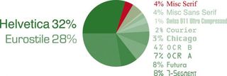
When we could identify specific typefaces, the majority were either Helvetica (or a derivative like Arial) or modular typefaces like Eurostile or Microgramma. The next third divides between Futura, OCR A, and LED-type faces. OCR B, Chicago, and Courier appeared in more than one property. Swiss 911 Ultra Compressed, the typeface used in the Star Trek LCARS interface, is underrepresented here because we counted it as a single property. Based on screen time, this one typeface might well eclipse all of the others. After counting typefaces per property, we get the results shown in Figure 3.8.
Lesson: sans serif is the typeface choice of the future
Given the propensity of sci-fi to use sans serif typefaces, de- signers working on projects meant to have a futuristic or sci-fi feel choose sans serif typefaces. If designers wish to build directly on the cache of sci-fi, Helvetica and Eurostile are strong candidates that viewers are accustomed to seeing.
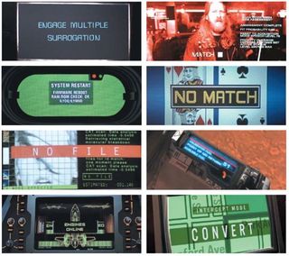
Typography in interfaces largely conforms to standards of the real-world systems being mimicked, with one primary exception. Cinematic interfaces must be read by audiences much more quickly than their real-world equivalents, and the visual hierarchy often becomes much more exaggerated to draw attention to the aspects of the interface that are important to the plot (Figure 3.9). In a few cases, this makes sense in the real world if the system is truly critical or built for true novices, but in systems built for expert users we would not expect the overly large text labels.
As desktop publishing and GUIs became more sophisticated in the early 1990s, more sophisticated typography appears in the survey, as well.
Typography on paper has been evolving for hundreds of years and has been optimized for its high-resolution medium. While screen-based typography has some of its own, unique requirements, as screen resolutions have increased steadily since the 1990s, the principles of print-based typography have become both more and more applicable to screens and possible to implement. For example, compare the displays in The Island, which use a great deal of text, with the command-line interfaces in the prior section. The Island interfaces are richer and more legible partly because they use a variety of type sizes and faces to distinguish information (Figure 3.10).
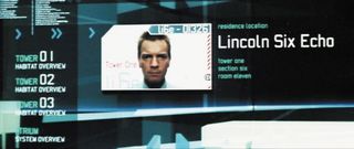
Most importantly, first-read information is larger and uses both upper and lowercase letters. Repetitive, second-read, and less important information uses only uppercase letters and smaller sizes. Third-read information is colored to have less contrast so that it stands out less, and fourth-read data—the least important—is very small. Sci-fi designers were maximizing the screen technology available to them and reminding us how far display technology has come.
Lesson: incorporate typographic principles from print
The graphic style of early GUIs was partly a result of the con- straints of the technology. Today, high resolutions and detailed graphic control is the norm. Without losing the new principles learned from on-screen design that deal with time, motion, and mode, designers can reincorporate the best practices from print that, for a time, had been disregarded as obsolete.
Though we don’t have enough room to get into all of them here, a few obvious ones jump to mind: use strong visual hierarchies to draw the eye, and use mixed cases as well as graphically correct punctuation, diacritical marks, and ligatures. These principles can make text on screen much more legible and beautiful.
This is an edited excerpt from Chapter 3 of Make it so: Interaction design lessons from science fiction, published by Rosenfeld Media. Please use the discount code NETMAG12, good for 20% off all products purchased from Rosenfeld Media.

Thank you for reading 5 articles this month* Join now for unlimited access
Enjoy your first month for just £1 / $1 / €1
*Read 5 free articles per month without a subscription

Join now for unlimited access
Try first month for just £1 / $1 / €1
The Creative Bloq team is made up of a group of design fans, and has changed and evolved since Creative Bloq began back in 2012. The current website team consists of eight full-time members of staff: Editor Georgia Coggan, Deputy Editor Rosie Hilder, Ecommerce Editor Beren Neale, Senior News Editor Daniel Piper, Editor, Digital Art and 3D Ian Dean, Tech Reviews Editor Erlingur Einarsson and Ecommerce Writer Beth Nicholls and Staff Writer Natalie Fear, as well as a roster of freelancers from around the world. The 3D World and ImagineFX magazine teams also pitch in, ensuring that content from 3D World and ImagineFX is represented on Creative Bloq.
