The insider’s guide to a successful website: design (part 1)
Laurence McCahill, co-founder of Spook Studio, explains how his team has simplified the process of creating a website into three key stages. In part one of this series he looks at design, including research, planning and testing, and breaks down the phase into 10 simple steps
Whether you’re redesigning your existing website or building the next Facebook, there are some fundamental steps that you should follow in order to get the most from your investment. When developing a new website many businesses make some basic mistakes which can be avoided.
Through our experience of working on over 250 web projects, we’ve simplified the process of creating a website into three key stages – design, build and promote. To help you with your own projects we’ve created a series of articles that break down each stage into 10 simple steps you can follow. We hope these will help you in your quest for online success and help you stay ahead of the competition!
Part 1: design
By design we don’t just mean pretty pictures – this stage also covers research, planning and testing. This first phase is fundamental – get this right and you’ll lay the groundwork for the rest of the project.
1. You need a clear business vision
For any supplier to be able to help you, they need to be able to clearly understand what your business is about and where it’s going. Make sure you’re able to do this by providing the right amount of detail. The more your designer knows about your business and requirements, the more useful and focused the final product will be. Any designer worth their salt should be asking you lots of questions before they start designing.
2. Be clear about your objectives
It’s crucial that you’re able to clearly communicate the goals and business drivers for the website. Without knowing the purpose of the site and agreeing on measurable objectives, it will be impossible to determine whether it has been a success or not.
3. Know your audience
The key to a successful website is making sure it fulfils the needs of its users. If they don’t find it useful and engaging, then you won’t retain their attention (or attract them in the first place). Therefore you need to be able to know everything about typical users of your site – their needs, behaviours and goals when on your site, as well information that influences this, such as their attitudes, beliefs, skills, environment, etc. You should create simple personas in collaboration with your designer, ideally basing these on real research from actual users of your site rather than just assumptions. These personas can then be used as a common reference point for any design decisions that are made as the project progresses.
4. The devil is in the detail
Don’t get bogged down in technical details and talk of technology too early on. The key thing for you to do is communicate what your site is supposed to do not how it’s supposed to do it. You provide the problems and your supplier will provide the solutions. After all, that’s what you’re paying them for.
5. Test early, test fast, test hard
To create great things you need to be working on the edge. The trouble with that is you never know what’s round the corner. Avoid making too many assumptions and test every idea you have at the earliest opportunity. Whether it’s an early draft of a logo; an intricate web form or even your business model, get it in front of people and listen to their feedback. And don’t think doing it once is enough. Iterate and test again. And again. The earlier and more frequently you involve users in creating your website, the more in tune it will be to their needs.
Get the Creative Bloq Newsletter
Daily design news, reviews, how-tos and more, as picked by the editors.
6. Avoid trends
You can’t be unique and differentiate yourself if you end up following the crowd. Don’t be afraid to break the mould whether it’s regarding design or technology. The key thing is to always work towards your business goals and make sure you’re not alienating your users. If you want to be ahead of the game then be unique. Apple didn’t become the biggest technology company in the world by following the crowd.

7. Show your human side
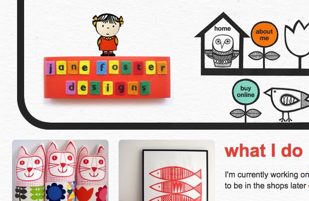
Just because a website is created using technology, that doesn’t mean it can’t have a human touch. It should be designed for people not computers, so don’t be afraid to show a little personality. Through strong branding, friendly copy, thoughtful and delightful design, you can create a bond with your audience that builds trust and loyalty. Too many websites are impersonal and faceless. Don’t be one of them.

8. Keep it simple
It’s amazing how even the simple ideas can get very complicated very quickly. Condensing a business idea, service or feature into an elegant, usable interface takes hard work and a lot of thought. Start with core ideas and don’t overcomplicate by adding more features because you thought they were a good idea at the time. Remember your business goals and think of your users. It’s a lot easier to add a feature later, than take it away once launched!
9. Love your designer
You need to find a supplier you trust. Someone who understands and believes in your business. In that way you’ll be guaranteed that they won’t be just following a brief but also adding value with new and potentially lucrative ideas.
10. Put it down in black and white
It’s crucial that you and your supplier are clear about your relationship. Make sure you have a contract and terms and conditions that are mutually beneficial. Make sure you own the IP, the website code and any digital assets produced for your site.
Don't miss part 2 next week, in which we look at the Build stage.

Thank you for reading 5 articles this month* Join now for unlimited access
Enjoy your first month for just £1 / $1 / €1
*Read 5 free articles per month without a subscription

Join now for unlimited access
Try first month for just £1 / $1 / €1
The Creative Bloq team is made up of a group of design fans, and has changed and evolved since Creative Bloq began back in 2012. The current website team consists of eight full-time members of staff: Editor Georgia Coggan, Deputy Editor Rosie Hilder, Ecommerce Editor Beren Neale, Senior News Editor Daniel Piper, Editor, Digital Art and 3D Ian Dean, Tech Reviews Editor Erlingur Einarsson, Ecommerce Writer Beth Nicholls and Staff Writer Natalie Fear, as well as a roster of freelancers from around the world. The ImagineFX magazine team also pitch in, ensuring that content from leading digital art publication ImagineFX is represented on Creative Bloq.
