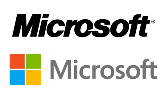
INDUSTRY INSIGHT: Designers comment on new Microsoft logo
Following the recent news that, after 25 years, Microsoft has a new logo, we asked our industry panel for their thoughts on the redesign.

Last week, Microsoft unveiled a new logo - its first since 1987. The redesign features the company's famous square symbol next to its name and the Helvetica font gives way to the Segoe typeface.
The logo design has been designed to coincide with the release of many new versions of their products this year, including Windows 8. The official Microsoft blog states: "This wave of new releases is not only a reimagining of our most popular products, but also represents a new era for Microsoft, so our logo should evolve to visually accentuate this new beginning."
So what are people making of the redesign? We asked our industry panel for their thoughts...
Elliot Jay Stocks says

"I don't have anything against Segoe as a typeface (although some have compared it to Apple's use of Myriad), but I find it slightly odd that that Windows mark has been included as part of the umbrella company's logo. Firstly, because it only represents one product and therefore excludes offerings such as Xbox. Secondly, because the Windows logo mark itself has recently been updated, so there's no correlation between the two. And thirdly, because the colour combination just looks so much like the Chrome icon, even though Windows hasn't been using it for some time. I don't dislike the new logo but it feels confused to me. Instead, I'd like to see Microsoft make a genuinely bold statement."
Elliot Jay Stocks is a designer, speaker and author.
Chris Malbon says

"I think its more of a case of 'it's what you do with it that counts' - yes it's pretty bland, but there's thought behind those four squares. It'll never date, it's a great platform for progress, it works across all media, and it has heritage. At the end of the day, Microsoft has played it safe, it doesn't offend anyone or stop you in your tracks, but that's part of its problem - it doesn't stir up any emotions, it just, well... IS. I think it's one to watch. The new Windows system and style guide is very similar, as a branding language it works well as a kit of parts, it's clear and trustworthy. I just wish there was some risk or hook to it but, who knows, that might happen over time?"
Chris Malbon is a freelance designer and illustrator.
Daily design news, reviews, how-tos and more, as picked by the editors.
Simon Jobling says

"There are a number of reasons to condone the redesign, appreciate the injection of colour to reflect the new Metro visual language, respect the modern, elegant feel of the new typeface Segoe. But I have a problem with the icon. The lack of depth or perspective feels inconsistent with other recent designs by the Redmond giant. The new Microsoft frame icon lacks the depth I was expecting. It’s lovely to see the brand colours into a unified element but it’s missing that wow factor for me."
Simon Jobling is a web developer and designer based in the UK.
Rob Redman says

"Microsoft definitely seems to be heading in a clearer direction with the new design. It perfectly reflects both previous incarnations of the company's logos as well as the new device-independent GUI, which is something vital to their success. Creating a unified identity could be the main tool in Microsoft turning the tables again and becoming a intuitive platform, something Apple has been doing well for a long time.
"The new logo also has nostalgic connotations for people of my age. When I first started using computers seriously I was using Windows 3.1 then 95. Enough time has passed for the new logo to look back at those fond memories and re-interpret them in a clean and simple way (not like the last few versions which have all been too fussy)."
Rob Redman is a 3D artist and founder of Pariah Studios.
What do you think of our industry panel's views? Tell us in the comments below!

The Creative Bloq team is made up of a group of art and design enthusiasts, and has changed and evolved since Creative Bloq began back in 2012. The current website team consists of eight full-time members of staff: Editor Georgia Coggan, Deputy Editor Rosie Hilder, Ecommerce Editor Beren Neale, Senior News Editor Daniel Piper, Editor, Digital Art and 3D Ian Dean, Tech Reviews Editor Erlingur Einarsson, Ecommerce Writer Beth Nicholls and Staff Writer Natalie Fear, as well as a roster of freelancers from around the world. The ImagineFX magazine team also pitch in, ensuring that content from leading digital art publication ImagineFX is represented on Creative Bloq.
