INDUSTRY INSIGHT: Designers' favourite architecture revealed
Following The Shard's official inauguration last week, we asked our industry panel to name their favourite architectural designs.
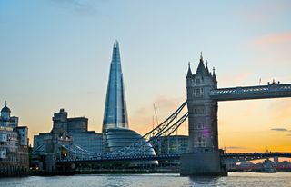
Just last week, The Shard in London received its official inauguration after building work on its exterior was completed. Standing at 1016ft high, The Shard is now Europe's tallest building.
Italian architect, Renzo Piano, designed the skyscraper with an irregular pyramid shape, clad entirely in glass. With design always on our minds, and with so many stunning pieces of architecture around the world, we asked our industry panel to name their favourite...
Mark Lee says

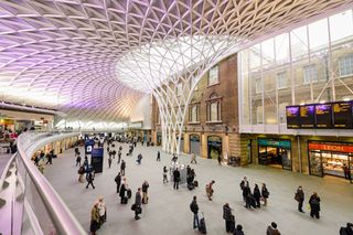
"A recent favourite of mine has to be the new King's Cross station roof in London. I'm a sucker for the classic juxtaposition of old-meets-new, and I think this John McAslan and Partners-designed structure does it perfectly against the old Victorian brick station façade.
"Yes, it's a roof, but what a roof it is. The delicate stem rises from the concourse and blossoms into an organic tree-like canopy with a mesmerising lattice of branches overhead. The glazed elements let natural light flood into the station, and if you're going to have to wait for a train (and indeed you will), it's not a bad place to do so at all!
"Also, not to be outdone by impressive statistics (The Shard's being 'Europe's tallest building'), King's Cross station roof is 'Europe's largest single-span station structure'. For now."
Mark Lee is senior designer at brands communications agency Uniform
Rob Redman says

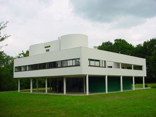
"I've always had a soft spot for the designs of Le Corbusier. Something about the clean lines, defined proportions and the crisp silhouettes speaks to and satisfies me. Considering the Villa Savoye is now over 80 years old it still looks ultra modern and although it may be less structurally sophisticated than some of Zaha Hadid's designs it remains a strong contender for one of the world's most recognisable designs. I've long been a fan of Farnsworth house but the Villa Savoye takes that approach and lifts it, quite literally, into the air, with it's regimented pillars.
"I also love the industrial-looking towers that are reminiscent of Midwestern grain silos. They shouldn't work with the hard lines of the lower floors but they do."
Rob Redman is a 3D artist and founder of Pariah Studios
Howard de Smet says

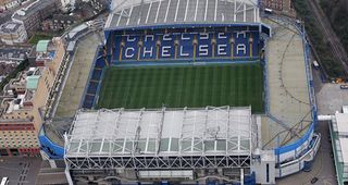
"There are many grand, interesting works of architecture I admire but there's one building that means more to me than any other. There's no piece of architecture more powerful that Chelsea Football Club's ground, Stamford Bridge, in Fulham. The sense of theatre in the stadium is unrivalled. I notice something new each time I attend, sitting through the different levels and each time having a new view of the blue plastic chairs, concrete and turf. How it feels to be watching The Blues play amongst 40,000 others, all boiling over with emotion, is something hard to put into words.
"It's certainly not the most beautiful of stadia. In fact I'd almost call it ugly. A grey and beige monster in one of the wealthiest areas of London. It's been knocked down and rebuilt over the years, with new stands added along with hotels and megastores, all becoming part of the club's history and creating something unique. The Bridge is a work of convenience, yet it's an ampitheatre that fills me with a feeling of brilliance like nothing else."
Howard de Smet is a senior visual designer at global digital agency Huge
Dan Moat says

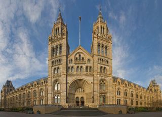
"There's one building which leaves me in awe every time I see it in person and that's the Waterhouse Building, the main building of the Natural History Museum in South Kensington, London.
"I love the sheer scale of the museum juxtaposed with all the extraordinarily small detail in the animal sculptures which are found hiding amongst the elaborately patterned columns inside, and the animal and plant carvings found dotted across the whole of the building. The work that has gone into these decorations is fantastic, and they are a delightful window into the Victorian view of the natural world. But, I think the building itself stands alone as a work of beautiful design too.
"The beautiful Romanesque architecture uses both yellow and blue terracotta tiles in various sizes which makes for a distinctive look. And this is used to a wonderful effect in the stunning main entranceway where the nested arches alternate between rows of carved blue and yellow tiles. So much work has clearly gone into making even the simplest detail perfect. The building even has a (delightfully decorated) ventilation system built into it, which should impress functional design junkies out there! You can tell a great amount if thought, and love, went into how every inch of the building looks and it really makes you feel you're walking into somewhere special. It's not exactly as trendy as the Gherkin or the Shard but it'll do for me!"
Dan Moat is a freelance graphic design operating from his UK-based studio Tahninial
Neil McFarland says

"My favourite piece of architecture is the standard post-war semi detached housing seen all over the UK. This is in large part due to nostalgia, as I lived the first three years of my life in one of these houses. They are extremely well designed with front and rear gardens, plenty of storage space inside and a good wide space between each pair. I've still got the handbook my grandparents received when taking up residency, the contents of which remind of the great hope and optimism that existed when these estates were built.
"While it's not grand or awe-inspiring architecture, it's supremely functional and gave thousands of people a much higher standard of living that they'd ever known (the indoor toilets being the big bonus). Many housing schemes since have failed to reach the same standard set by these developments, which greatly depresses me. I wish I could force the planners and developers who built badly designed, poorly built houses to live in them for a year so they could understand the levels of human suffering they are responsible for. That's why I'm happy to champion an overlooked but great bit of architecture!"
Neil McFarland is lead visual designer at digital design studio ustwo

- For more architectural awesomeness, check out 20 Design Landmarks Everyone Should See Before They Die
What's your favourite piece of architectural design? Let us know in the comments box below...

Thank you for reading 5 articles this month* Join now for unlimited access
Enjoy your first month for just £1 / $1 / €1
*Read 5 free articles per month without a subscription

Join now for unlimited access
Try first month for just £1 / $1 / €1
Get the Creative Bloq Newsletter
Daily design news, reviews, how-tos and more, as picked by the editors.
The Creative Bloq team is made up of a group of design fans, and has changed and evolved since Creative Bloq began back in 2012. The current website team consists of eight full-time members of staff: Editor Georgia Coggan, Deputy Editor Rosie Hilder, Ecommerce Editor Beren Neale, Senior News Editor Daniel Piper, Editor, Digital Art and 3D Ian Dean, Tech Reviews Editor Erlingur Einarsson and Ecommerce Writer Beth Nicholls and Staff Writer Natalie Fear, as well as a roster of freelancers from around the world. The 3D World and ImagineFX magazine teams also pitch in, ensuring that content from 3D World and ImagineFX is represented on Creative Bloq.
