INDUSTRY INSIGHT: Designers' top Pixar characters revealed
Following the release of Brave this week, we asked our industry panel to name their favourite Pixar character designs.
Neil McFarland says

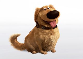
"My favourite Pixar character is Dug, the helpful dog from UP. Basically Dug is just out-and-out funny. From his opening lines of, 'I can smell you!', to the way they structure his speech. It's such a great depiction of exactly what a dog would say if he could speak.
"The animators have done a superb job of capturing the movement and physical communication of a dog - I literally just re-watched a clip again with the sound off and the acting is sublime. When you add this touch with the comedy value of hearing him talk, it just creates magic way above most of the other 'talking animals' out there.
Scene setter
"I think usually with talking animal animation, the main focus is portraying the 'character' that appears in the script, which is just an actor. Of course, this is important and the character of the animal must be folded into the performance but only really to set the scene. With Dug, we have an actual dog, who happens to speak and that is genius and what makes it so hilarious!
"Dug is totally disarming, brave, and loyal - everything a dog should be. When we hear him talk it feels, to me at least, that we've been granted a privilege of understanding the workings of a dog's mind. And it's as hilarious, warming, and loveable as I always imagined it would be."
Neil McFarland is lead visual designer at digital design studio ustwo.
David Fleet says

"I fell in love with Dug, the Golden Retriever from UP. Instead of just being a cartoon talking dog, they chose to play out his thoughts through a speaker on his collar - not the most effective way to communicate in animation terms.
"The animators must have had a lot of work to do to make him engaging and expressive. The layout of his face, especially around his eyes and brows, is remarkably successful in giving him bags of personality. Coupled with his big nose and short legs, its hard not to love him.
"Squirrel!"
David Fleet is deputy head of 3D at post-production and visual effects facility The Mill.

Mike Stone says

"Of all the many loveable characters given life by Pixar, few have captured my imagination quite like Wall-E. He has a junkyard aesthetic that I find especially appealing – a combination of unusual odds ‘n’ ends, brought together to create a refreshingly unique character.
"There’s something distinctly Studio Ghibli-ish about his appearance, perhaps the cute little caterpillar tracks or binocular eyes. It makes him the perfect fit for the scrap wasteland he inhabits at the start at the movie. Even his beige colour palette locks in seamlessly with his environment. Of course, the character is completed by some exquisite sound design - the whine of his engines, the quirky little clicks, and his adorable, barely audible, robotic ‘voice’.
Tan lines
"A final reason why both the film and character are particularly close to my heart is the involvement of Oscar-winning illustrator Shaun Tan (perhaps my favourite illustrator) in producing the concept art for this animated masterpiece.
"Say it with me! 'Waaaaaallll-eeeeeee'."
Mike Stone is an illustrator and copywriter at global digital agency Huge.
Tom and Mark Perrett say

"Wall-E is the character that does the most with the least. He's basically just a box and a pair of eyes but the thought and detail in his design makes him so much more than the sum of his parts.
"As robot fans, and designers, we know how hard it is to get warmth and emotion from cold glassy mechanical eyes but Wall-E has no such problems. You engage with him immediately and (for the first 20 minutes at least) he gives us a perfect combination of design, storytelling, animation. And sound design... his voice is amazing."
Brothers Tom and Mark Perrett are directors at independent production company and animation studio Nexus.
Antony Ward says

"Having looked back over the Pixar library, a few stand out to me but the main one would have to be Wall-E. His design is perfectly suited to his purpose which is to collect and process rubbish. It would have been easy to get carried away when creating him, but Pixar made him believable because the of way his look fits his job and his location.
"What they also managed to do was design him in such a way that he could express emotion. He is a robot so shouldn't need to show feelings but the small details, like the flaps over his eyes, gave the animators the ability to bring him to life. It's these elements which make him such a good example of character design, and it shows throughout the film."
Antony Ward is a freelance digital artist, animator and writer.

Find out what other Pixar characters are loved by designers next...

Thank you for reading 5 articles this month* Join now for unlimited access
Enjoy your first month for just £1 / $1 / €1
*Read 5 free articles per month without a subscription

Join now for unlimited access
Try first month for just £1 / $1 / €1
Get the Creative Bloq Newsletter
Daily design news, reviews, how-tos and more, as picked by the editors.
The Creative Bloq team is made up of a group of design fans, and has changed and evolved since Creative Bloq began back in 2012. The current website team consists of eight full-time members of staff: Editor Georgia Coggan, Deputy Editor Rosie Hilder, Ecommerce Editor Beren Neale, Senior News Editor Daniel Piper, Editor, Digital Art and 3D Ian Dean, Tech Reviews Editor Erlingur Einarsson, Ecommerce Writer Beth Nicholls and Staff Writer Natalie Fear, as well as a roster of freelancers from around the world. The ImagineFX magazine team also pitch in, ensuring that content from leading digital art publication ImagineFX is represented on Creative Bloq.
