Improve your website navigation
Content might be king and a picture may speak a thousand words, but you’d see none of it were it not for navigation. Interaction designer Paul Annett explores navigation trends and how they’re evolving
This article first appeared in issue 212 of .net magazine - the world's best-selling magazine for web designers and developers.
The ability to instruct our web browsers to move from one page of hypertext to another, or between blocks of content, is a fundamental building block of the web. In recent years it’s developed far beyond its humble beginnings as a list of small blue links set in Times New Roman.
Navigation trends in use on the web today range from the traditional to the groundbreaking, the usable to the downright bizarre. The field is changing rapidly – but maybe it’s best to start by defining what ‘navigation’ actually is.
The Merriam-Webster dictionary talks about navigation primarily in terms of movement:
1 – the act or practice of navigating
2 – the science of getting ships, aircraft, or spacecraft from place to place;
It goes on to define it in terms of orientation:
...the method of determining position, course, and distance traveled
Get the Creative Bloq Newsletter
Daily design news, reviews, how-tos and more, as picked by the editors.
We have navigation devices to fulfil both of these roles, but it could be argued that navigation specifically on the web also serves a third role: to inform the user of a site’s purpose.
“The problem with the term ‘navigation’,” says James Box, user experience designer at Clearleft, “is that it suggests it’s about wayfinding, but it’s about much more than that. It’s also about underlining the proposition. Well-conceived navigation can act as a positional statement for your site.”
“Your navigation can set your company apart from your competitors,” adds Relly Annett- Baker, content strategist at Headscape. “The language that you use to describe what you offer should be direct, informative and enticing.”
Indeed, a common mistake is to use generic terms as main navigation items. Someone with a broken sink is likely to be more responsive to a navigation item labelled ‘Plumbing’ rather than ‘Services’, and search engines would definitely list your site more favourably under the relevant terms. In some situations, however, creating such a meaningful navigational structure can be difficult if your company offers a range of diverse services.
Primary web navigation traditionally takes two forms: a horizontal list across the top of the site, or a vertical list down the left-hand column. Each of these has its pros and cons, most notably that a horizontal list has a finite length and can only be made up of fewer or shorter labels, while using a vertical list can significantly reduce the usable width of the site.
Drop-down menus
Drop-down menus are often used to squeeze in those navigation items that otherwise don’t fit. In the hands of the badly structured sites, drop- down menus can be a usability nightmare (see etoncollege.com for an example of this).
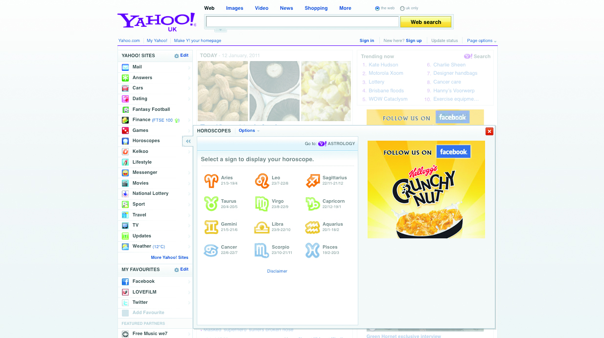
Yahoo’s recent redesign included a left navigation with pop-out boxes, where simply hovering over a menu item invoked a huge panel of related options (and a dashing array of ads) that obscured the rest of the page. At the time of launch, I tweeted that I’d accidentally hovered over the navigation and the website punched me in the face – at least that’s what it felt like!
Yahoo has since removed that functionality but replaced it with having a singular sub-navigation ‘choice’ called ‘open quickview’. To me this still seems like an ill-conceived compromise focused on short-term profitability rather than usefulness.
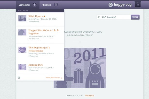
However, drop-downs or pop-out panels can be used to good effect. “There’s been a lot of care and attention provided to the (ahem) venerable drop-down menu,” opines web designer Ethan Marcotte. “Historically, they’ve been treated as ‘link piles’, buckets into which a list of links could be dumped. NYMag.com was one of the first sites I saw that introduced tiers of content into their drop-downs, with thoughtful design applied to each. Happy Cog, my former employer, also has a beautiful treatment of the ‘Articles’ and ‘Topics’ menus on its blog, the design of each tailored to the content housed within.”
Considering context
Attention to detail and consideration for the context in which it will be used play a massive role in designing good navigation. “User interfaces are a necessary evil,” says UX designer/iOS developer Aral Balkan. “In an ideal world, you wouldn’t need to navigate through information hierarchies or search for information: your device would intuitively know and display the information you need, when you need it, without requiring further input from you.”
Pagination is the sequence of numbers used to navigate through content that spans multiple pages. Typically this might be search results, or another type of list such as tweets or Facebook updates. A recent trend is to ditch pagination and instead use Ajax to load more content from the server directly into the current page: for example, when the user presses a ‘load more’ button or simply scrolls as far as the bottom of the page. In normal day-to-day use this seems like the intuitive solution craved by Balkan – the website anticipates the user’s next action and takes care of it for them – but in some niche circumstances it can make the user’s goal harder, if not impossible, to achieve.
Let’s say you want to look back through your Twitter stream for something you tweeted a month ago. With pagination, you’d be able to skip back multiple pages at a time, or even look for the pattern in the URL that indicates that you’re currently on page 2, and change that to 20 to manually skip back an even larger period. Admittedly these tricks are probably mostly the domain of power-users, but by removing pagination in favour of loading more into the current page, Twitter prevents this shortcut from working.
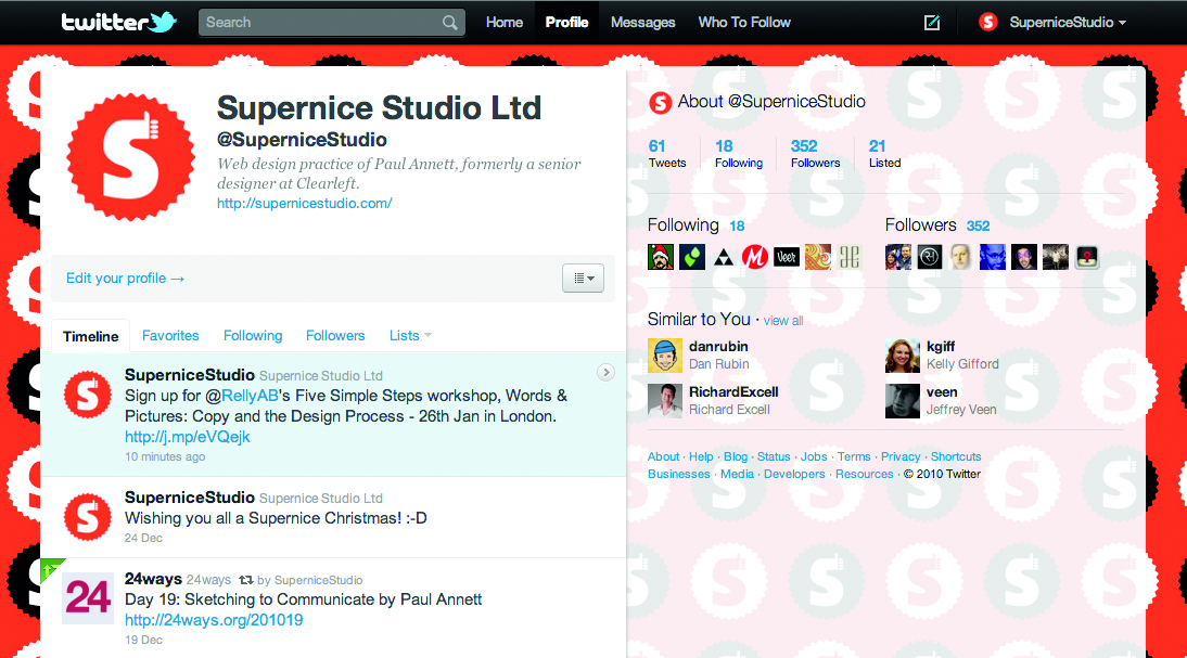
It’s also slightly disconcerting if you want to click a link in the footer on Facebook, but upon reaching the links they disappear off the page because the website has ‘kindly’ loaded more content for you. Fortunately, Facebook only automatically loads more once, then prompts you the next time with a link that will only work if you have JavaScript turned on.
On the subject of JavaScript dependency, Yahoo recently completed a study into how many users worldwide browse without JavaScript. Their findings show that it’s as low as two per cent in the USA and 1.29 per cent in the UK, so some sites like Facebook may choose not to support those users. “The percentage of users with JavaScript disabled seems like a low number,” says Nicholas Zakas, principal front end engineer at Yahoo. “But keep in mind that small percentages of big numbers are also big numbers.” It’s surprising that a site as large as Facebook doesn’t seem to agree with his policy.
“The best approach,” adds Zakas on the YDN blog, “is still progressive enhancement, ensuring each user is capable of receiving the best possible user experience based on their browser capabilities.”
Breadcrumb trail
The humble breadcrumb trail is a perfect example of navigation whose primary role is not to facilitate movement between pages, but more to help the user orientate themselves within the site. A typical breadcrumb trail is a list of pages, which are higher up the site hierarchy than the current page – a kind of web equivalent of the ‘you are here’ sign. But it’s not always that simple.
In 2008 while at Clearleft I worked with Cennydd Bowles on a client project for a travel startup. “Two critical factors in choosing from the ‘active’ holidays offered through Tourdust were what the activity is and where it happens,” recalls Bowles. “It’s therefore no accident that these two variables are featured prominently on the site, as both navigation and headings.
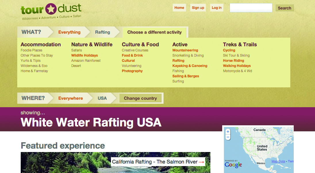
“We made the decision to split these two key variables off and turn them into primary navigation by means of dual nav bars, part breadcrumb and part hierarchical menu,” he adds. Had we had more time we probably would have developed this innovative design solution further and made a handful of other tweaks to the site – but by all accounts this unconventional navigation is working for Tourdust’s customers.
Tourdust is the type of website an information architect might term poly-hierarchical, where the same content can be discovered within multiple sections throughout the site. Because there is no rigid hierarchical structure it makes it difficult to define breadcrumb trails, or to use the parent category in the URLs.
Using parent categories in URLs provides a logical structure that will benefit the site, not only because search engines love keywords in web addresses, but because the URLs will be ‘hackable’ by – and therefore your site will be more accessible to – humans.
Setting a perfect example in this regard is the Accessible Train Times site by Matthew Somerville. Just by looking at the URL of a journey page, you can see how you might change it to navigate to the train times for a different journey: traintimes.org.uk/london/ brighton/1600/tomorrow.
Chris Shiflett, a founding member of Analog took human-readable URLs a step further when building the site for his former employer, Omni TI. “Instead of thinking purely in hierarchies, I wanted to also make the URLs powerful statements that stand on their own,” he says. “If other sites can get away with ugly URLs, surely we can get away with having some fun.”
Tag clouds
Tags clouds are evolving. No longer are they just a way to annotate your content with keywords to aid its discoverability; more and more they are created and consumed by other websites, in a format called machine tagging. Machine Tagging essentially enables any website to call in and display content from across the web, based on whatever variables were assigned to that content when it was uploaded. These could be location details (latitude, longitude), event details (time, date), subject details (person, topic etc) or pretty much anything you can think of. Apps that can automatically tag content for mobile users take a lot of the burden of what might otherwise be a complex interaction away from the user.
More and more interactions are happening on the move via mobile phones, and as real-time communication becomes increasingly popular on sites such as Twitter, tags are becoming trends – a glimpse at what’s currently capturing the public’s attention. Twitter trends are tag clouds on speed. What makes them different is that they reflect more than just popularity.
“Twitter Trends are automatically generated by an algorithm that attempts to identify topics that are being talked about more right now than they were previously,” says Twitter’s Carolyn Penner. She was forced a couple of months ago to explain on the Twitter blog why Wikileaks wasn’t trending despite the high levels of conversation about it: “Sometimes, popular terms don’t make the list because the velocity of conversation isn’t increasing quickly enough, relative to the baseline level of conversation happening on an average day; this is what happened with #wikileaks this week.”
Interacting with services like Twitter on the move is a completely new paradigm for interface designers to contend with. Should we be bearing taps in mind as much as clicks? Anthony Ribot, of Ribot, thinks so. “There’s a general trend that interfaces are becoming more ‘touch friendly’, as seen on Flickr’s mobile website. Buttons and content designed to be at least the size of a fingertip result in a much more usable touch mobile interface.”
It’s not only ‘tappability’ we should be considering, but the entire mobile experience. “When designing Tesco’s mobile shopping experience, we cut existing online navigational elements down by 74 per cent,” Ribot explains. “This resulted in a more efficient, effective shopping experience as a result. If you’re creating a utility app, part of your core focus should be to provide a time-efficient path to the intended action or item of required information.”
James Box suggests designing completely different navigation for different mediums, rather than relying on one universal design for all devices. “iPads and iPhones, for instance, are used in a vastly different context,” he argues. “Navigation will benefit from feeling consistent between the two devices, but should also be device-appropriate. Universal design almost delivers the worst of both worlds, as it’s not contextual to the user’s browsing experience.”
The mobile world offers the most exciting opportunities for emerging navigation trends. We’re no longer restricted to invoking navigation options as a result of direct user input. Today’s smartphones have a myriad of sensors: cameras, microphones, accelerometers, magnetometers, gyroscopes and GPS all open a world of possibilities. Point-and-click, or even point-and- touch, are not the only options.
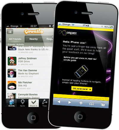
“These are technologies that allow developers to create augmented reality apps that users navigate by moving their phones in real-space,” says Balkan. “Sometimes the best user experience is that which requires no user interface. Devices that intuit user intent based on various factors – including geolocation, time of day and perhaps even your heart-rate or the look on your face – are still a long way off and some conscious statement of intent will no doubt always be required in human-computer interaction. What excites me about the iPhone today is that it constitutes a step in the direction of realising this ideal.”
Coding it up
Providing code samples for every navigation implementation would be impossible, so here are the very basics for marking up ‘standard’ horizontal or vertical navigation in HTML.
You should use a ul element, styled with CSS to define the look.
Applying a class to each li element within it enables you to control the ‘current page’ state by changing the class on the body rather than requiring different navigation markup for each page.
<style type="text/css"> ul{ margin:20px; }#nav li{ display:inline; /* produces horizontal nav – leave it out for vertical nav */ margin:0; list-style-type:none; } #nav a{color:#333; padding:5px 10px 4px; background:#eee; text-decoration:none; display:inline-block; } #nav a:hover{ background:#aaa; color:#fff;} body.home #nav .home a,body.about #nav .about a, body.blog #nav .blog a, body.contact #nav .contact a { background:#f00; color:#fff;} </style><body class="about"> <ul id="nav"><li class="home"><a href="/ home">Home</a></li><li class="about"><a href="/ about">About</a></li><li class="blog"><a href="/blog">Blog</ a></li><li class="contact"><a href="/ contact">Contact</a></li></ul> <!-- put the rest of your site here! --> </body>If you know any sites that do navigation particularly well, please let us know in the comments!

Thank you for reading 5 articles this month* Join now for unlimited access
Enjoy your first month for just £1 / $1 / €1
*Read 5 free articles per month without a subscription

Join now for unlimited access
Try first month for just £1 / $1 / €1
The Creative Bloq team is made up of a group of design fans, and has changed and evolved since Creative Bloq began back in 2012. The current website team consists of eight full-time members of staff: Editor Georgia Coggan, Deputy Editor Rosie Hilder, Ecommerce Editor Beren Neale, Senior News Editor Daniel Piper, Editor, Digital Art and 3D Ian Dean, Tech Reviews Editor Erlingur Einarsson, Ecommerce Writer Beth Nicholls and Staff Writer Natalie Fear, as well as a roster of freelancers from around the world. The ImagineFX magazine team also pitch in, ensuring that content from leading digital art publication ImagineFX is represented on Creative Bloq.
