How to use vector graphics with imagery to create striking artwork and backgrounds
We demonstrate how to quickly create striking graphic backgrounds that will bring your designs to life!
Creating background graphics that can really bring your designs to life is a skill any designer should have, especially when it's so quick and easy to do. Through the next few steps I'll demonstrate how to create a vector pattern within Illustrator, how you can then affect and manipulate it within Photoshop, and finally, how you can then utilise the patterns within InDesign with existing imagery.
01. Basic shape creation
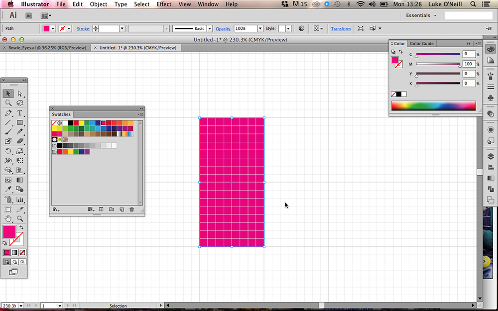
Launch Illustrator and create a new document. Use the shortcut Cmd+' to show the document grid and ensure that 'Snap to Grid' is selected from the view menu.
Select the rectangle tool and draw an oblong that sits flush to two of the bigger grid squares in height and one larger grid square in width. Set the stroke to 'none' and pick a colour for the fill so it's easier to see.
02. Creating a rounded oblong with gradient fill
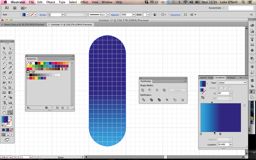
Now draw two perfect circles by holding Shift whilst using the ellipse tool and position them so their centre point sits perfectly at either end of our original oblong shape. Navigate to the pathfinder panel and use the 'unite' function to combine all three shapes into one single lozenge shape.
Now navigate to the gradient panel and click to apply a fill gradient. Enter 90 into the angle field and simply drag colours from the swatches panel onto the gradient slider to apply a colour scheme.
03. Duplicating vectors to create a pattern
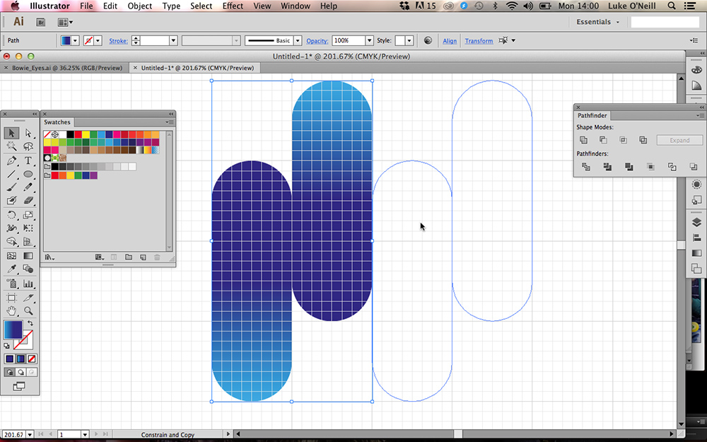
Next, with 'Snap to Grid' still turned on hold alt and drag the lozenge shape horizontally so that it sits flush alongside the original shape. With the new shape still selected, hit R and hold shift to rotate the shape 180 degrees so that the gradients are travelling in opposite directions.
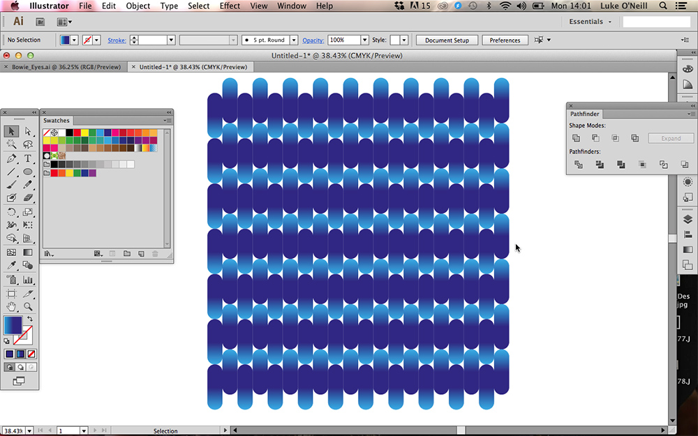
Now drag the shape so that it sits offset to the original shape as shown in the first screenshot above. Then simply select both shapes and duplicate them to sit alongside the originals, using Cmd+D to duplicate the shapes at equal intervals. Repeat this process until you have filled a large square area of your document as shown above.
Get the Creative Bloq Newsletter
Daily design news, reviews, how-tos and more, as picked by the editors.
04. Importing into Photoshop
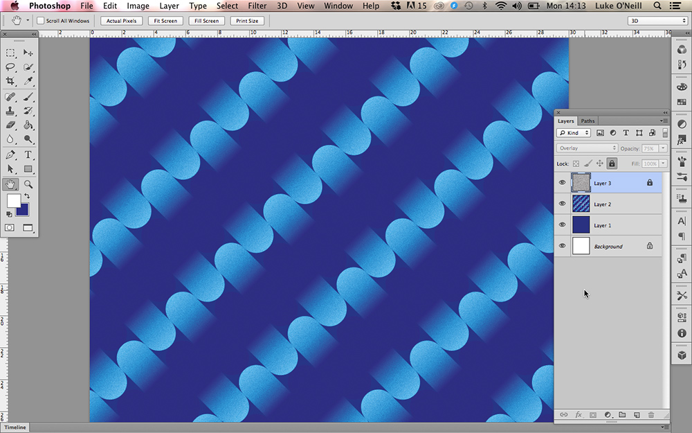
Now navigate to Photoshop and setup a new square RGB document. Create a new layer and fill it with the darkest colour value from your vector gradient shapes and paste the whole pattern into Photoshop as 'Pixels' rather than 'Smart objects'. Now rotate your pattern 45 degrees so we have a diagonal pattern rather than a vertical one.
Next we want to add a bit of grain to the piece. Create a new white filled layer at the top and simply navigate to the filter gallery (only available in RGB mode) and select the 'Film grain' filter. Play around with the sliders until you're satisfied and then set the layer blending mode to 'Overlay' back in the layers panel and adjust its opacity until you're happy with the results.
05. Blending mode fun and games
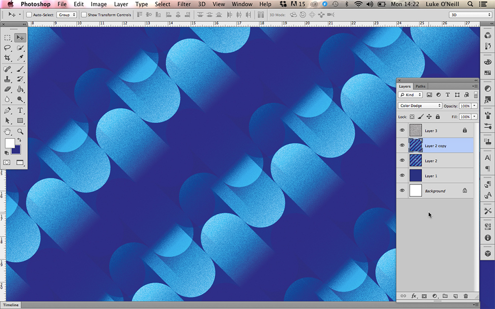
Now for the fun experimental part of the process. Simply duplicate the pattern layer by dragging it onto the 'Create new layer' icon at the bottom of the layers panel. Now experiment by playing around with the blending modes and offsetting the duplicated layers to create interesting effects and different patterns.
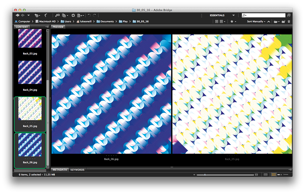
The first example above shows the original layer simply duplicated, set to 'colour dodge' blending mode and then offset from the original layer. Experiment with adjusting the colour and saturation and deleting areas with a large soft brush to create a variety of effects. You may wish to save out separate flat jpeg images for later use so that they're more manageable than a large PSD file.
06. Putting the backgrounds to use
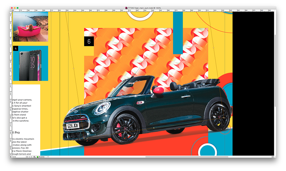
Once you've created a variety of backgrounds you're then free to utilise them in anyway that you wish. You may want to use them as a base for another piece in Photoshop or as in the case above, use them within a layout in InDesign.
In the above example I'd already designed my layout but wanted to add some more visual interest in the background. Simply select the shape that you wish to import the graphic into, hit Cmd+D to bring up the place menu and then hit enter to place the graphic within the frame. You can then use the direct selection tool (A) to rotate, enlarge or flip the pattern until you're satisfied with the results.

Thank you for reading 5 articles this month* Join now for unlimited access
Enjoy your first month for just £1 / $1 / €1
*Read 5 free articles per month without a subscription

Join now for unlimited access
Try first month for just £1 / $1 / €1
Luke is a creative director, visual designer and digital artist, who works at THG Studios in Manchester as creative director of beauty. He previously worked for Future Publishing, where he was art editor of leading magazines such as Guitarist, T3 and Computer Arts.
