How to style website lists: 5 great examples
Lists are a common tool to keep our content concise and digestible. Matthew Smith looks at how to get them right.
There are many different types of list, from numbered, stepped and bulleted ones to complex lists with multiple content types. The ways to style them are even more numerous. Lists are a perfect content form for the web because they conform to the speed it's taken in. In order to leverage the power of a great list, it's important to remember a few key design principles.
Lead with a clear hierarchy
A list will be clear and easy to scan if the hierarchy is well established. Use a strong contextual title, styled to grab the attention of the viewer with large, bold or high-contrast text. A variant on this would be to lead the list with an image, illustration or visual marker that relates to the content.
Give your lists room to breathe
One of the most frequent errors in list styling is jamming everything together. A list is effective when it's distinct from a paragraph or body copy. You can do this with hierarchy and by allowing the list to be divided by a rule or visual element, but also with a liberal helping of whitespace.
Don't overuse them
Lists make for such good web content that they're often overused and end up so ubiquitous that they lose their strength. They become commonplace nontent (nonsense content). It's best to let a list create a contrast to the rest of your copy. Whether it's in the sub-content or part of an article, a list can be a perfect way to summarise your ideas, draw out a set of concepts or point to related content in a concise fashion.
Five examples to check out
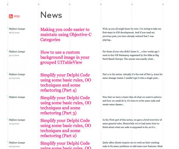
01. Devia

Using an outstanding grid system and an elegant hierarchy of pure typography, Devia has a great example of a list of articles in a horizontal format.
02. JoyentCloud

Illustrated concepts form wonderful leads to each of these services that JoyentCloud employs in its cloud offering.
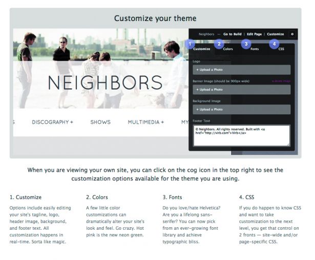
03. Virb

Graphic illustrations often require accompanying lists to walk a viewer through the meaning of the illustration. Virb has done just this, and effectively.
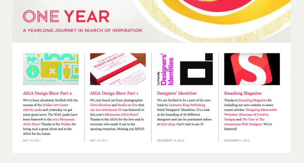
04. Eight Hour Day

Some article lists have associated images, for instance in this example from Eight Hour Day.
05. Hey Indy

A step list is a common need for web applications or service industry sites such as Hey Indy. This list uses numbers, colours and a stacked heading and body to show you its process.
If you've seen any examples of sites getting lists right, why not mention them in the comments?
Words: Matthew Smith

Thank you for reading 5 articles this month* Join now for unlimited access
Enjoy your first month for just £1 / $1 / €1
*Read 5 free articles per month without a subscription

Join now for unlimited access
Try first month for just £1 / $1 / €1
Get the Creative Bloq Newsletter
Daily design news, reviews, how-tos and more, as picked by the editors.

The Creative Bloq team is made up of a group of art and design enthusiasts, and has changed and evolved since Creative Bloq began back in 2012. The current website team consists of eight full-time members of staff: Editor Georgia Coggan, Deputy Editor Rosie Hilder, Ecommerce Editor Beren Neale, Senior News Editor Daniel Piper, Editor, Digital Art and 3D Ian Dean, Tech Reviews Editor Erlingur Einarsson, Ecommerce Writer Beth Nicholls and Staff Writer Natalie Fear, as well as a roster of freelancers from around the world. The ImagineFX magazine team also pitch in, ensuring that content from leading digital art publication ImagineFX is represented on Creative Bloq.
