How to design an event poster using stock photography
We run through the basics of how to create a striking event poster.
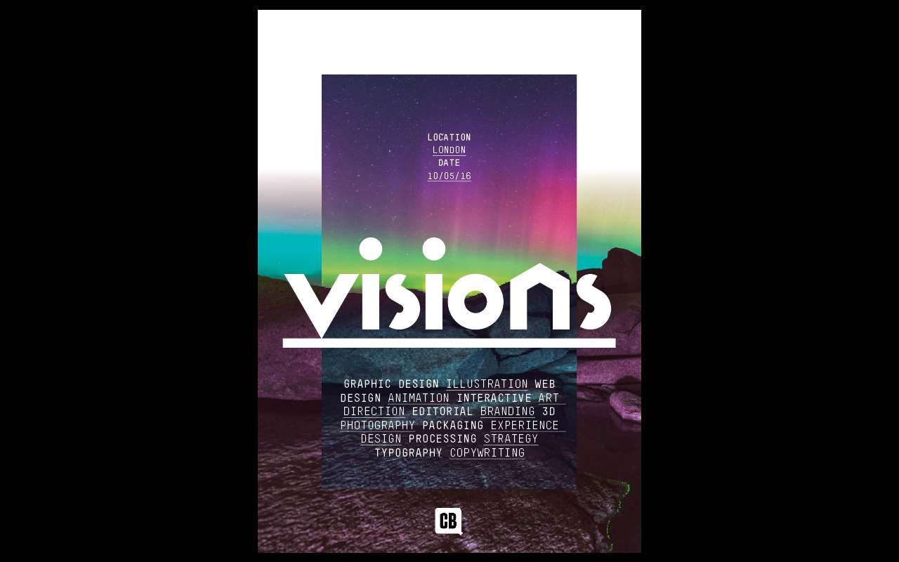
Through this short step-by-step tutorial we're going to cover the basics of creating a striking event poster, something every designer will be charged with creating at some point in their career.
We'll cover the essentials, including setting up a simple grid within InDesign, type setting, as well as choosing and editing the right images for your poster design using stock imagery.
01. Set up a grid.
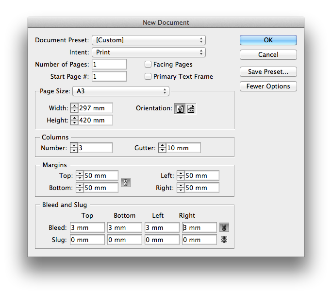
Navigate to 'File>New Document' within InDesign. Within the new document panel, uncheck facing pages, set the standard page size to A3, the number of columns to 3 with a gutter width of 10mm and a margin width of 50mm all around. The large margin width will ensure we have a nice thick frame to base our design on. Finally, add 3mm bleed to the document.
02. Add image boxes and headline typography
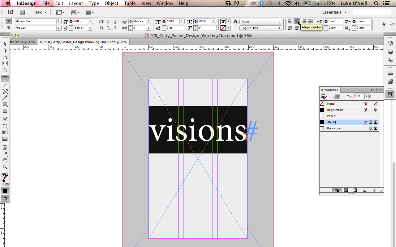
Using the rectangle frame tool, draw two rectangular shapes sticking to the bleed boundaries and the margins and then fill them with two contrasting swatches. Hit T to bring up the tip tool and draw a rectangular type box within the centre of the document and type in your main headline, in this case the word "Visions". Centre the type and increase its point size so that it sits almost flush with the margins.
03. Choosing the right font
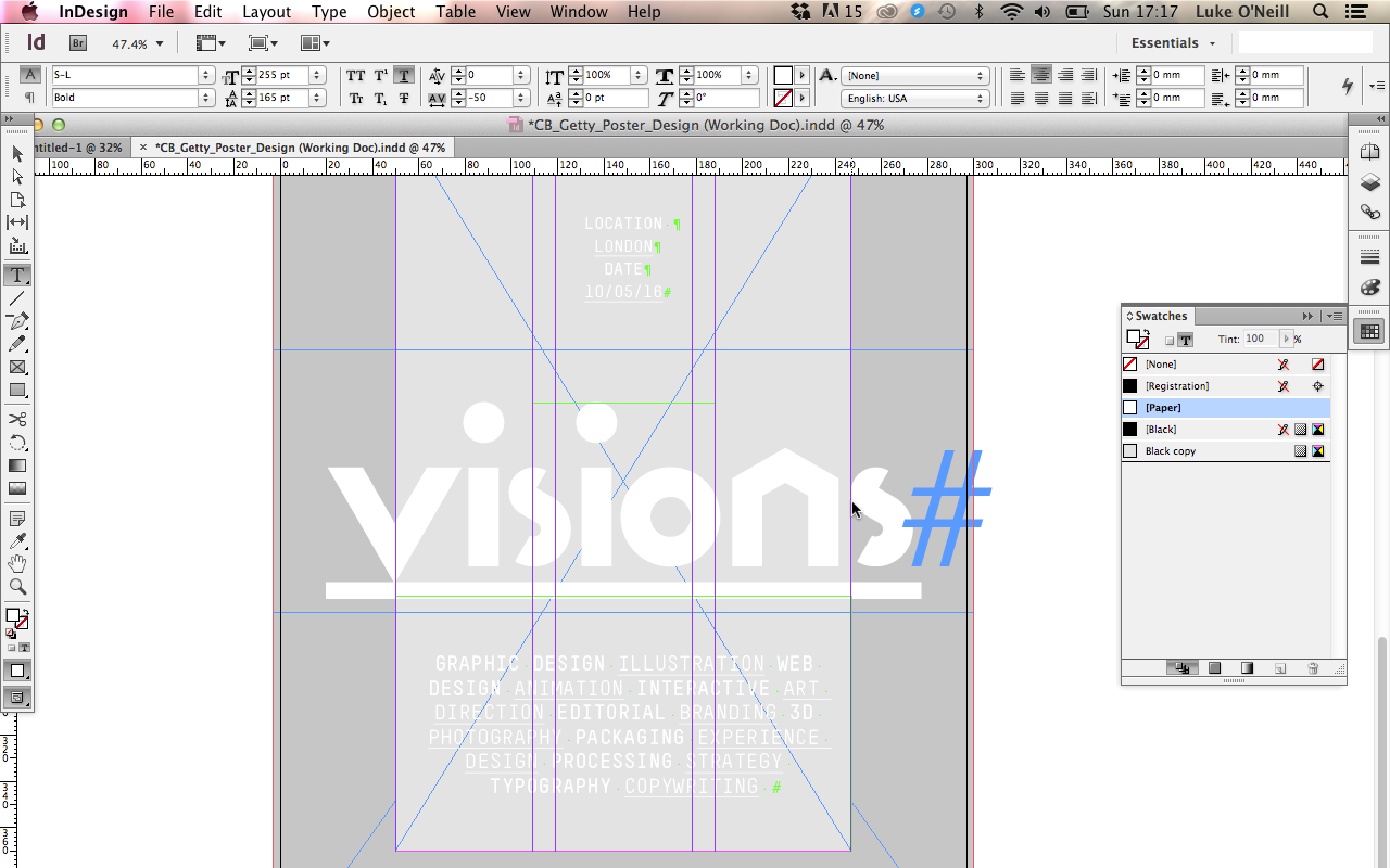
Choosing the right typeface for a given job is very much a skill in itself and it's worth taking extra time at this stage to ensure you make the right choice as it will dramatically affect the overall tone of the finished piece. For my poster I've chosen the headline font S-L and for my secondary detail typography I've chosen TSTAR Mono Rounded. Both faces I've chosen have a contemporary and very graphic feel to them, which fits with the look and feel that I'm trying to achieve.
Spend some time kerning the type by using alt and the left and right arrow keys, and re-size the headline typography so it gels with the poster grid we've set up. In this case I've made sure that the 'V' sits central to the left hand margin and the 'S' sits flush just outside of the right hand margin, creating some balance and consideration to the piece. I then add a thick underline to the main headline and alter the weights and underlines within the smaller type to create variety.
04. Image selection
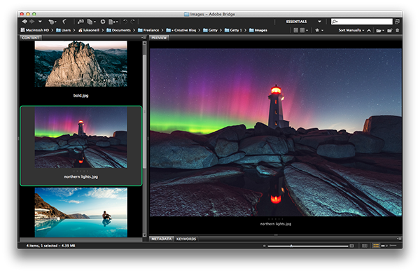
For this poster we don't have a photography budget, which is often the case with commercial jobs, so we're going to use stock photography to flesh out our design.
Get the Creative Bloq Newsletter
Daily design news, reviews, how-tos and more, as picked by the editors.
Start by scouring online stock libraries, in this case iStock, and choose a selection of images that will fit the look you're going for. I've picked out a number of scenic and quite atmospheric shots that I think will help to convert the slightly other-worldly feel that I'm going for.
I finally whittle it down to just the one image and decide on a striking image of the Northern Lights for this particular poster design.
05. Image placement and cropping
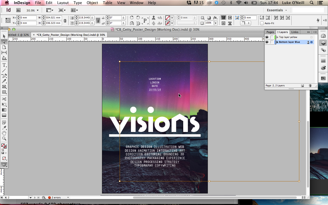
Back within InDesign, select the central rectangular shape that we created earlier and hit Cmd+D to bring up the place window and select the stock image that you've chosen. Re-size the image and crop it within the frame until you're happy with the composition and repeat the process for the image in the background.
06. Final tweaks and edits
To add some contrast to the background image I've used the gradient feather tool to fade the image out to a white background by simply selecting the image frame, making sure you have a white swatch selected and by simply dragging the tool in the direction you'd like the gradient to travel in.
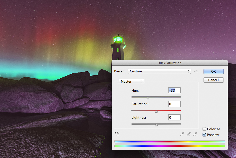
As one final tweak to the background image, open it within Photoshop and tweak the Hue and saturation slightly: this can be found under 'Image>adjustments' menu. Simply re-save the image and replace it within InDesign. Finally add any logos or branding that you may require and we're all done.

Thank you for reading 5 articles this month* Join now for unlimited access
Enjoy your first month for just £1 / $1 / €1
*Read 5 free articles per month without a subscription

Join now for unlimited access
Try first month for just £1 / $1 / €1
Luke is a creative director, visual designer and digital artist, who works at THG Studios in Manchester as creative director of beauty. He previously worked for Future Publishing, where he was art editor of leading magazines such as Guitarist, T3 and Computer Arts.
