How to curate a creative portfolio
We dish out essential advice on curating a creative portfolio.

Whether you're a recent graduate, a seasoned pro applying for a new job, or a freelancer scouting for new work, you need a powerful portfolio. Curating and maintaining your portfolio should be an essential part of your professional life.
In essence, your portfolio should showcase your professional work, demonstrating what you can do and the skills you have. But more than that, it should demonstrate your experience and the journey that you've been on to get there. Needless to say, it's no simple task,
Through this article, we'll run through some essential portfolio advice and golden rules that can be applied to any creative discipline, to help you on your way to curating a killer design portfolio.
01. Only the best will do

This is a no-brainer, but only include your very best work in your portfolio: it should be all killer and no filler. Although we're used to being ruthless in presenting only the key information when responding to a creative brief, it's often very hard to apply the same ruthless decision-making process to our own work.
Ensure that all the pieces in your portfolio 100 per cent represent your best work. If you're unsure whether or not to feature a piece then, as a rule of thumb, you probably need to ditch it.
The work featured should demonstrate the very best of what you can do. Any sub-par pieces will only let down the portfolio as a whole, and give the impression that you're unable to self-edit or be self-critical.
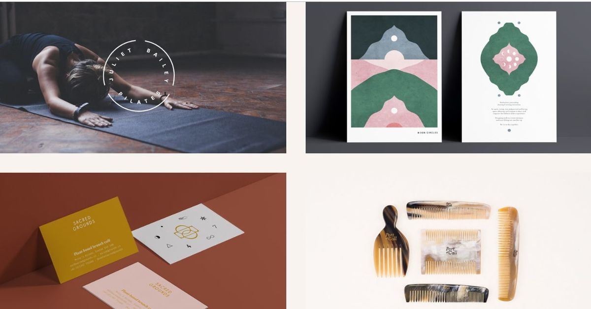
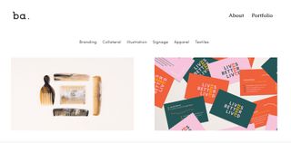
I asked designer and illustrator Becca Allen about how she goes about selecting the work that appears in her portfolio.
"My portfolio is 5 per cent of my work over the last five years. It's the pieces I slaved over, I am most proud of and through which I pushed my design knowledge. It covers a large variety of design practices to show my ability and strengths, but only the best pieces make the cut. Quality not quantity."
02. Choose the right format
This is more of an interview-specific tip, really, as it should go without saying that you need an online portfolio in this day and age. If you don't, get one!
There's no excuse for not having an online space to showcase your creative work – you don't even have to be able to code. There are so many off-the-peg solutions from Cargo to Squarespace, not to mention the likes of Tumblr, Wordpress and Behance.
Back to the interview portfolio. This really depends on your output as it would make zero sense to print out motion work. But I'm going to go out on a limb and say that traditional printed portfolios are largely redundant today.
Put together an iPad presentation or even a full screen interactive PDF presentation that fits to your laptop screen and can be cycled through easily. Of course, take in physical copies of some of the more tactile pieces.
If you've created a beautiful foil blocked and embossed book cover, that's the sort of thing people want to see and feel in the flesh. Printing that out and presenting it in a traditional format would not do it justice.
03. Tell your story and present it well
Pacing and presentation is key when curating a portfolio. Treat it like any other design job in the way that you present the work, and ensure that it has a beginning, middle and end. The exact aesthetic and typographic choices you make when creating your portfolio are yours and yours alone, but I'd suggest that less is more.
It's better to let the work featured speak for itself and be the main event – not the vessel that holds the work. Whether it's a website or a printed folio, it should be easy to view each project clearly and identify who it was created for.
"Your portfolio is a piece of artwork in itself – the order, composition, format, typography, colour palette," adds Allen. "It should all be considered just like a brief. A poorly designed portfolio could let the rest of the work down. It should be cohesive as a whole, from the first page to the last and all the pages in between."
In terms of pacing, my suggestion would be to always start and end with key, knockout pieces so that the viewer is instantly impressed and left wanting more. This is easy to apply to a printed, PDF or showreel portfolio, but slightly harder online.

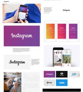
With online portfolios, my advice as a commissioning art editor would, again, be 'less is more' in terms of the design and presentation. Make the work easy to view and then make the images big.
I have definitely left illustrator and designer's websites in the past, not because the work was poor but because the experience of trying to view it was so awful.
Mike Sullivan, from digital design studio Mister, agrees with this. "When designing a portfolio, you want a website that is straightforward, easy to use and engaging," he says. "You want your work to be the focal point, rather than a distracting, design-heavy folio."
04. Adapt for each job
Your portfolio should be a living, breathing entity and should evolve over time, as your work does. It makes sense to periodically update your website and if you're looking for a job, always update what you intend to present in the interview.
Don't be tempted to simply take along the same selection of work and present it in the same manner for every job role. The work within your folio should be thought about in terms of who you're going to be presenting it to.
This, of course, applies to the samples that you send out when applying for the job in the first place as this is the first snapshot of your work that the potential employer will see.
05. Be confident
Finally, be confident when curating your portfolio. This will speak volumes to viewers, telling people a little about yourself in the process. Choose your most interesting, dynamic and accomplished work, and pick pieces that you know you'll be able to talk about in a meeting or interview situation.
Think about including some WIPS or alternative routes to a finished piece of work as this will provide valuable insight into your creative process and a talking point when face-to-face with someone.
Sullivan concurs: "Don't be afraid to specialise, if you want to work in editorial show this. If UX is your strong suite – show that and always share the process and backstory."
Be careful not to overdo the 'behind the scenes' bit, though, and don't be tempted to retro-fit 'process' images as it'll only come off as contrived. We've all seen those spirograph logo diagrams.
Now go forth and curate!
Related articles:

Thank you for reading 5 articles this month* Join now for unlimited access
Enjoy your first month for just £1 / $1 / €1
*Read 5 free articles per month without a subscription

Join now for unlimited access
Try first month for just £1 / $1 / €1
Get the Creative Bloq Newsletter
Daily design news, reviews, how-tos and more, as picked by the editors.
Luke is a creative director, visual designer and digital artist, who works at THG Studios in Manchester as creative director of beauty. He previously worked for Future Publishing, where he was art editor of leading magazines such as Guitarist, T3 and Computer Arts.
